A website made by AI usually looks like it came from nobody in particular. It is clean and competent, with a soft gradient, rows of rounded cards, a sparkle icon and copy full of words like seamless and elevate. Each choice is fine on its own. Together they read as a default, and customers are getting quick at spotting it.
Why do AI websites all look the same?
An AI website builder works by predicting the most likely choice at every step. The most likely colour, the most likely sentence. So the results land in the middle, again and again.
People have started calling the output AI slop. That is a little harsh on the tools, which can be very useful, but it describes what happens when the defaults go live untouched. You end up with a site that seems complete but could belong to anyone.
I see these tells all the time, on new sites and in the AI mock-ups clients bring me. Here is what to look for.
What are the visual tells?
- A purple or blue gradient. The soft wash of lavender into blue behind the headline is the single most common sign.
- Rounded cards with soft shadows, stacked. Every section is a box floating on the page, and every box looks the same.
- Icon, heading, short description, repeated. Features lined up in neat rows, each with its own little icon.
- The sparkle. A star or magic-wand icon next to anything described as smart or new.
- Everything centred. Perfect symmetry, with nothing breaking the line.
- Glossy generated people. The same polished, too-perfect look on everyone, whoever the business is for.
- Flat 3D illustrations. Rounded blobby figures and floating objects that could belong to any company.
And don’t get me started on AI posters. They share the same polished, airbrushed look whatever they are for, and you can see nobody decided what should make this one different.
A site that could belong to anyone is easy to pass by.
What gives it away in the type?
Type is where a lot of AI sites quietly blend together. Look for:
- The same few fonts. Inter, or a similar clean sans, used for everything, including the big headline.
- Playfair as the classy option. When the builder wants to look upmarket, it reaches for the same serif every time.
- One word in a different colour. A headline where a single word glows in the accent colour, or ends in a coloured full stop.
- No real hierarchy. Everything at a similar size and weight, so nothing leads your eye.
Good type has a point of view. If you are not sure what that looks like, my type trends article is full of studios doing it well.
What about the words?
AI copy is often the easiest tell of all, because it says a lot without saying anything about you:
- The rhetorical flip. Sentences that set something up only to swap it for something grander, used over and over.
- The vocabulary. Seamless, effortless, elevate, unlock, empower, streamline, cutting-edge.
- “In today’s fast-paced world.” An opening that could sit on any website in any industry.
- Neat little pairs. Short matching sentences that sound like a slogan and mean nothing.
- Exclamation marks and em dashes scattered everywhere.
- No evidence of a life. Confident claims with no names, places, prices or real projects behind them.
That last one matters most. A real business has details nobody else has. When a site has none, it reads as if nobody is there.
Why does it matter if a site looks AI-made?
Your website is often the first proof that you are real. If it looks like a template that a hundred other businesses could have, it gives a visitor no reason to choose you, and some reason to doubt you.
There is research behind that feeling. In one survey of 2,000 UK and US consumers, people often preferred the AI-written article when they didn’t know which was which, but over half said they felt less engaged once they were told AI had written it (MarTech, June 2026). What puts people off is the feeling that nobody cared.
I think AI search makes this sharper. When ChatGPT recommends a business, it needs something specific to say about it, and generic copy gives it nothing to quote.
How do you make your site look like it came from you?
You don’t need to start again. Work through this list:
- Swap the stock imagery for your own. Your space, your products, your team, your hands at work. Real photos, even simple ones, do more than any generated image.
- Lose the gradient and the floating cards. Let your photography and your type do the work, with plenty of space around them.
- Choose type on purpose. Two typefaces that suit your brand, with a clear difference between the headline and the body.
- Keep every heading one colour. Emphasis comes from size and placement.
- Rewrite the copy with specifics. Where you are, who you work with, what you charge, what a project looks like. Read it out loud and cut anything that could belong to someone else.
- Show real work. Case studies with names and pictures are the strongest proof you have.
- Check it on your phone. Plenty of your visitors will see it there first.
If you’d like a second pair of eyes, send me your site and I’ll tell you what I’d change first. You can see how I approach it in my work.
Questions people also ask
Can people tell if a website was made with AI?
More and more, yes. Most people won’t name the tells, but they recognise a site that looks like lots of others and trust it less. In one survey of 2,000 UK and US consumers, over half said they felt less engaged with content once they were told AI had written it (MarTech, June 2026).
Is it bad to use an AI website builder?
Not at all, for a first draft or a quick test of an idea. The problem comes when the defaults go live unchanged. Use it to get started, then replace the stock choices with your own photos, words and type.
Will an AI-built website hurt my Google ranking?
Google says it judges content on whether it is helpful, however it was made (Google Search Central). A site full of generic copy with nothing specific to your business gives it, and your customers, very little to go on.
What is AI slop?
It is the name people have started using for content made quickly by AI and published without much care: images and websites that all look alike.
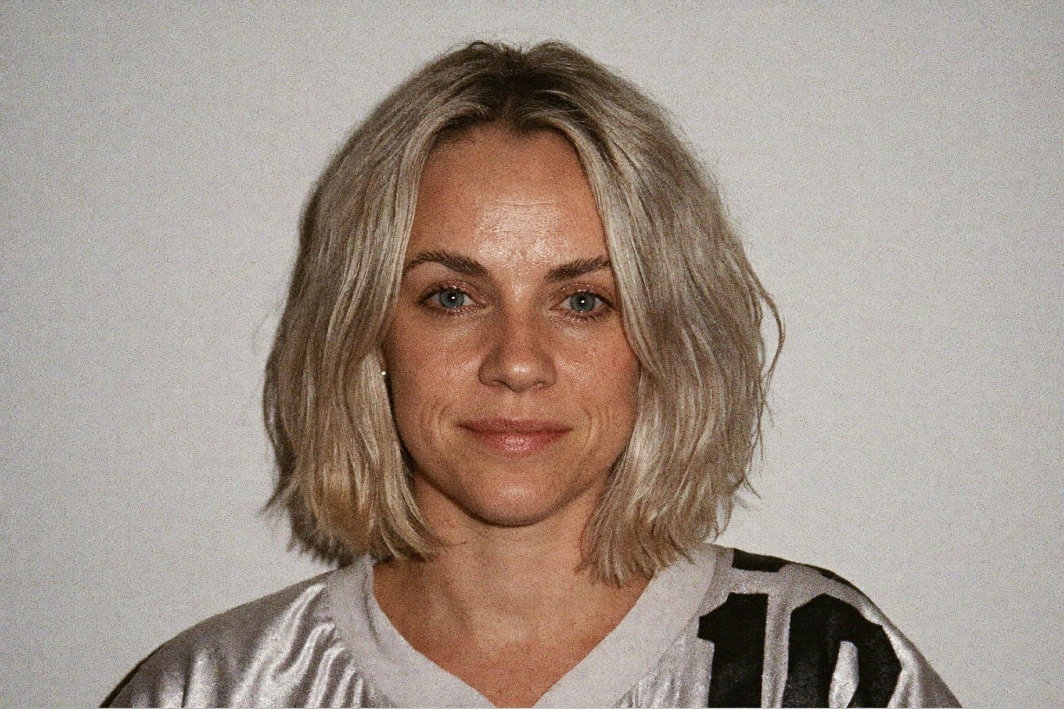
Sophie is an independent designer based in the UK and the founder of S Evans Design, working across brand, web and product for founders and brand teams. Her career work includes projects for Arsenal, DreamWorks, BBC, Sky, Channel 4, Barclays and the NHS, and she is a Squarespace Circle Gold partner. More about Sophie.