Logistics website design for OnLogistics: the live homepage on a laptop in a warehouse office overlooking pallet racking
Case study · 2026

OnLogistics

Brand identity, brand guidelines and website design for a UK fulfilment and logistics company, bringing OnLogistics and Exact Logistics together under one name.
Client
OnLogistics
Year
2026
Role
Brand identity & website design
Services
Discovery · Identity · Guidelines · Web
01The brief

Two logistics companies, one name.

OnLogistics is a UK logistics integrator with more than 25 years in warehousing, fulfilment and transport. After its merger with Exact Logistics, the business needed one identity that customers, drivers and staff would all recognise.

That meant a brand that reads as established and technology-led, and a website that makes the whole offer clear: warehousing, fulfilment, value added services, transport and the sectors it serves. A buyer should understand what OnLogistics does, and ask for a quote, without hunting for either.

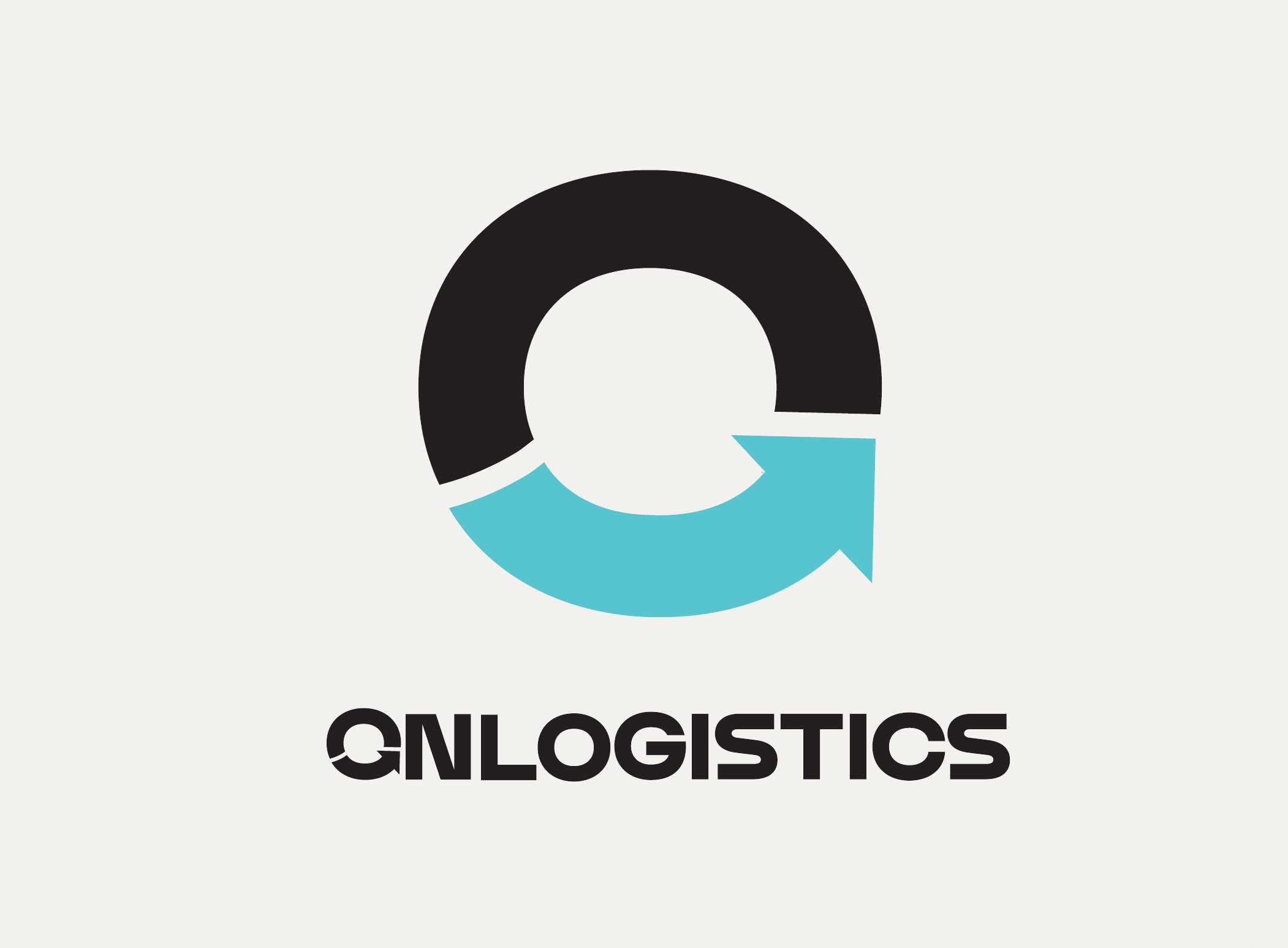
Logistics company logo design: the OnLogistics wordmark with its teal arrow O and the tagline Taking care of every step
The identity
One mark for the merged business.

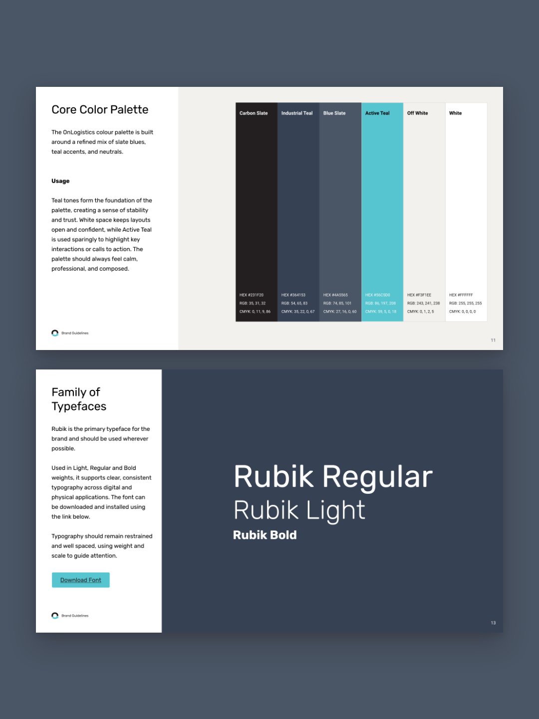
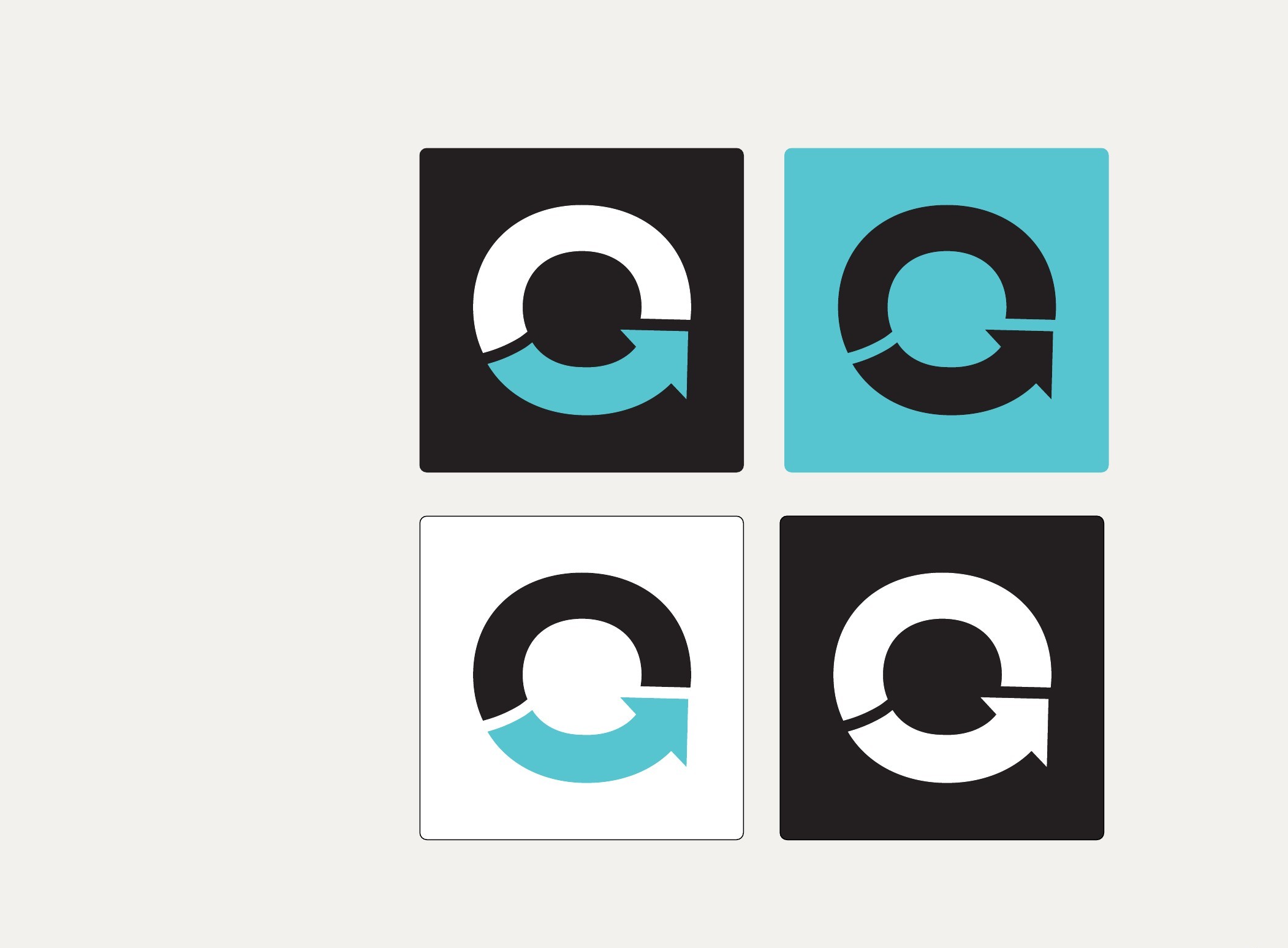
The O closes into an arrow, a mark about flow and control across the supply chain. The tagline, Taking care of every step, sits under the wordmark wherever there is room for it. Carbon Slate carries the brand, and Active Teal is kept for the moments that need attention, like a call to action.

231F203641534A556556C5D0F3F1EEFFFFFF
02The system

Built for the side of a lorry as much as a browser tab.

Every place the brand appears has a version made for it. The full logo and tagline for fleet and signage, a vertical lockup for workwear, and the symbol on its own for social profiles and app icons. Rubik runs across everything, with Calibri set as the fallback so Word and PowerPoint documents still match.

It is all written up as brand guidelines the team can hand to a signwriter, a uniform supplier or a new marketing hire, with the approved logo files linked from the document.
The brand guidelinesVersion 1.0, January 2026
OnLogistics vertical logo for workwear and compact spaces
Vertical logo
OnLogistics symbol-only mark in four approved colourways
Symbol
OnLogistics logo in its alternative colourway on off white
Alternative colourway
OnLogistics typography: Rubik Regular, Light and Bold
Typography
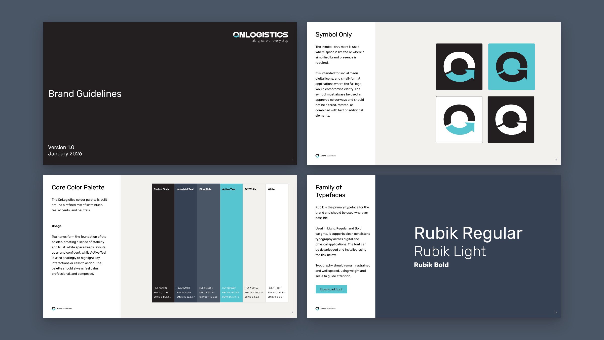
Four pages from the OnLogistics brand guidelines on Blue Slate: the cover, Symbol Only, Core Color Palette and Family of Typefaces
Brand guidelines · Cover, symbol, colour and type
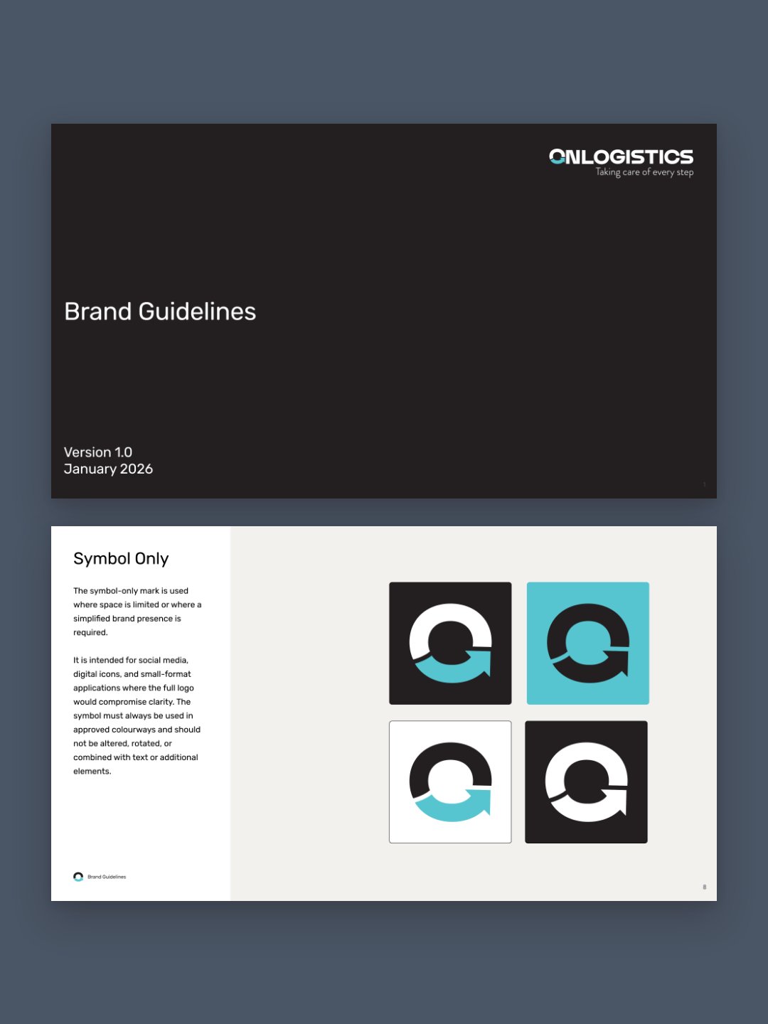
The cover and the Symbol Only page from the OnLogistics brand guidelines, on Blue Slate
Brand guidelines · Cover and symbol
The Core Color Palette and Family of Typefaces pages from the OnLogistics brand guidelines, on Blue Slate
Brand guidelines · Colour and type
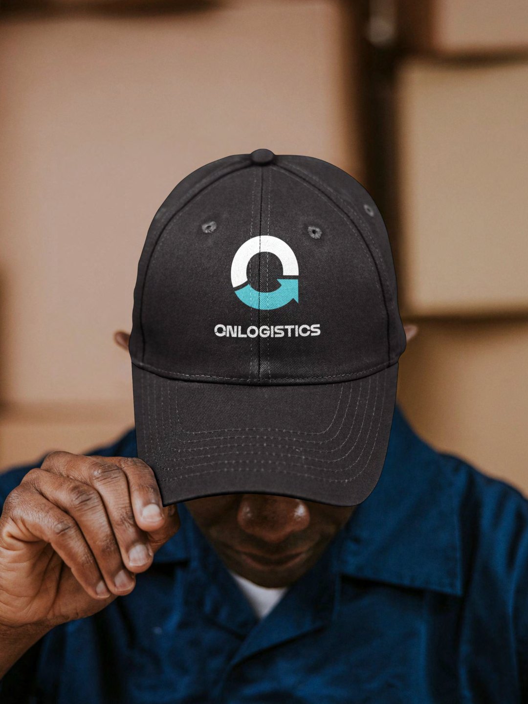
Brand guidelines application: a cap carrying the OnLogistics vertical logo
Brand guidelines · Cap
Brand guidelines application: a forklift driver in a navy vest carrying the OnLogistics symbol
Brand guidelines · Vest
The Workwear and Fleet pages from the OnLogistics brand guidelines: black polo shirts, front and back, and a black lorry trailer carrying the full logo
Brand guidelines · Workwear and fleet pages
The website
Every service and sector,
one click from the homepage.
Website · Homepage, desktop
Live OnLogistics mobile screens: the Health and Beauty hero, the transport services cards and the Transport hero
Website · Mobile screens

onlogistics.co.uk. Services, sectors and transport each have their own section, with client success stories and testimonials close to where a buyer decides to get in touch. Fully responsive on mobile and desktop, with the customer portal login in the header of every page.

03The site

Planned around what a buyer asks first.

What do you handle, for which sector, from where, and who else trusts you with it. The sitemap and wireframes answer those in that order, across every key template: services, sectors, transport, case studies, news and contact.

I designed the site. Chris Hough at WP Bees built it in WordPress, and Laura Sargeant at SEM Consultants led the SEO.
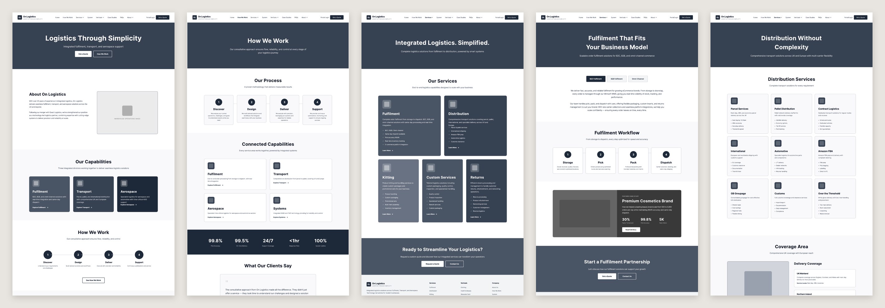
The wireframesSixteen page templates
OnLogistics website wireframes: homepage, how we work, services, fulfilment and distribution page templates
The identity in useWordmark and vertical lockup
An OnLogistics van in a yard, with the wordmark on the body and the vertical lockup on the cab door
Photograph supplied by OnLogistics
04The outcome

One company, one name, one website.

The merged business now presents as OnLogistics, with a single identity and a website that sets out everything it offers. The guidelines give the team the files and the rules to apply the brand to fleet, signage, workwear and documents as each is renewed.

  • Discovery, stakeholder input and a market review
  • Brand concepts for the merged business
  • A logo for every use: full logo with tagline, horizontal, vertical and symbol
  • Colour palette and typography, with a Microsoft Office fallback
  • Brand guidelines, including workwear, fleet and photography direction
  • Website sitemap and wireframes
  • Website design, built by WP Bees and live at onlogistics.co.uk
Brand identity & website designS Evans Design, sophie-evans.com
Website buildChris Hough, WP Bees
SEOLaura Sargeant, SEM Consultants
“
Taking care of every step.
The OnLogistics brand line
Next project · 02 of 08 All work →
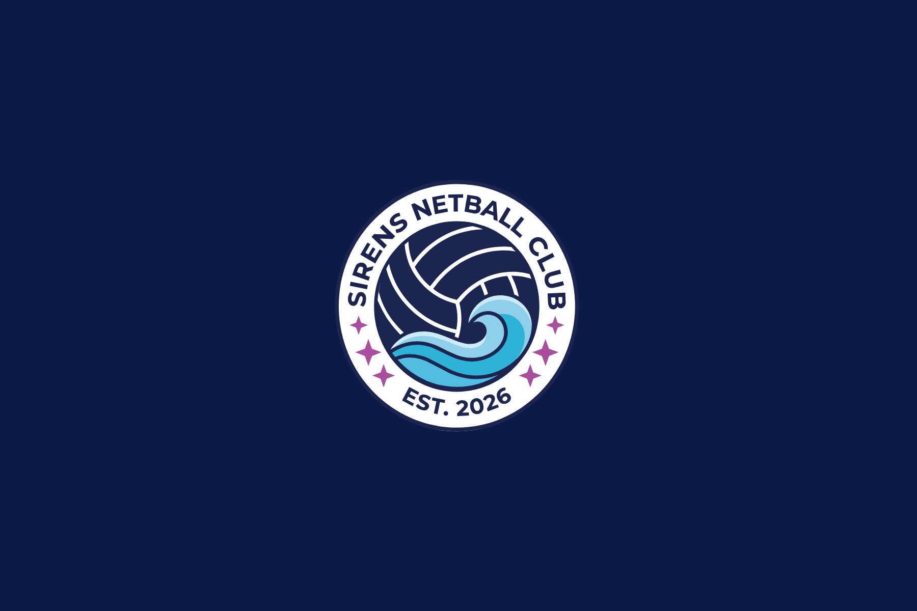
Sports club branding for Sirens Netball Club: the club crest on navy
Brand · Website · Social

Sirens Netball Club

Brand identity, website and a social media launch pack for a new junior netball club in Sidcup, live four weeks before its first session.

View the case study →

Working on something similar?

Start a project →