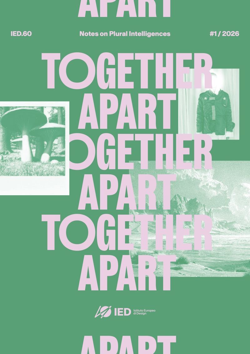
Five type trends are shaping brands in 2026: the serif revival, ultra-condensed display type, warped type, soft and wonky letterforms, and monospace. For a small business logo, serifs and mono last longest. Condensed type works hard in headlines, and warped or bubbly type is best kept for packaging, posters and launches, where it can change next season.
What are the type trends for 2026?
The clean, neutral sans serif had a long run. The type replacing it has more personality: serifs with some nerve, letters squeezed, stretched and softened, and monospace taking over whole brands.
I picked five trends from this year’s type round-ups and found six pieces of real, published work for each. Every image is credited to the studio or designer who made it, with a link to the source. Each section says what the trend is, which kind of business I’d use it for, and what to watch.
Serif revival: why are serifs back?
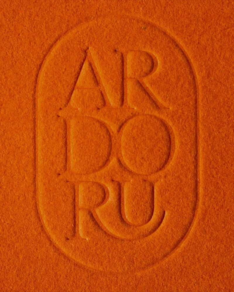
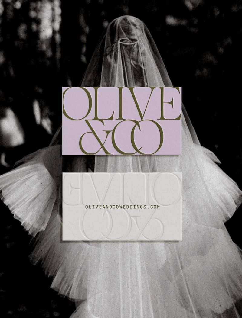
Serifs are back on logos, and in two moods. One is sharp and high-contrast, with hairline strokes that look expensive. The other is chunky and soft, a 1970s serif with round, flared ends that looks friendly up close.
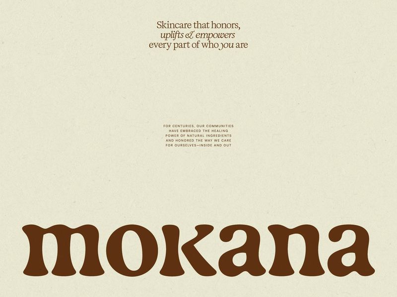
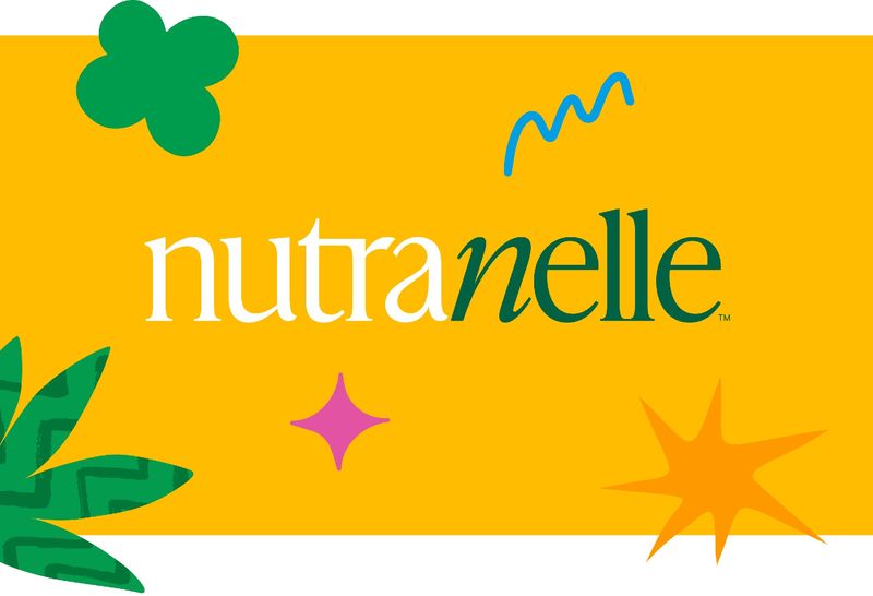
The examples that stand out are the ones where the serif replaces the symbol. Chantal Jemmott’s identity for Mokana skincare is a wordmark in Gaya, brown on cream, with nothing else needed. Riser gave Nutranelle, a plant-protein brand of the kind that usually gets a rounded sans, an IvyPresto wordmark with a swung italic n.
Where I’d use it: skincare and food brands, and anyone in weddings.
Watch: high-contrast serifs lose their hairlines at small sizes on screen. Keep the serif for the logo and headings, and set paragraphs in something plainer.
Ultra-condensed: what is it good for?
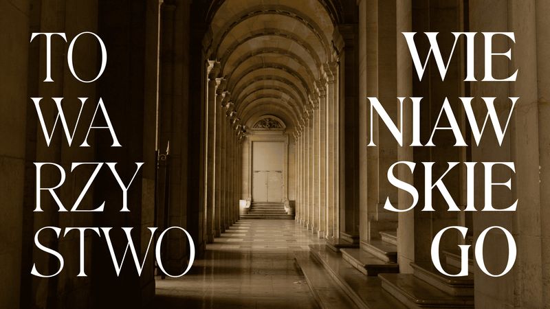
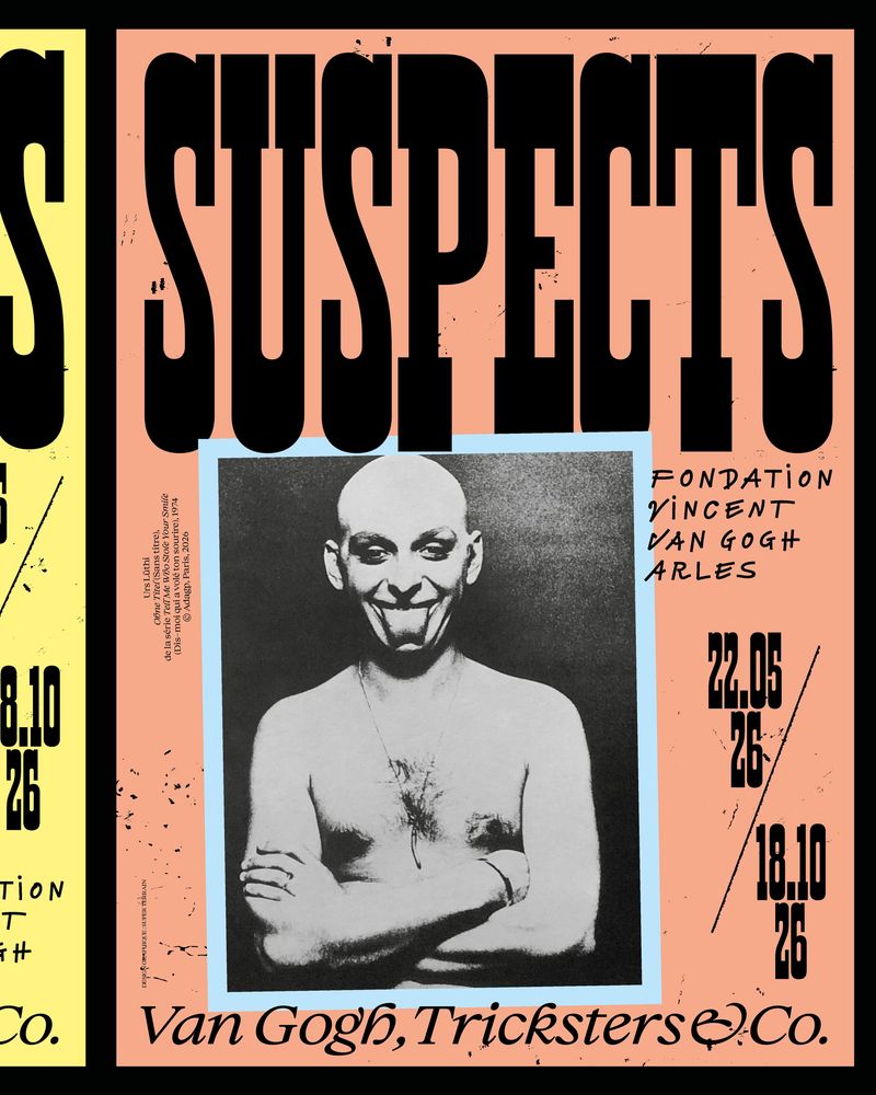
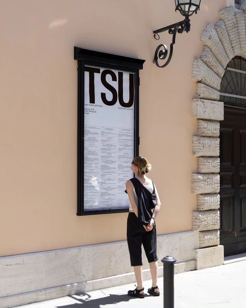
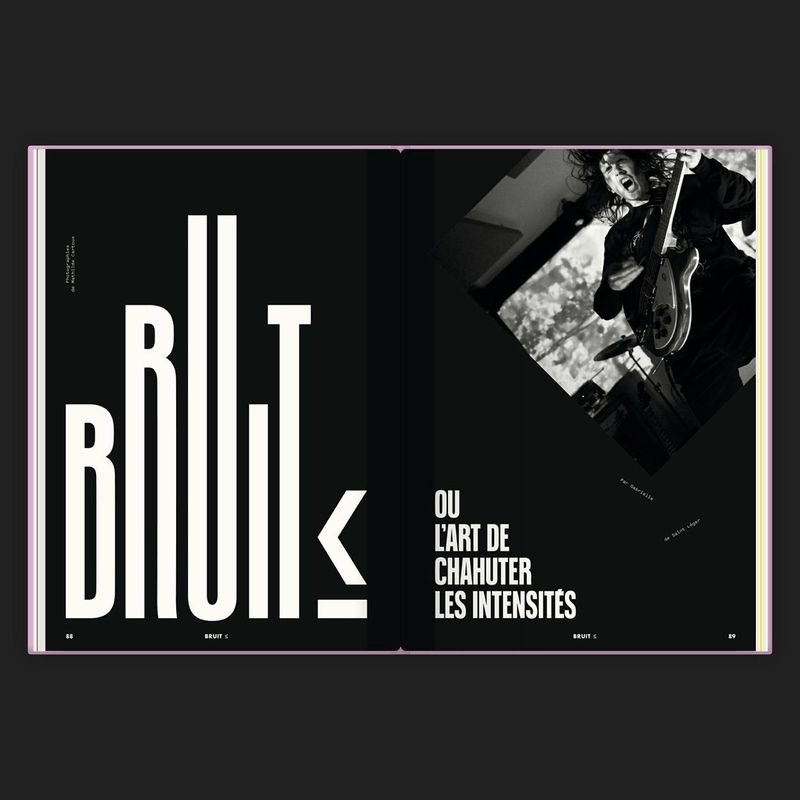
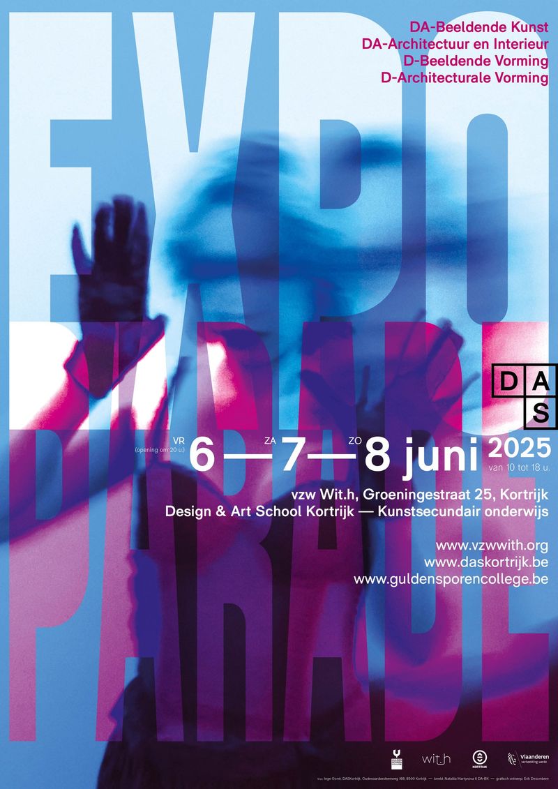
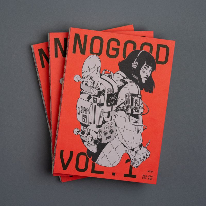
Very tall, very narrow capitals, set big enough to fill a poster from top to bottom. Super Terrain’s campaign for the Fondation Vincent van Gogh in Arles gives the whole top third of each poster to Horizon, a compressed face. Due Studio built the Teatro Stabile dell’Umbria identity on tall condensed initials that look institutional, in black on white, without shouting.
It has a practical side for websites too. A condensed headline fits a long word across a phone screen at a size that still has impact.
Where I’d use it: events, sport and editorial.
Watch: condensed capitals need a little extra letter spacing or the letters start to touch, and they are tiring to read in anything longer than a headline.
Warped type: can a brand use it?
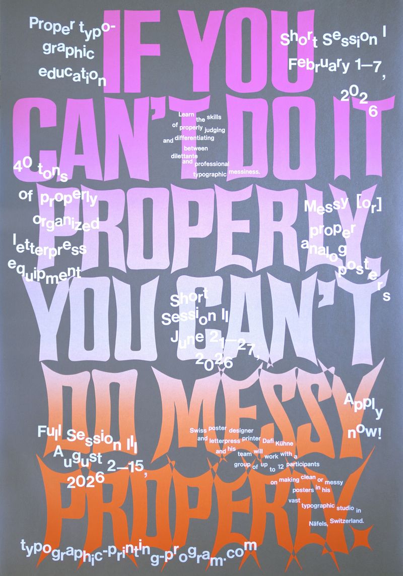
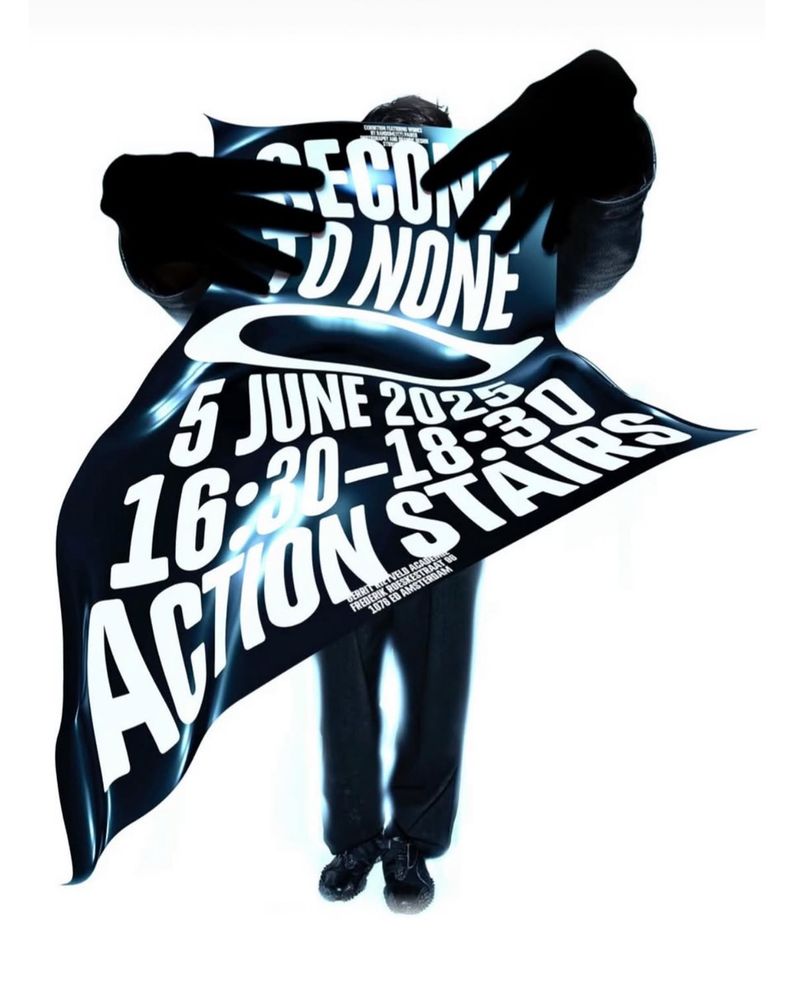
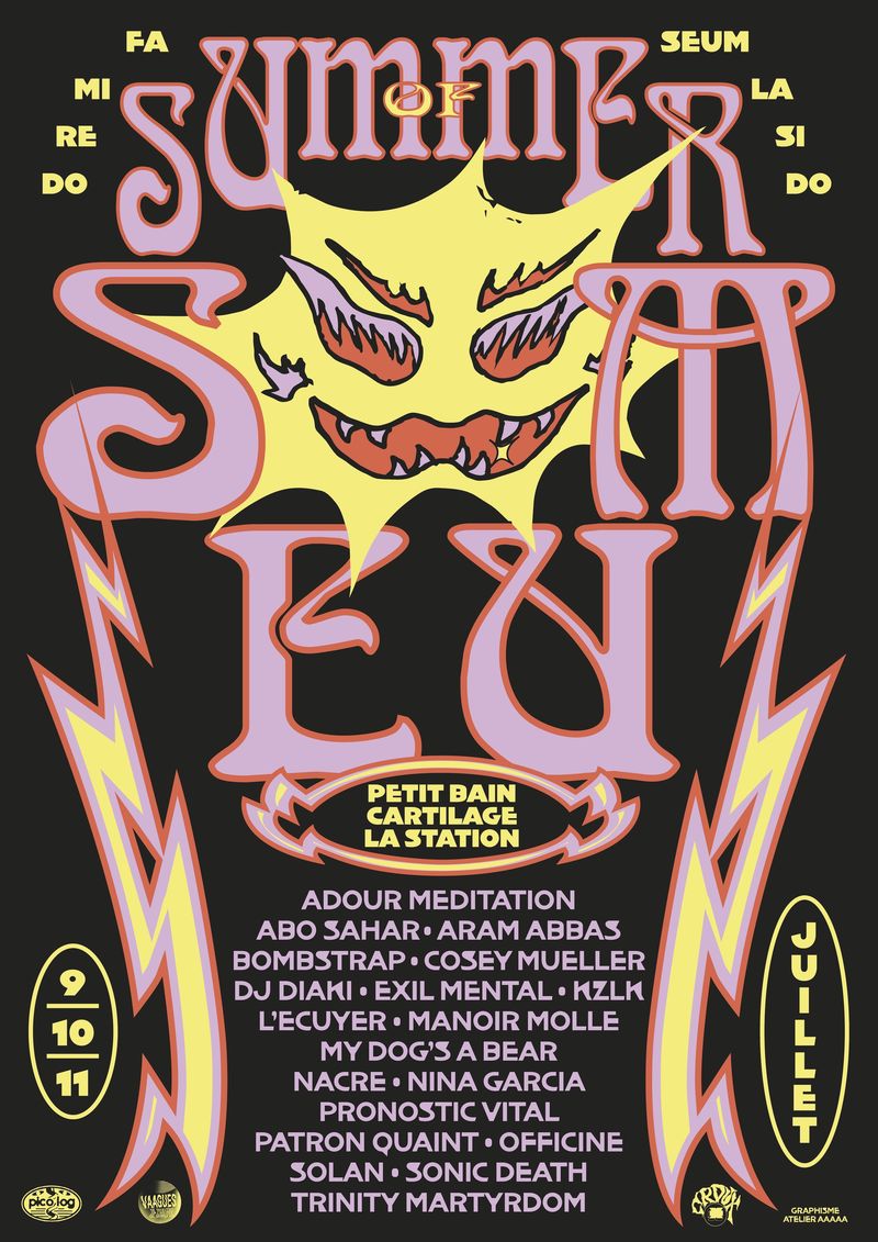
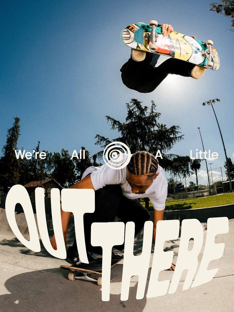
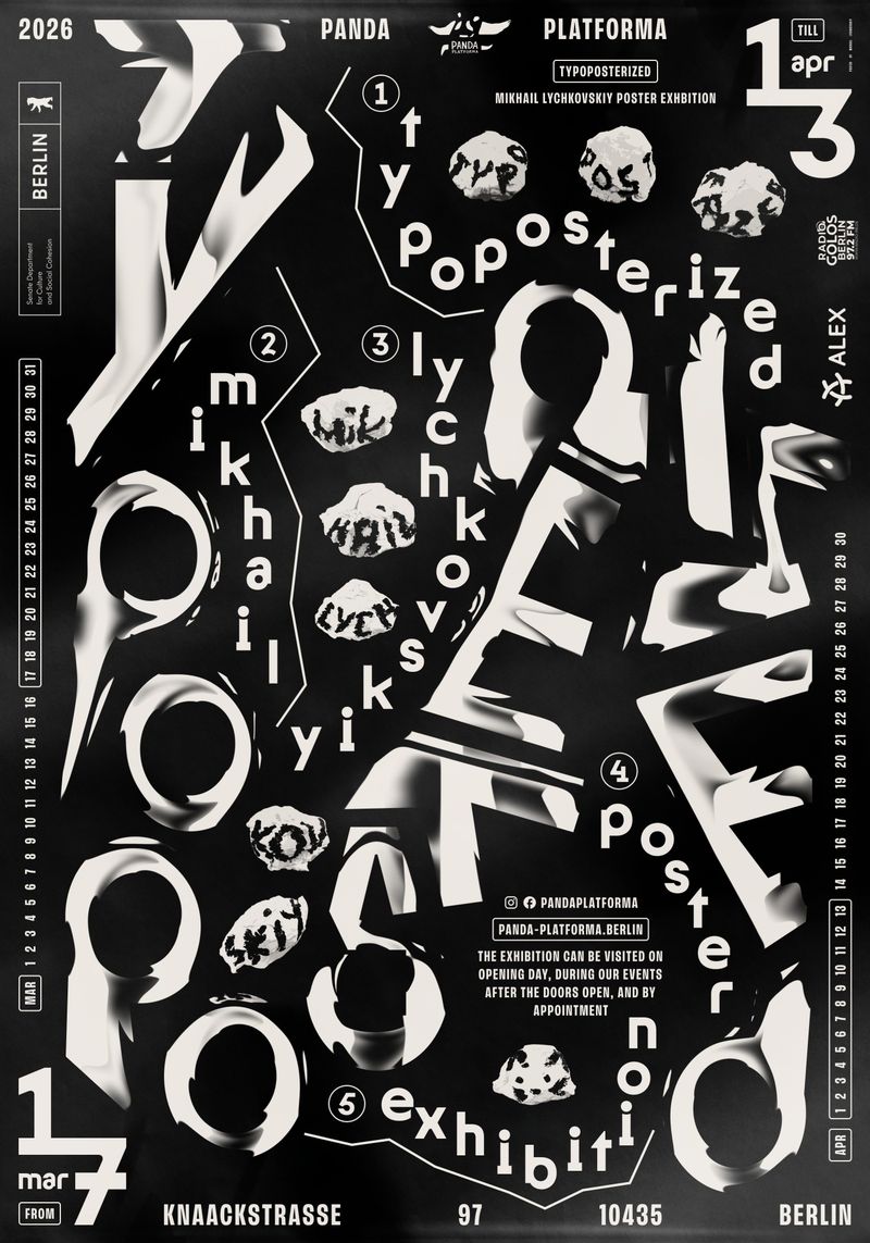
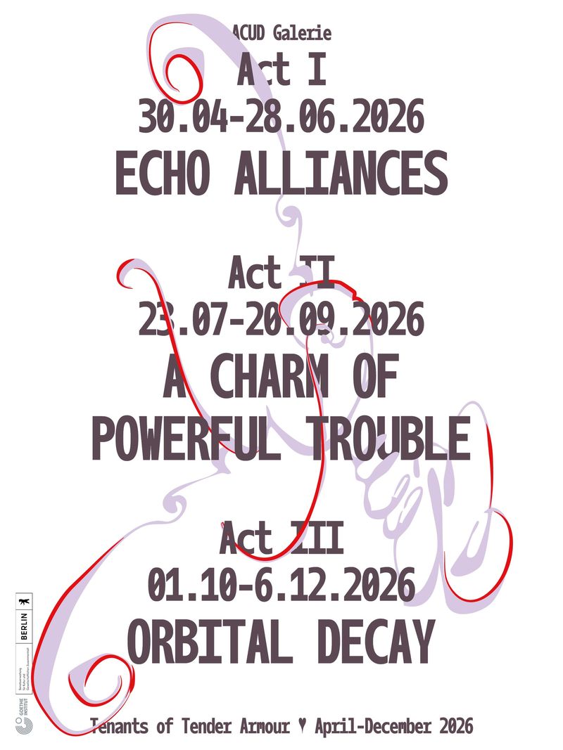
Letters bent, melted, stretched or pulled into perspective. Some of the best of it is made by hand. Dafi Kühne’s letterpress poster starts its headline in a normal shape and melts it line by line, using hand-cut linoleum letters. Combo’s Out There campaign with the skateboarder Nyjah Huston bends the wordmark across a fisheye skate photo, as if the lens is pulling it in.
Where I’d use it: music, festivals and youth brands.
Watch: a warped logo can’t be read at the size of a browser tab or a social profile picture. Keep a straight version of the logo as the master and warp it for campaigns, posters and merchandise.
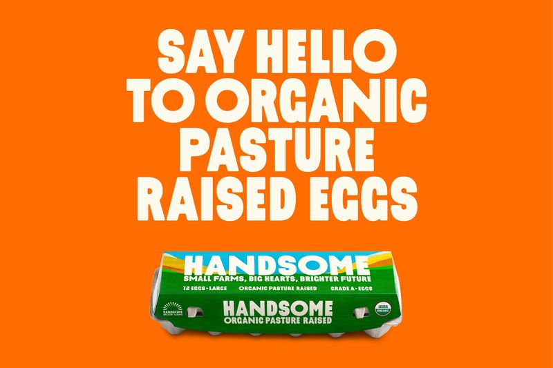
Soft and wonky: who suits bubbly type?
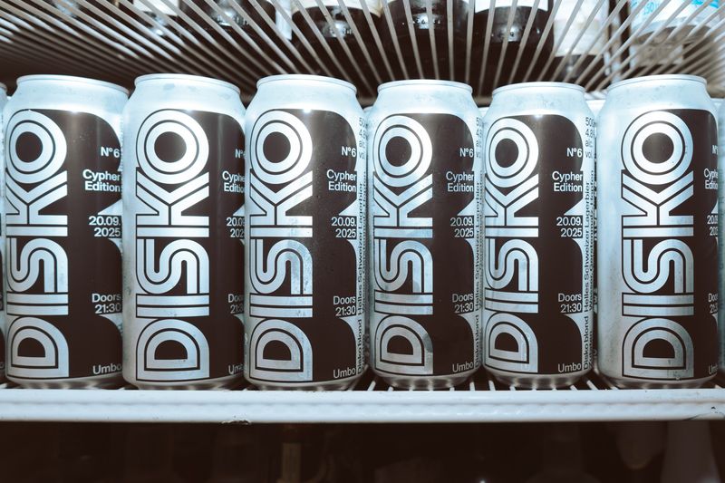
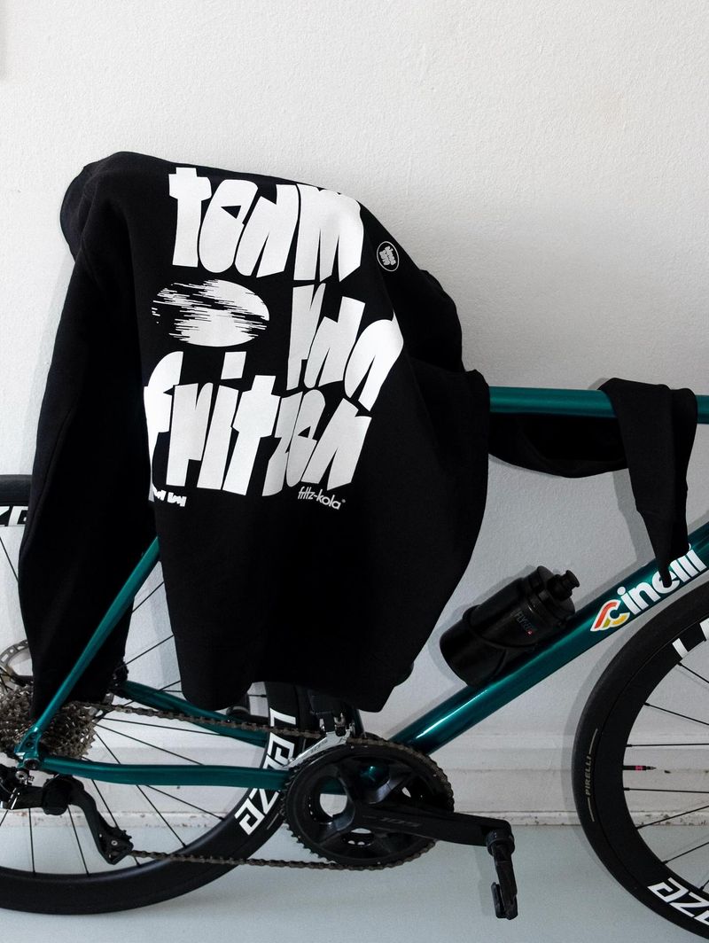
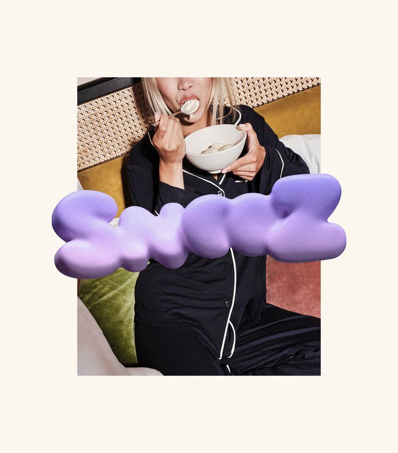
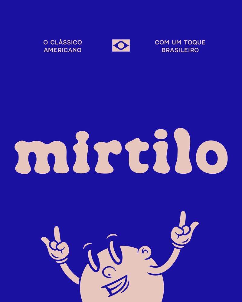
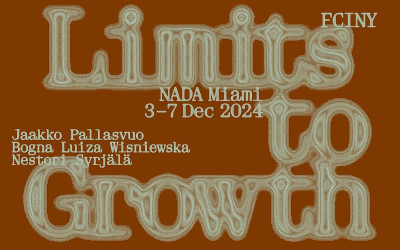
Rounded ends, swollen strokes, letters that look inflated or poured. How&How’s identity for Snooz ice cream puffs the wordmark up into soft 3D letters. Victor Cruz drew the Mirtilo Cheesecakeria logotype from a stencil filled with cheesecake topping.
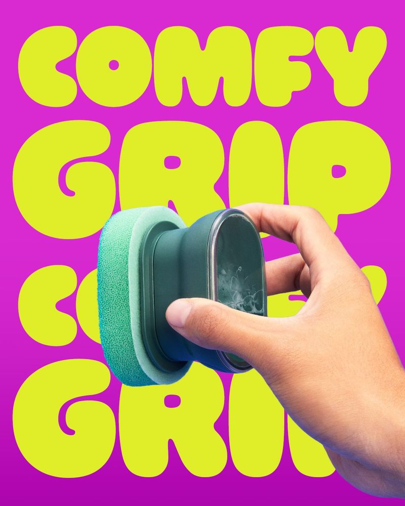
It works best when only the display type is soft. 3M’s Brite by Scotch-Brite launch sets Ohno Softie huge, then uses a plain sans, Poppins, for everything else.
Where I’d use it: food and drink, children’s brands and apps.
Watch: bubbly type is the most likely of the five to look dated in a couple of years. That matters less on packaging, which gets reprinted anyway, than on a logo.
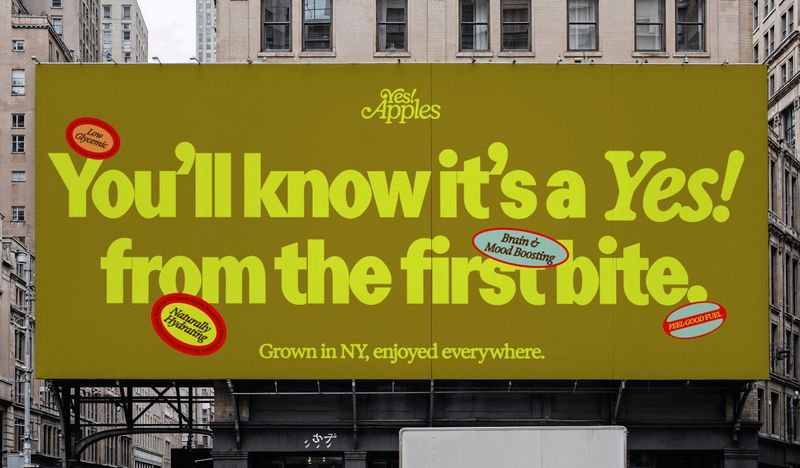
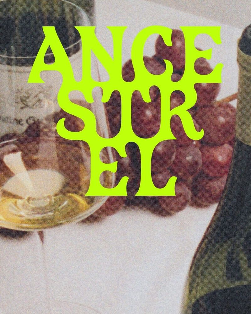
Keep the logo steady and let the trend live around it.
Mono everywhere: why do brands use monospace?
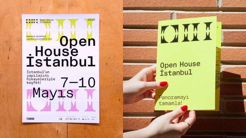
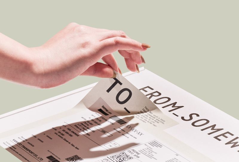
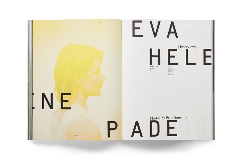
A monospace font gives every character the same width, like a typewriter. Brands are now using one face for everything, from the logo to the small print. ZYLA’s packaging for FROM_SOMEWHERE, a Tokyo photo-print shop, sets the wordmark, the shipping seal and every line of box copy in one monospace, so each box reads like a printed label. Sömestr Studio uses Crit Mono across the whole Open House İstanbul festival identity.
Where I’d use it: architecture practices, galleries and tech.
Watch: monospace is wide and slow to read in long paragraphs. On a website, use it for headings, labels, prices and navigation, with a regular sans for the reading.
Which type trend should a small business use?
Start with how long the type has to last. A logo goes on your signage, invoices and social profiles, and changing it costs money. A launch campaign or a run of packaging can change next season.
Of the five, serifs and monospace are the easiest to live with in a logo, because both have been in use for well over a century. Condensed type earns its place in headlines on the website. Warped and bubbly type suit the layer around the logo, where a brand can try something and move on.
Then check the type against what you sell. A soft, wonky wordmark suits an ice cream brand far better than a solicitor.
Can you use these fonts on your website?
Most of the fonts named here come from independent type foundries and are paid. A licence to use a font on your computer usually does not cover putting it on a website, so check what a licence includes before you buy. If your site is on Squarespace, the font picker already includes about 600 Google Fonts and about 1,000 Adobe Fonts at no extra cost, and there are serif, condensed and mono options in both.
If you are choosing type for a new brand, or your current logo feels stuck in the last decade, I can help. I design brand identities for small businesses, with the type chosen, licensed and set up for print and the website as part of the job.
Who made the work in this article?
Every image belongs to the studio or designer named under it. I found them through Fonts In Use and the studios’ own websites, and each caption links to the source. If you made one of these and would like the credit changed or the image taken down, email hello@sophie-evans.com.
Questions people also ask
What are the typography trends for 2026?
Serifs with more character, very condensed display type, letters that are warped or melted, soft and bubbly letterforms, and monospace used across a whole brand. All five move away from the plain, neutral sans serif that most brands used for the last decade.
Are serif fonts back in fashion?
Yes, in two directions. High-contrast serifs with sharp hairlines are back on culture and food brands, and chunky, soft 1970s serifs are back on skincare and wellness. Both are being used for logos, which a few years ago would almost always have been a sans.
What is a monospace font?
A font where every character takes up the same width, like a typewriter or computer code. It makes text look like a label, a receipt or a spec sheet, which is why galleries, architects and tech brands like it.
Should my logo follow a type trend?
Only if the trend suits what you sell and you would still be happy with it in five years. The safer route is a lasting logo with the trend in the layer around it: packaging, social posts, a launch campaign. That layer is cheaper to change.
What is a condensed font?
A font whose letters are drawn narrower than normal, so more fit across a line. Ultra-condensed fonts are very tall and very narrow, which makes them good for posters and for fitting a long word onto a phone screen.

Sophie is an independent designer based in the UK and the founder of S Evans Design, working across brand, web and product for founders and brand teams. Her career work includes projects for Arsenal, DreamWorks, BBC, Sky, Channel 4, Barclays and the NHS, and she is a Squarespace Circle Gold partner. More about Sophie.