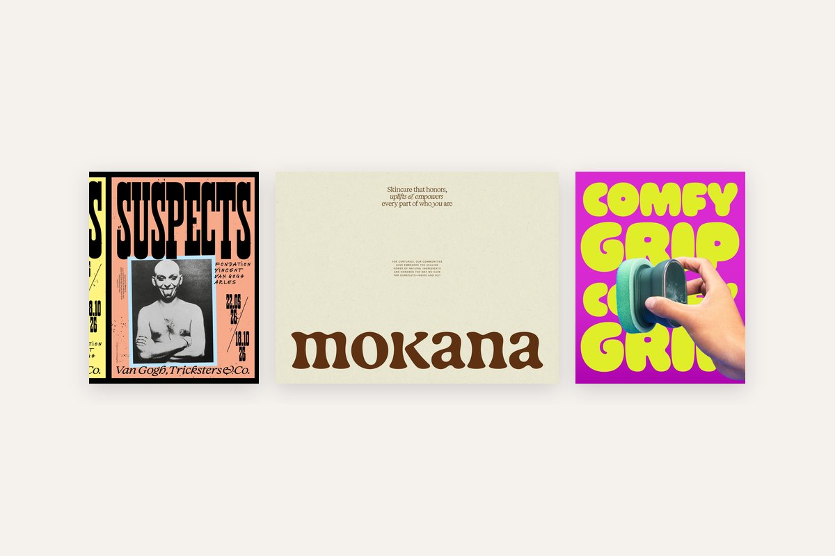
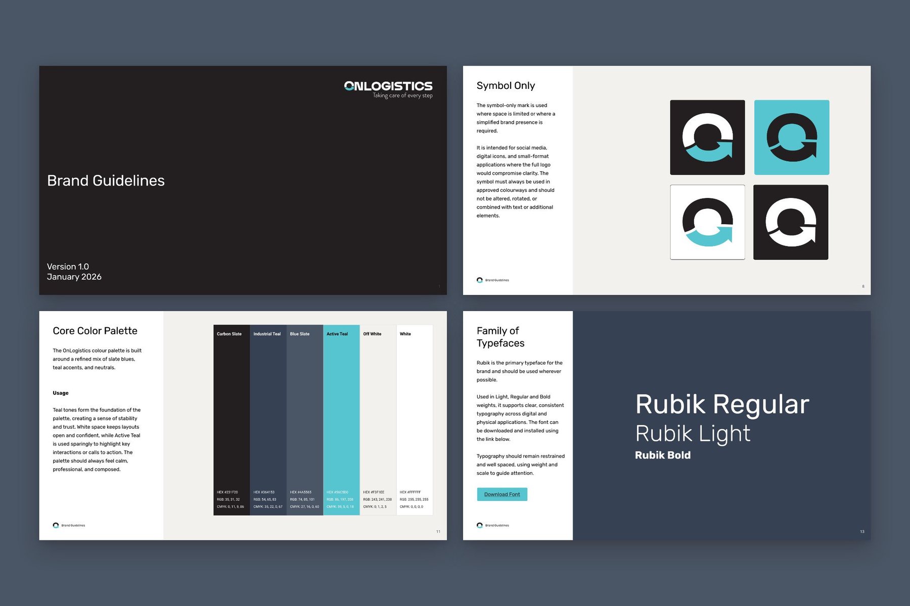
Four looks are leading supplement and wellness packaging in 2026: beauty-shelf vitamins, bright neon core, botanical drawing and bedtime blue. Beauty-shelf suits collagen and daily vitamins, neon suits gummies, botanical drawing suits teas and herbal blends, and bedtime blue suits anything for sleep. Choose by who is buying and where the pack will sit at home.
What are the wellness packaging trends for 2026?
I’m loving wellness design at the moment. Supplements are finally getting packaging you’d want on show, like gummies in neon pouches and collagen in pots that could pass for skincare.
I’ve been working on some product projects lately, and these four trends came out of the research. I kept to supplements and wellness aids: vitamins, gummies, herbal teas, powders and sleep sprays. Every image is real packaging, credited to the studio that made it, with a link to the source. Each section covers what the look is, the products I’d use it on and what to watch before you print.
Beauty-shelf vitamins: why do supplements look like skincare?
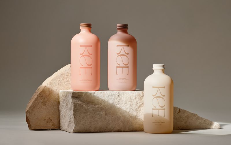
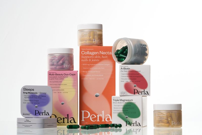
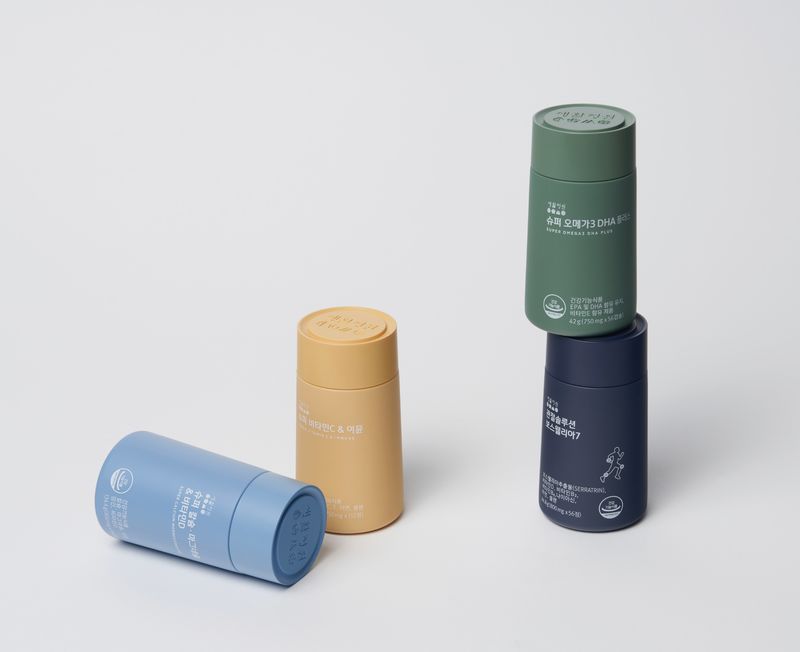
Collagen and daily vitamins in tonal pots and bottles, made to sit beside a serum on the bathroom shelf. The white pharmacy tub has gone. In its place are matte finishes, one colour carried across a whole range and a quiet serif for the name.
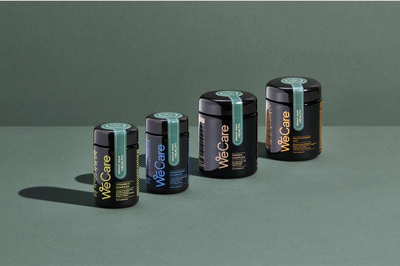
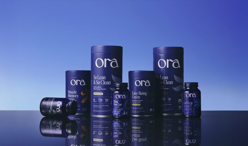
Forner’s bottles for Kee, a liquid collagen, come in matte peach, rose and cream with a tall serif wordmark. Roman Klis kept the whole Ora range in one colour, with cobalt glass jars and tonal blue tins, the way a premium skincare line would. Marlon Studio’s WeCare jars are dark violet glass with a single tinted seal strip, closer to an apothecary than a chemist.
Where I’d use it: collagen, beauty supplements and everyday vitamins bought by people who already care what their bathroom shelf looks like.
Watch: tone-on-tone type is lovely until someone needs to read the dose. Keep the product name, what it’s for and how much to take in a colour that stands clear of the pack, and check it at arm’s length.
Bright neon core: why do gummies look like sweets?
Gummies, vitamin gum and functional snacks in packs borrowed from the sweet shop: acid yellow, bubblegum pink, fat rounded type and resealable pouches. It’s aimed at a younger buyer who wants a supplement to feel like a treat.
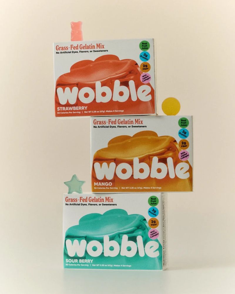
Fenomenal put Proxy’s Grow Lush hair gummies in an acid-yellow pouch that reads more like a sweet bag than a pharmacy pack. Benita Studios boxed Wobble, a gelatin mix with collagen and fibre, like a retro dessert packet with soft, wobbly lettering. The Offices gave Tummy Gummies sweet-shop pouches with vintage candy-store type, kept clean enough for an adult to carry.
Where I’d use it: gummies, chewables and anything with a flavour, especially if it sells through social media, where a bright pouch holds its own in a small square.
Watch: a supplement that looks like sweets will be picked up by children. The line about keeping it away from young children has to be on the pack, so give it a proper place in the design, and think about the closure as well as the artwork.
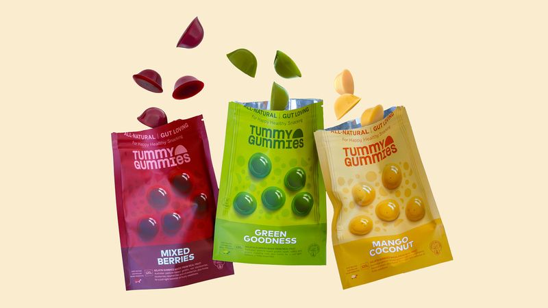
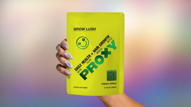
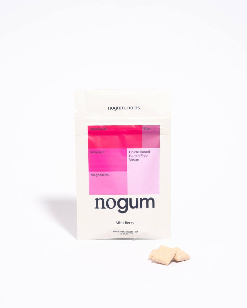
Supplements are finally getting packaging you’d want on show.
Botanical drawing: when does an illustration suit a wellness product?
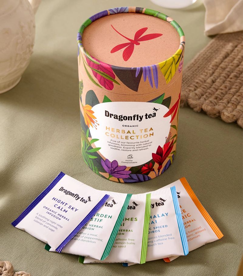
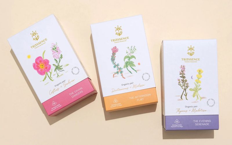
Herbal teas and adaptogens wrapped in drawn or painted plants. It’s the oldest look in the remedy cupboard, and the new versions work because the drawings are made for the brand and show the plants that are in the product.
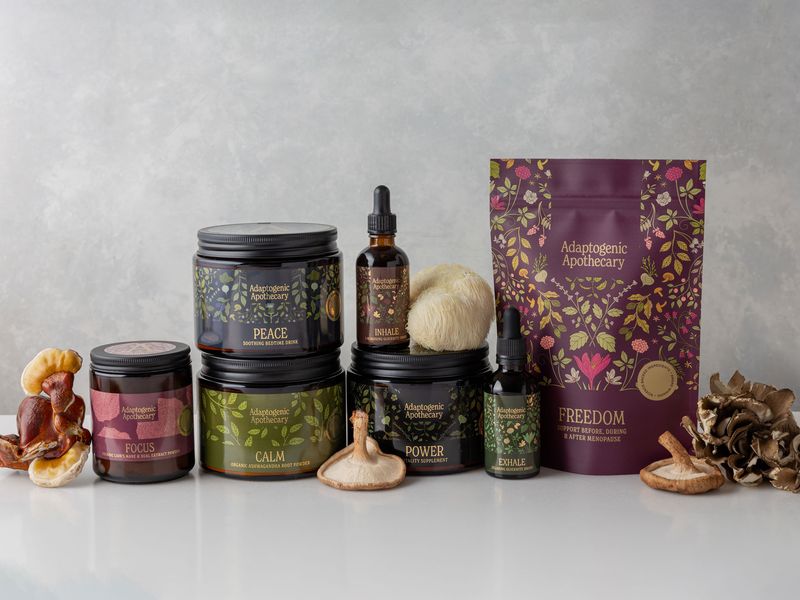
Lark Design Studio’s gift tube for Dragonfly Tea has a border of hand-drawn herbs and flowers by Tatiana Boyko, in colours taken from the plants inside. For Tri3ssence, Sophia Georgopoulou Design paired two Cretan herbs on each box, painted in watercolour by Natalia Mavrota as a couple dancing across a plain white pack. Claire Hartley Studio went darker for Adaptogenic Apothecary, with a repeating pattern of ashwagandha, milk thistle, maca and saffron across every jar, dropper bottle and pouch.
Where I’d use it: teas, tinctures, mushroom and adaptogen blends, and any brand whose customer reads the ingredients first.
Watch: commissioned illustration is a cost of its own, and the agreement with the illustrator needs to cover packaging, your website and adverts. Draw the plants that are in the product. A remedy shopper will notice a pretty flower that isn’t in the blend.
Bedtime blue: why are sleep products all blue?
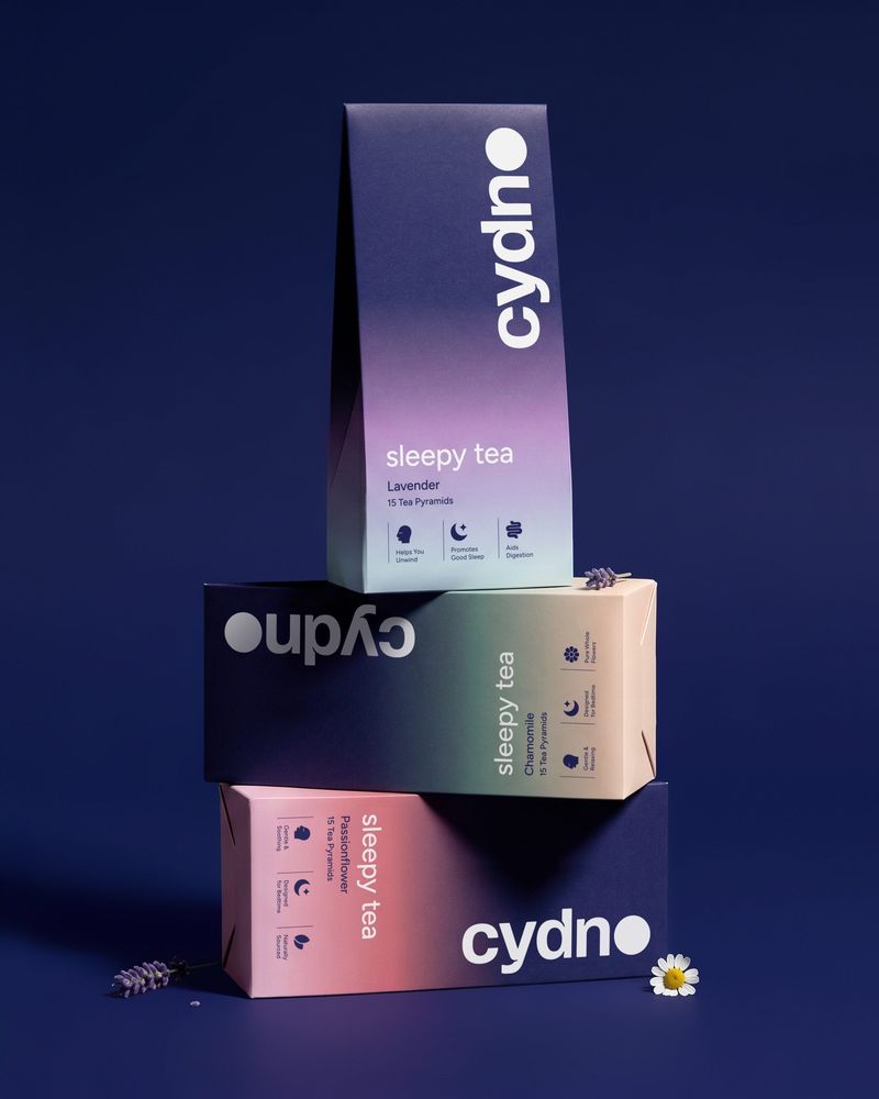
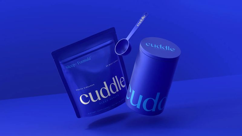
Sleep teas, powders and sprays in blue, from midnight navy through to pale powder blue, usually with a moon, a cloud or a fading sky somewhere on the pack. People read it as night before they’ve read a word.
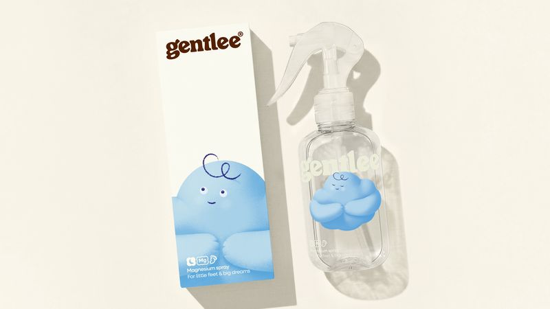
Deuce Studio’s cartons for Cydno sleepy tea fade from midnight indigo into soft dusk pastels, and the O of the wordmark is drawn as a full moon. Earthling Studio used one deep blue across the pouch, tin and scoop of Cuddle’s Sleep+ Formula, with a calm serif wordmark. At the pale end, WeWantMore gave Gentlee, a magnesium sleep spray for children, a sleepy cloud character in powder blue.
Where I’d use it: sleep teas, magnesium, bath and pillow products, and the night-time product in a day and night range.
Watch: because blue is the obvious choice, a lot of sleep products look alike. Cydno’s moon and Gentlee’s cloud are what make them easy to remember, so find the one detail that is yours. Dark, flat colour also shows scuffs and fingerprints, so ask your printer about the finish.
Which wellness packaging trend should a small brand use?
Start with who is buying and where the pack will live once it’s home. Something kept on a bathroom shelf can borrow from skincare. Something thrown in a gym bag or posted to a friend can be loud. A tea that sits in a kitchen cupboard can afford to be decorative, and a sleep product is usually seen in low light on a bedside table.
Keep your logo out of the trend. Your name and mark should look right in five years, on a jar, a pouch and a website. The colour, the illustration and the finish are the layer around the logo, and that layer can change with the next print run or the next product.
If you’re launching one product, I’d pick the look that fits it and commit. If you’re planning a range, choose one that can stretch: one colour per product, or one drawing per blend, so the second and third products are easy to add.
What should you check before you print a supplement label?
Get the words checked first. Supplements have rules about what a label must carry and what it’s allowed to claim, and the design has to make room for all of it. It’s much easier to design around the required wording than to squeeze it in at the end.
Ask your printer for a sample of the finish. Matte, soft-touch, foil and deep solid colour all look different in the hand from how they look on a screen.
Check the pack as a small photo. Most people will meet your product as a square on a phone, so the name and what it does need to be readable at that size.
If you’re launching a wellness product, or your packaging no longer looks like the brand you’ve become, I can help. I design brand identities for small businesses, with the logo, colour and type set up to work on a label as well as on your website.
Who made the work in this article?
Every image belongs to the studio or designer named under it. I found them through the studios’ own websites and packaging write-ups on Dieline, Creative Boom and World Brand Design Society, and each caption links to the source. A few of the images are 3D product visuals published with the project. If you made one of these and would like the credit changed or the image taken down, email hello@sophie-evans.com.
Questions people also ask
What are the main supplement packaging trends in 2026?
Vitamins and collagen in tonal pots and bottles that look like skincare; gummies and vitamin gum in neon pouches borrowed from the sweet shop; teas and adaptogens wrapped in drawn or painted plants; and sleep products in blue, from navy through to pale blue.
Why do supplements look like skincare now?
Because a lot of them are bought for the same reasons and kept in the same place. Collagen and beauty vitamins sit on a bathroom shelf next to serums, so brands are choosing matte bottles, one colour across the range and a quiet serif, which are the cues of a skincare line.
Do these trends work for a small wellness brand?
Yes, and most of the brands in this article are small. A pouch with a strong colour or a label with one good drawing costs far less to produce than a custom bottle, so start with print and colour and leave custom shapes until the product is selling.
What has to go on a supplement label in the UK?
A food supplement label has rules of its own, including the words food supplement, the recommended daily amount, a warning not to exceed it and a line about keeping the product away from young children. Health claims are regulated too. Have the wording checked by someone who knows the rules before the artwork is finished.
Which colour is used most for sleep products?
Blue. Sleep teas, powders and sprays run from midnight navy to a soft powder blue, often with a moon or a cloud somewhere on the pack. It works because people read it as night at a glance, though it also means a lot of sleep products look alike.

Sophie is an independent designer based in the UK and the founder of S Evans Design, working across brand, web and product for founders and brand teams. Her career work includes projects for Arsenal, DreamWorks, BBC, Sky, Channel 4, Barclays and the NHS, and she is a Squarespace Circle Gold partner. More about Sophie.