Five web design trends are holding up in 2026: bento grids, giant type heroes, editorial layouts, unusual navigation and dark-by-default sites. For most small businesses, bento grids and editorial layouts are the easiest to live with, because both organise content you already have. Giant type and dark sites suit a brand with one strong line or a product that looks good on black. Unusual navigation is best kept for studios and portfolios, with a plain menu behind it.
What are the web design trends for 2026?
For years most small business websites opened the same way, with a full-width photo and a line of text over it. The sites getting attention now are more organised and more opinionated: tiles, very big words, pages that read like a magazine, and menus that someone has thought about.
I started from this year’s web design round-ups, kept the five trends I would still recommend, and found six live websites for each. Every screen is credited to the studio that built it, with a link to the source. Each section ends with what to watch, which on a website mostly means what happens on a phone.
Bento grids: why are websites turning into tiles?
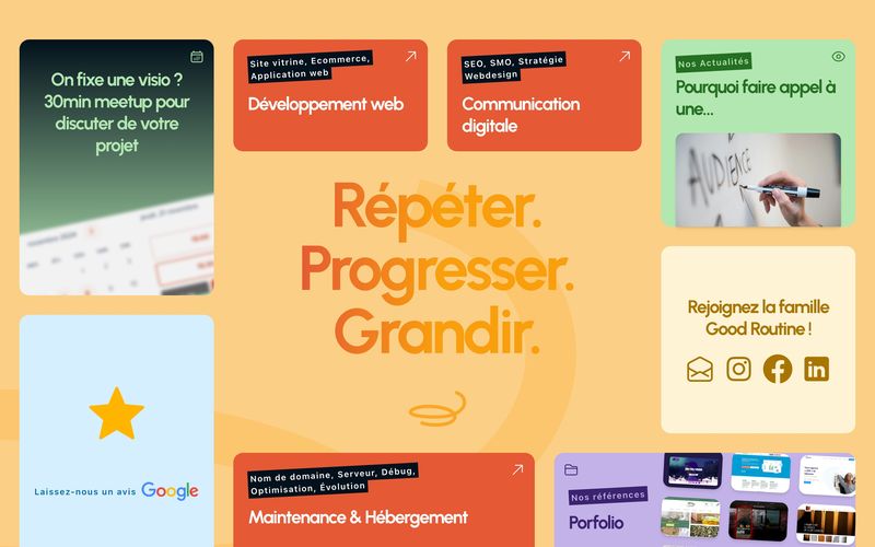
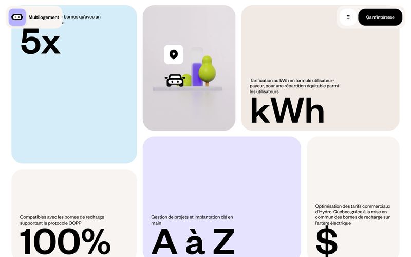
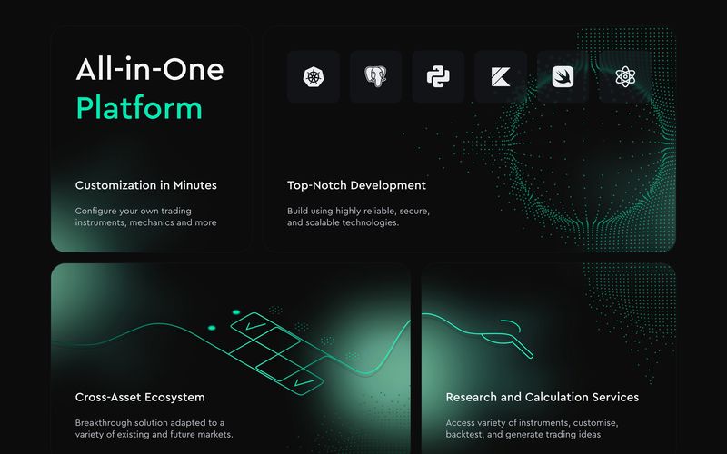
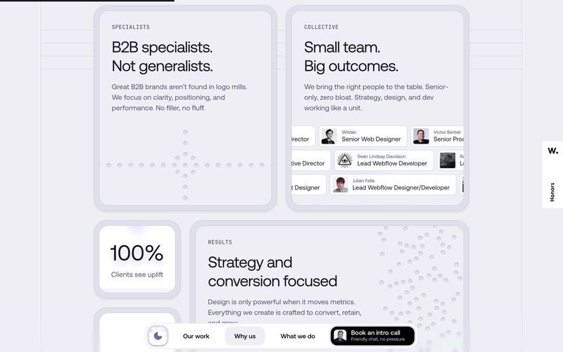
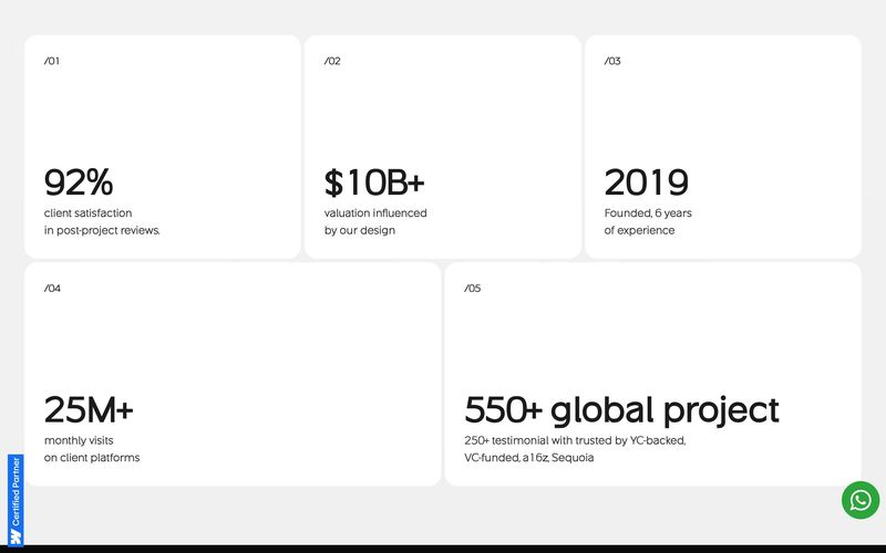
A bento grid splits the page into tiles of different sizes, each holding one thing: a service, a number, a review, a booking button. Agence Good Routine’s own home page is the clearest example I found, one grid of rounded tiles in orange, green, blue, cream and lilac around a big statement in type. Mambo Mambo’s page for Eddie, which sells EV charging to apartment buildings in Quebec, gives each pastel tile a single oversized figure and a short caption.
It suits a business with several short things to say and no single story to tell. A visitor takes in the whole offer at a glance and picks the tile they need.
Where I’d use it: service businesses, product launches and apps, anywhere the offer breaks into short pieces.
Watch: on a phone the grid becomes one column, so the order of the tiles becomes the order of the page. Decide which tile comes first on a small screen, and make sure each one still makes sense on its own. Text on coloured tiles needs enough contrast to read, which pale pastels often fail.
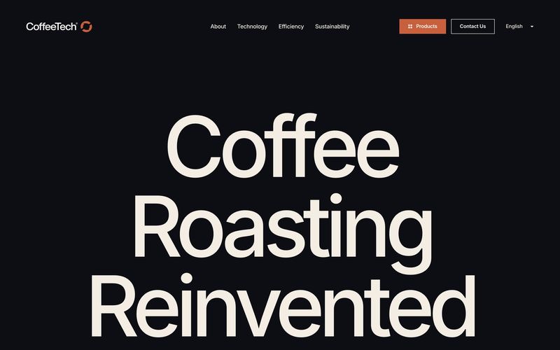
Giant type heroes: when should the headline fill the screen?
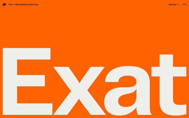
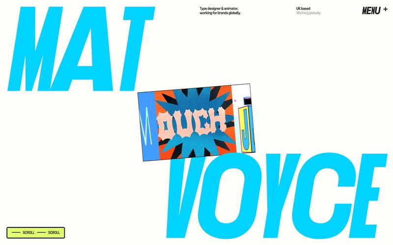
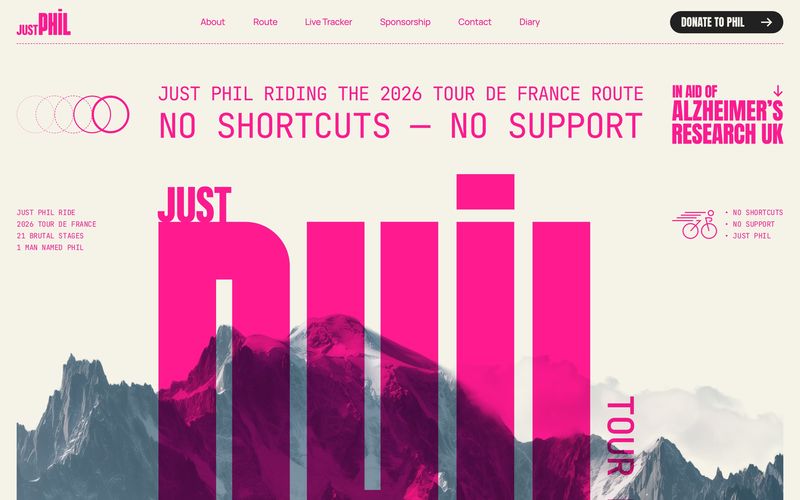
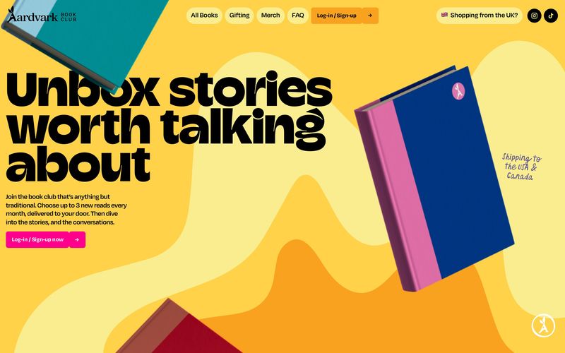
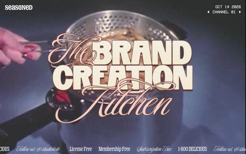
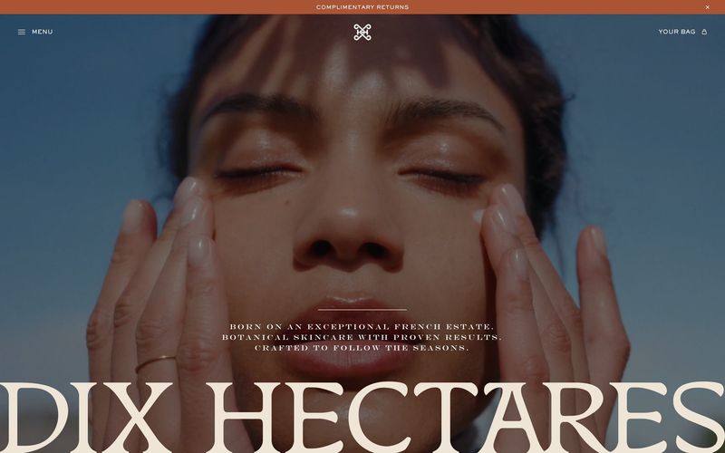
The headline is the hero. There’s no photo, or the photo plays second to a word set as big as the screen allows. Studio Size’s microsite for Exat, a typeface from the Hot Type foundry, is the name of the font in off-white filling the bottom two thirds of a flat orange screen, and nothing else. Mike Kus built Just Phil, a charity ride of the 2026 Tour de France route for Alzheimer’s Research UK, around a towering pink PHIL in a tall condensed face, rising out of a mountain photograph.
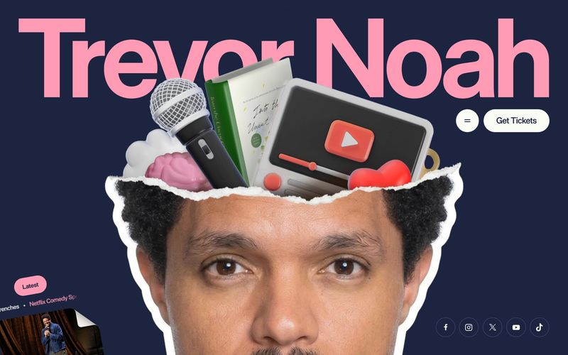
It works when the business has a short name or one line worth shouting. For someone whose name is the brand, it can do the job of a logo.
Where I’d use it: portfolios, events and personal brands.
Watch: a word that fills a desktop screen has to break or shrink on a phone, so check where it breaks and that no letter is left alone on a line. The big type also pushes everything else down the page, so the first screen still needs to say what you do and where to click. Keep the headline as live text on the page so it stays sharp at every size and search engines can read it.
Editorial layouts: what does a magazine-style website look like?
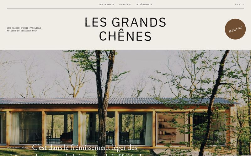
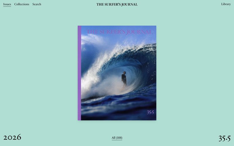
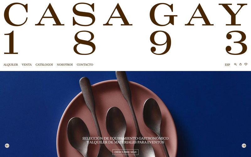
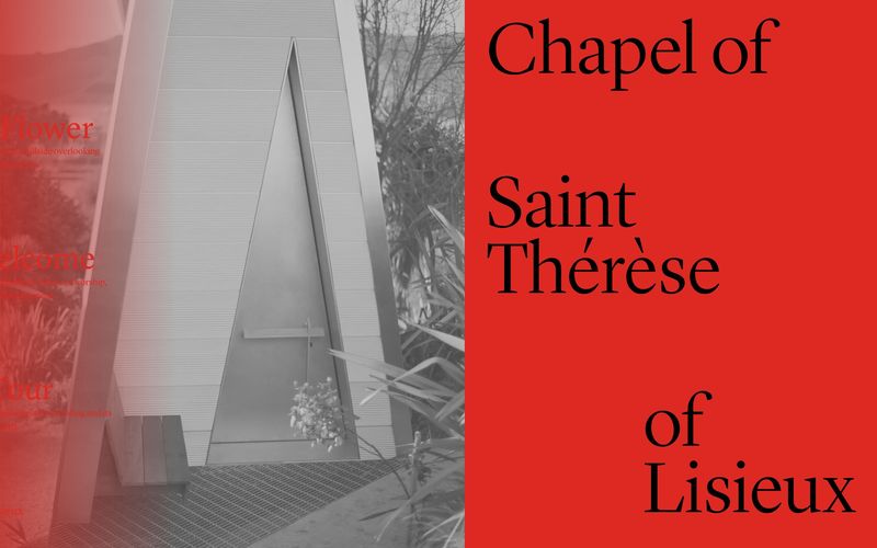
A homepage laid out like the opening pages of a magazine, with a masthead, a short standfirst, serif type and generous photography with captions. Studio Krabb’s site for Les Grands Chênes, a family guesthouse in the Périgord Noir, has a centred title, a standfirst in mono, a rule under the menu and a full-width photo with a serif caption. Pukkas dressed Casa Gay 1893, a Spanish company that sells and hires out hospitality equipment, as a heritage magazine, with a huge spaced-out serif nameplate carrying the founding year.
Casa Gay is the one I’d show a small business owner. Equipment hire is hardly a glamorous product, and the layout gives it the feel of a firm with a history.
Where I’d use it: hospitality, interiors and shops, where the photographs already do a lot of the selling.
Watch: the layout runs on photography. With a handful of average photos it looks empty, so plan a shoot before you commit to it. Small serif captions and small-caps menus can end up too small on a phone, and on a shop the buttons and prices still need to be easy to spot among the editorial pieces.
Be bold with the layout and plain with the menu.
Unusual navigation: can a menu be different and still work?
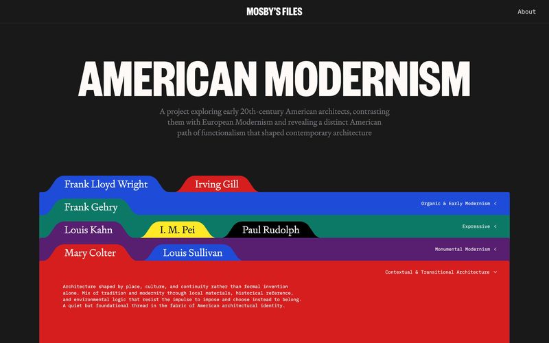
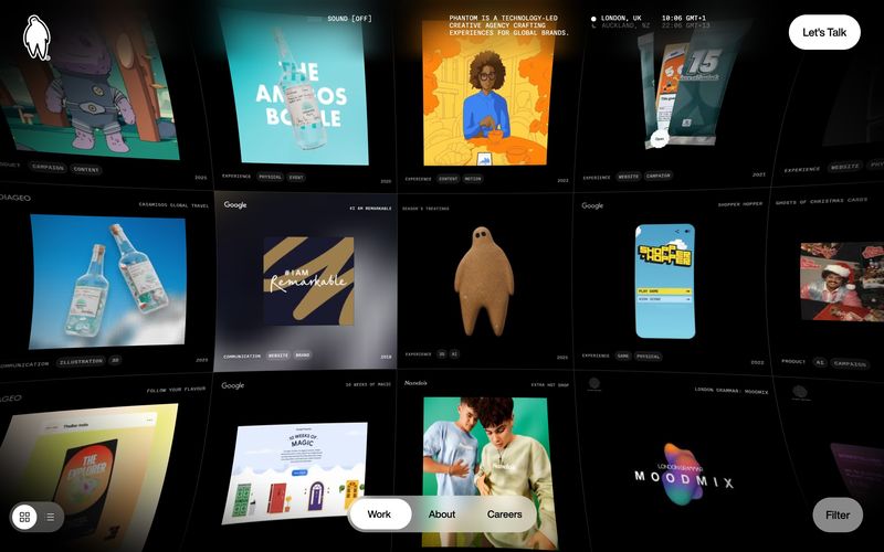
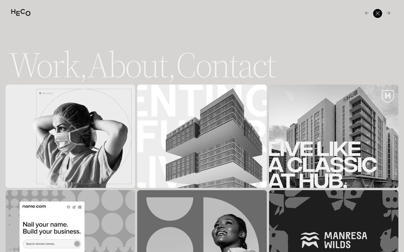
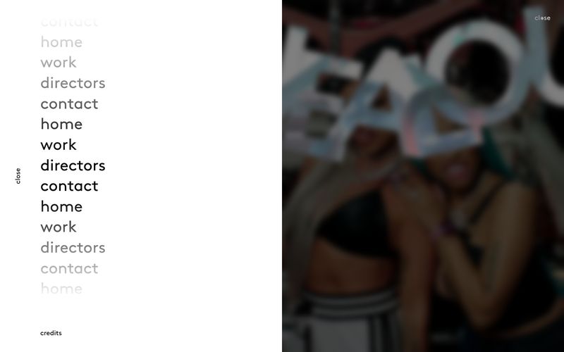
Here the menu becomes part of the design. Tubik’s site for Mosby’s Files, an editorial site about American Modernist architects, turns the navigation into a stack of coloured filing-cabinet folder tabs, one per architect, grouped by movement. Phantom, a creative technology agency, made its own homepage a curved grid of projects you drag around, with a small floating Work, About and Careers button where the menu bar would usually sit.
Both work because the idea comes from the content. Folders suit an archive, and a grid you can drag suits a studio that wants you to browse its projects.
Where I’d use it: studios, portfolios and cultural organisations.
Watch: this is the trend that most often breaks a website. People need to find the menu within a second or two, and they expect a contact link where it usually goes. On a phone, check there’s a visible menu button, that it opens, and that every main page can be reached from it. Check it can be used with a keyboard too, since some visitors can’t use a mouse or a touch screen.
Dark by default: who suits a dark website?
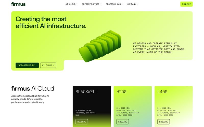
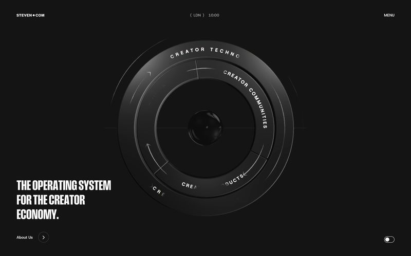
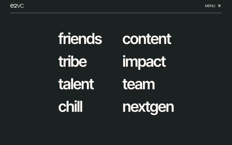
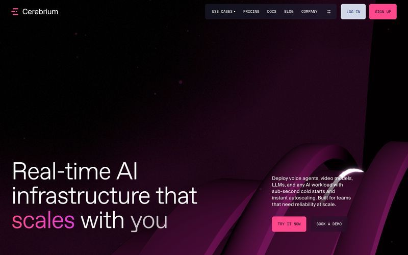
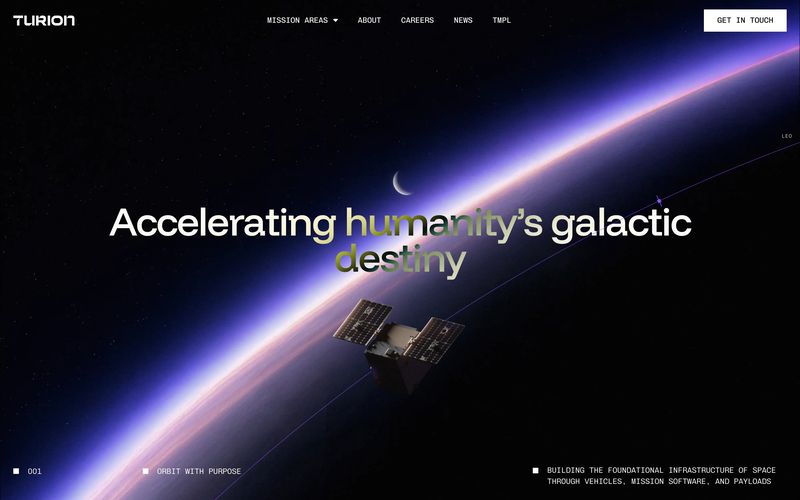
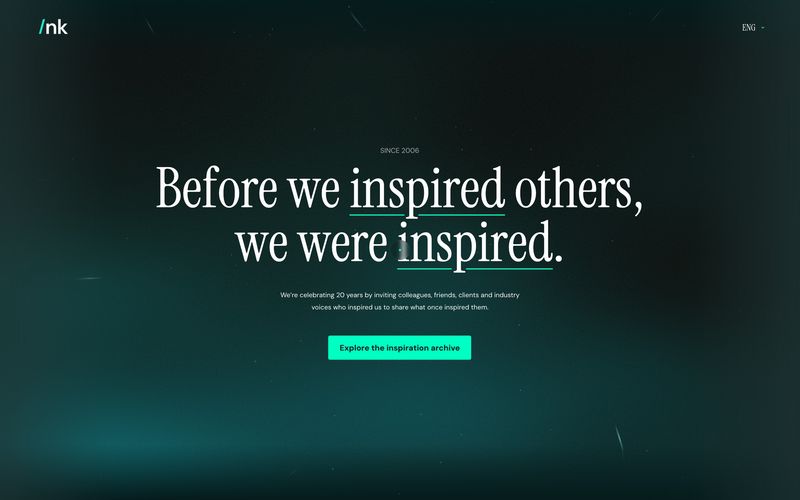
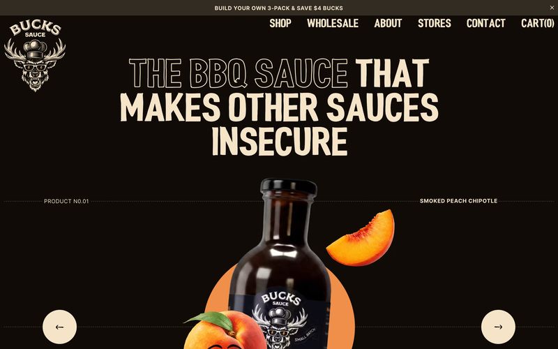
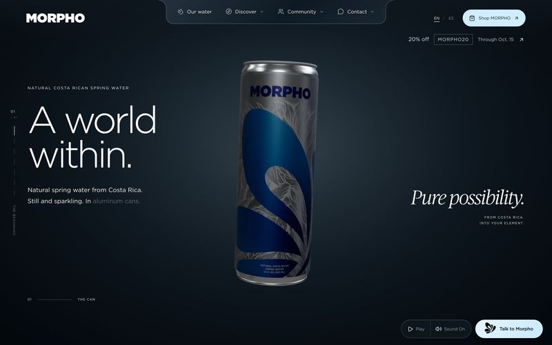
The whole site sits on near-black, with light type and one accent colour doing all the work. Louis Paquet’s site for Cerebrium, an AI infrastructure platform, made with KOKI-KIKO and Domaine Public, keeps a single hot pink for one headline word and the buttons. Buzzworthy Studio and Juraj Molnár took Bucks Sauce, a small-batch barbecue sauce, away from the usual bright packshot, with a warm near-black background, cream display type and one peach-orange accent.
The single accent is what holds each of these together, because every colour looks brighter on a dark ground.
Where I’d use it: tech, drinks and entertainment brands.
Watch: grey text on near-black often fails the contrast checks used for accessibility, and thin type looks thinner still on a dark screen, so keep body text pale and give it some weight. Product photos need shooting or cutting out for a dark background. If people will read a lot or fill in a long form on your site, give those pages a light background.
Which web design trend should a small business use?
Start with what changes least. Your menu, the order of your pages and the route to contacting you or buying from you should stay plain, because that is what visitors use. The trend belongs on the surface, in the homepage hero and the way a section is laid out.
Of the five, bento grids and editorial layouts are the easiest for a small business to live with, because both are ways of organising content you already have. Giant type needs a short name or a strong line to work with, and a dark site needs a product that looks good on black. Unusual navigation is for studios and portfolios whose visitors came to look around, and even then I’d keep a plain menu behind it.
Then check the trend against what you sell. An editorial layout suits a guesthouse far better than a plumber.
Can you build these on Squarespace or Shopify?
Mostly, yes. Squarespace’s editor places blocks freely on a grid, so a tile layout is possible, and the phone layout can be arranged separately, which lets you choose the order the tiles stack in. Giant type and dark sections come down to settings on both platforms: heading sizes and colours are set in the site styles, and most current Shopify themes, like Squarespace, let you give each section its own colour scheme. Editorial layouts depend more on the photography and the type than on the platform.
Navigation is the exception. Menus on both platforms are built into the template, so a filing-cabinet menu or a draggable project grid means custom code, and someone has to keep that code working as the platform updates. On Shopify a bento layout can need a custom section too, depending on the theme.
If you’re planning a new website and want one of these trends done properly, I can help. I design websites for small businesses, on Squarespace or Shopify or for a developer to build, and every one is checked on a phone before it goes live.
Who made the work in this article?
Every image belongs to the studio or designer named under it. They are screenshots of live websites, so some of the sites may have changed since. I found them through Awwwards, Siteinspire, Communication Arts and the studios’ own websites, and each caption links to the source. If you made one of these and would like the credit changed or the image taken down, email hello@sophie-evans.com.
Questions people also ask
What are the biggest web design trends in 2026?
Bento grids of tiles, giant type as the hero, layouts borrowed from magazines, menus designed as part of the site, and dark backgrounds with a single accent colour. What they share is a move away from the stock photo with a line of text over it that most small business sites have used for years.
What is a bento grid in web design?
A layout of tiles in different sizes, each holding one piece of content, such as a service, a figure or a review. It takes its name from the Japanese bento box, which keeps each part of a meal in its own compartment.
Is a dark website a good idea for a small business?
It can be, if your product looks good on a dark background and your visitors don’t need to read much. Run the text colours through a contrast checker, and keep pages with long forms, terms or a checkout on a light background.
Will a creative menu hurt my website?
It can, if visitors can’t find it or can’t use it on a phone. Keep the contact link where people expect to find it, try the menu on your own phone before launch, and make sure it can be used with a keyboard.
Should my website follow a trend?
Use a trend on the parts that are cheap to change, like the homepage hero or the layout of one section, and keep the menu and the route to contact you or buy plain. A trend that makes the site harder to use costs you enquiries, however good it looks.
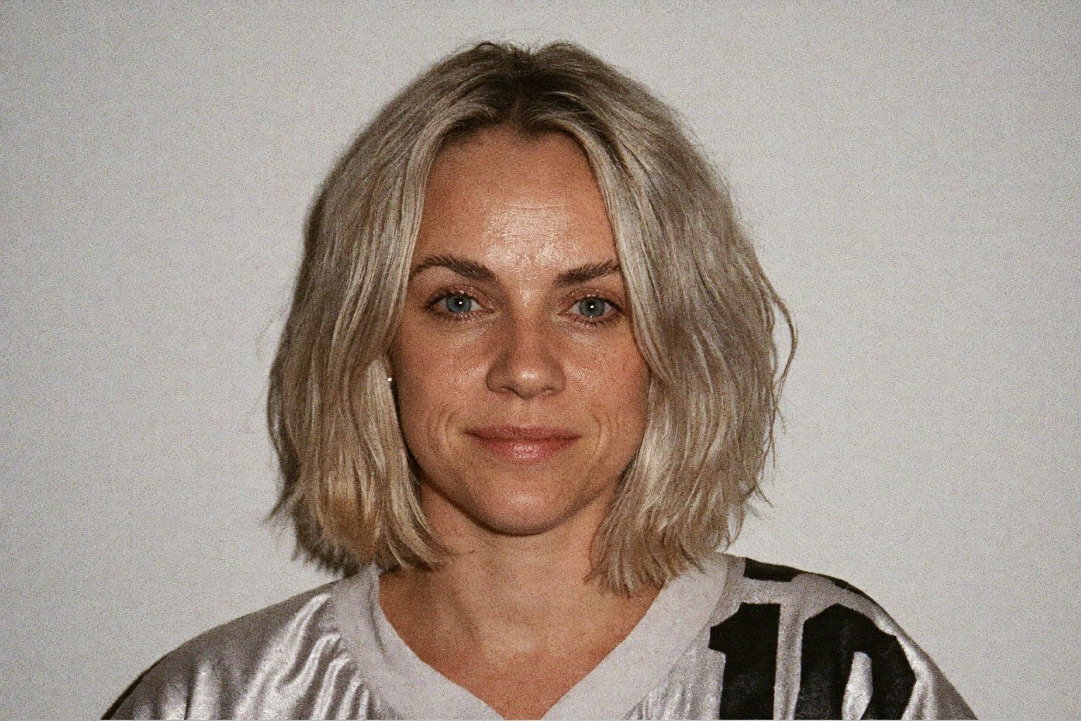
Sophie is an independent designer based in the UK and the founder of S Evans Design, working across brand, web and product for founders and brand teams. Her career work includes projects for Arsenal, DreamWorks, BBC, Sky, Channel 4, Barclays and the NHS, and she is a Squarespace Circle Gold partner. More about Sophie.