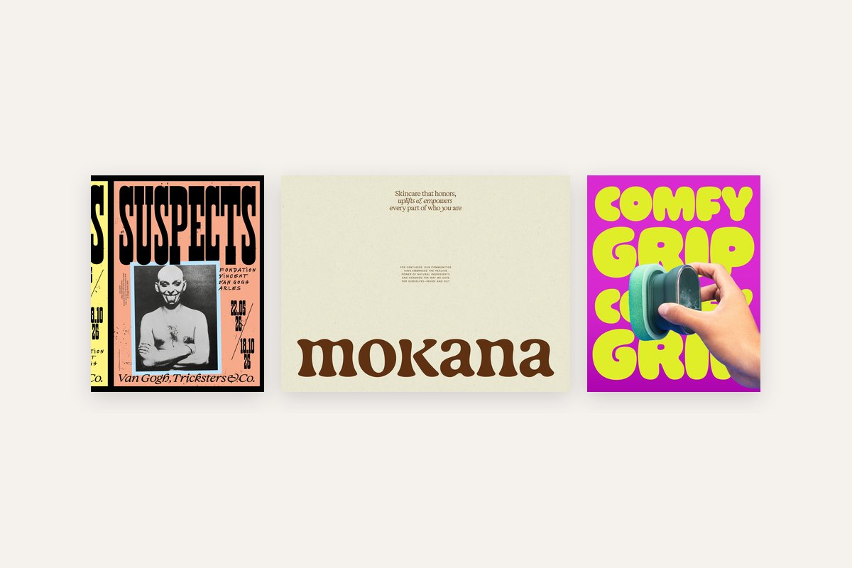
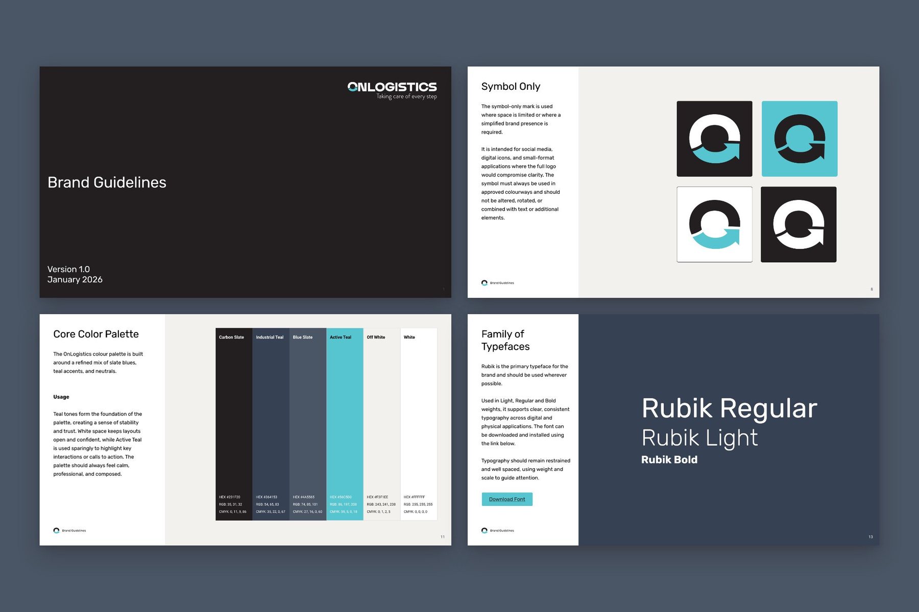
Five graphic design trends are shaping brands in 2026: hand-cut collage, bold minimalism, acid colour, chrome and deco, and hand-drawn marks. For a small business logo, bold minimalism and hand-drawn marks last longest. Collage, acid colour and chrome work best on packaging, posters, social posts and launches, where they can change next season.
What are the design trends for 2026?
A lot of branding in the last few years has been smooth and flat, made on a screen and meant to stay there. Much of the strongest work this year shows the hand that made it: paper cut with scissors, pen marks left wobbly, colours that clash on purpose and metal you want to pick up.
I picked five trends from Pinterest Predicts 2026 and this year’s design round-ups, and found six pieces of real, published work for each. Every image is credited to the studio or designer who made it, with a link to the source. Each section ends with where I’d use the trend and the catch.
Hand-cut collage: what does it bring to a brand?
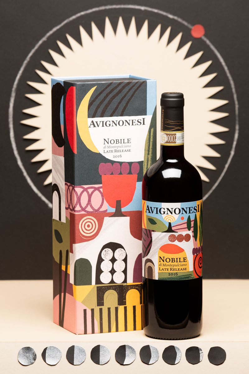
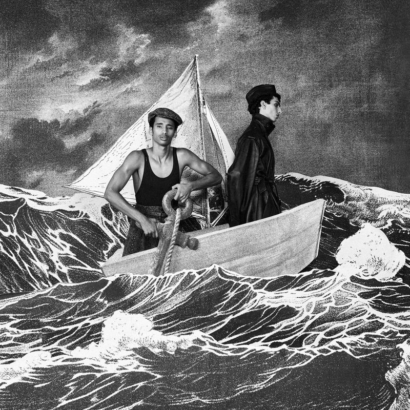
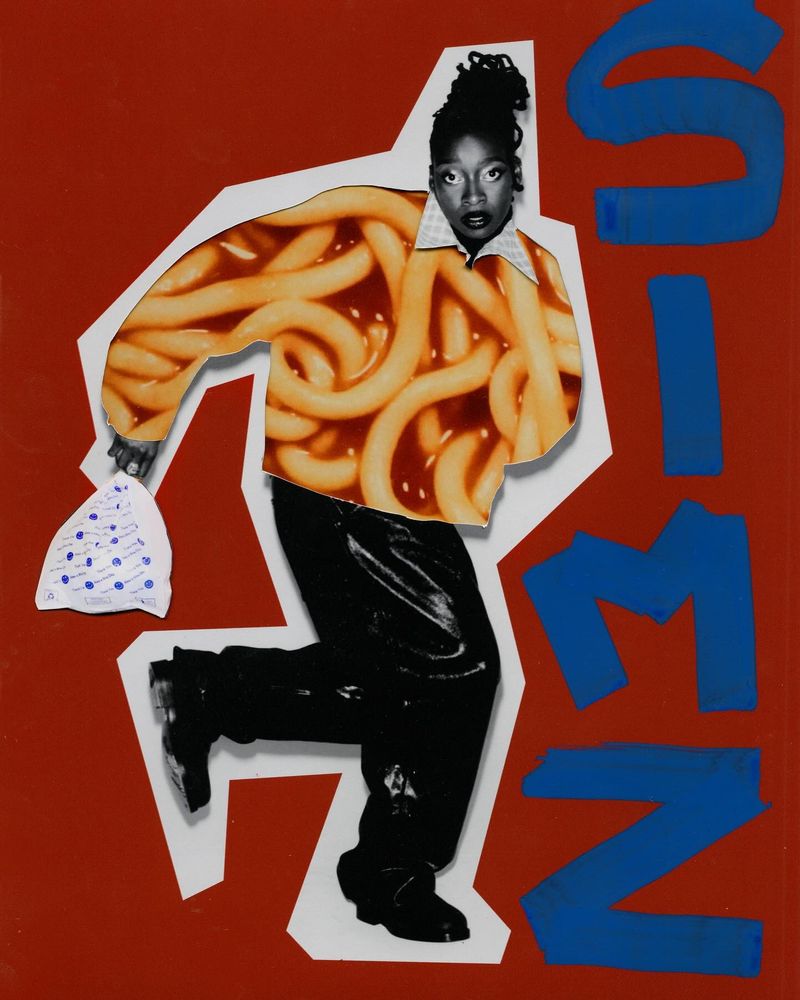
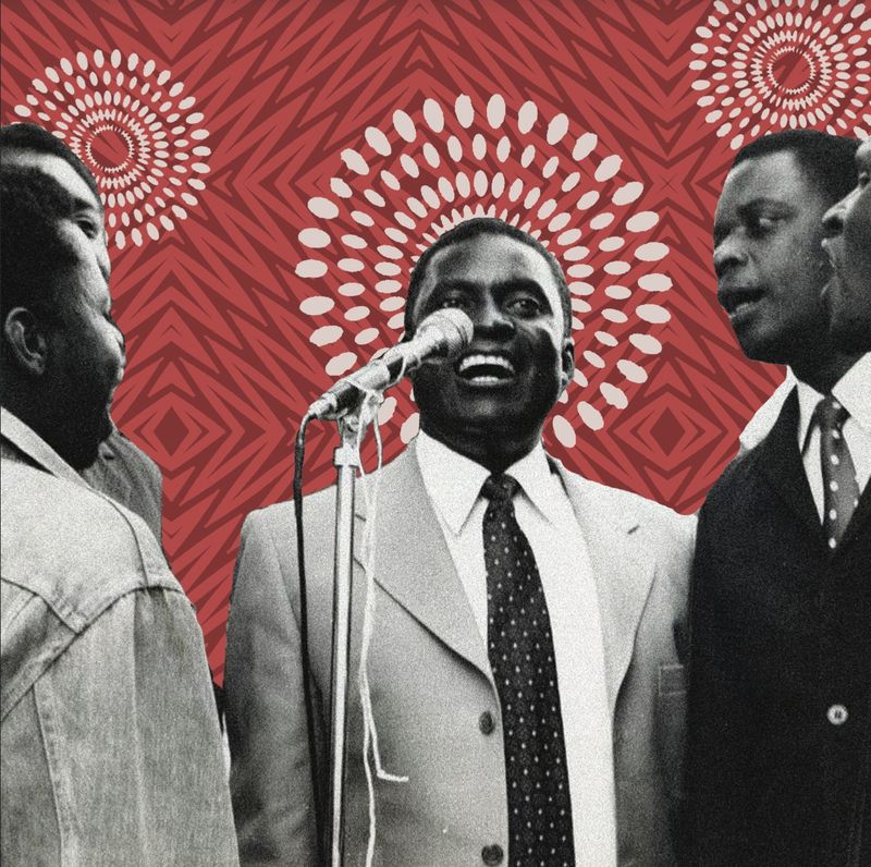
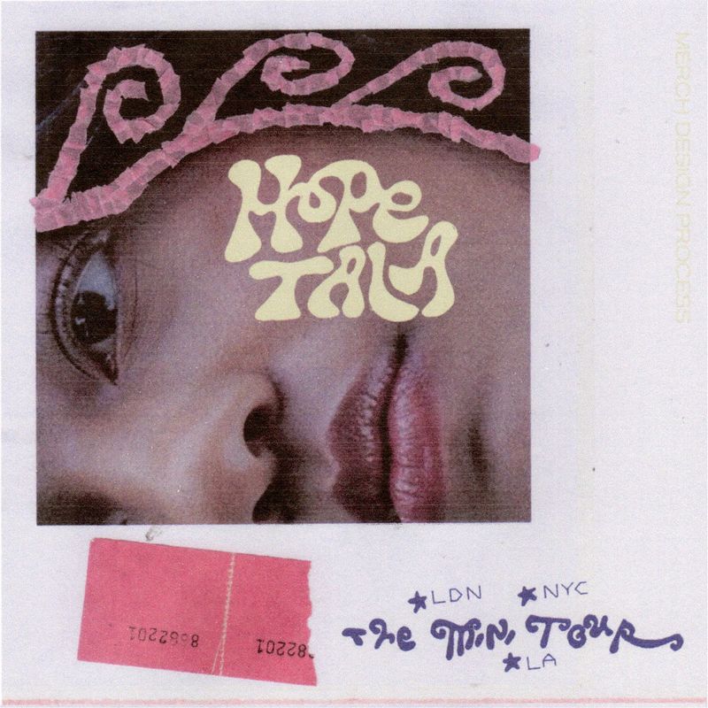
Photographs and coloured paper cut up by hand and put back together, often with drawn marks on top and the cut edges left in. Atelier Bingo built the label and box for Avignonesi’s Vino Nobile 2016 Late Release from hand-cut paper shapes, stamps and drawn marks, scanned and recomposed, and it still reads clearly at the size of a wine label. Sam Wenc’s sleeve for Alick cuts an archival black and white photograph over patterned red paper.
It also works in three dimensions. Jana Frost made a set from hundreds of cut and collaged paper pieces for an ICON Magazine fashion story, which Sophia French photographed.
Where I’d use it: editorial work, record sleeves and campaign posters.
Watch: collage gets busy quickly, and small type disappears into it. Give the logo and the words that matter a clear patch of plain paper to sit on.

Bold minimalism: how little is enough?
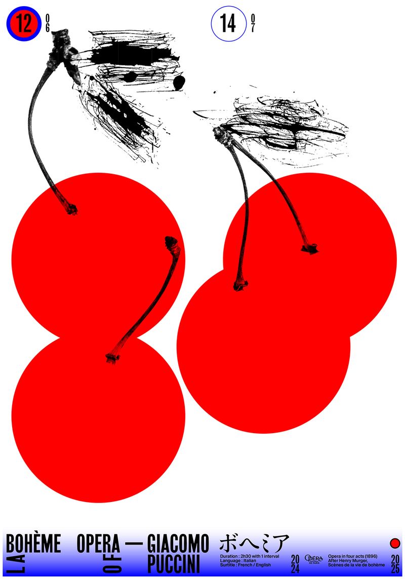
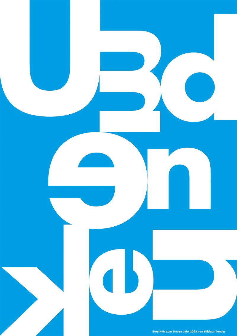
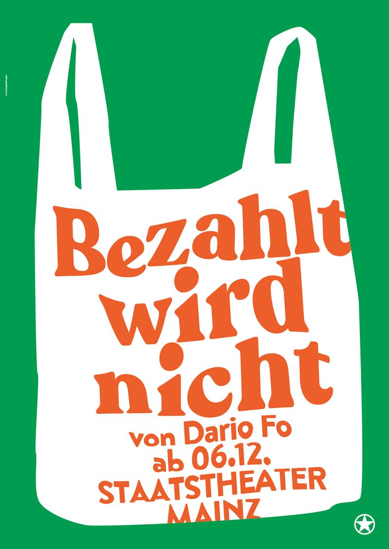
One big idea, usually two colours, and everything else made small. Niklaus Troxler’s New Year poster Umdenken is a single word set huge and flipped, white on flat blue. For Staatstheater Mainz, Neue Gestaltung drew one white carrier bag on solid green and put all the type inside it. Anastasia Temirkhan’s La Bohème poster lets two oversized red cherries do the work.
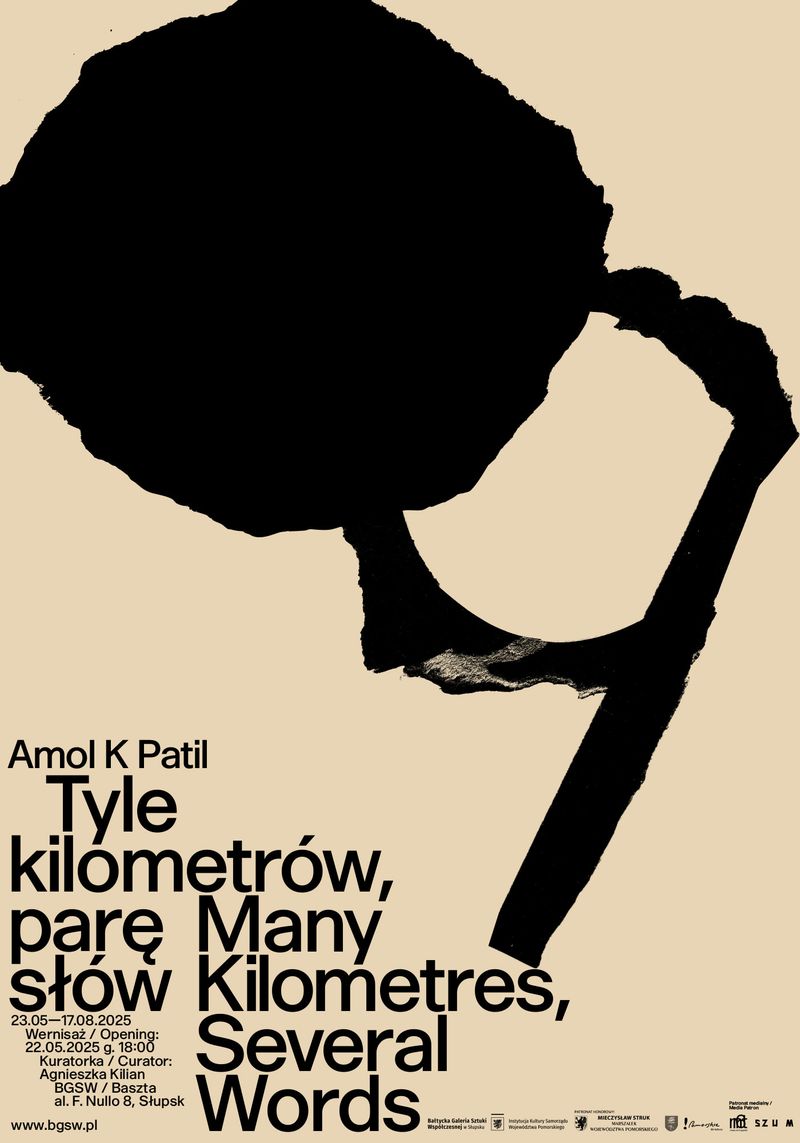
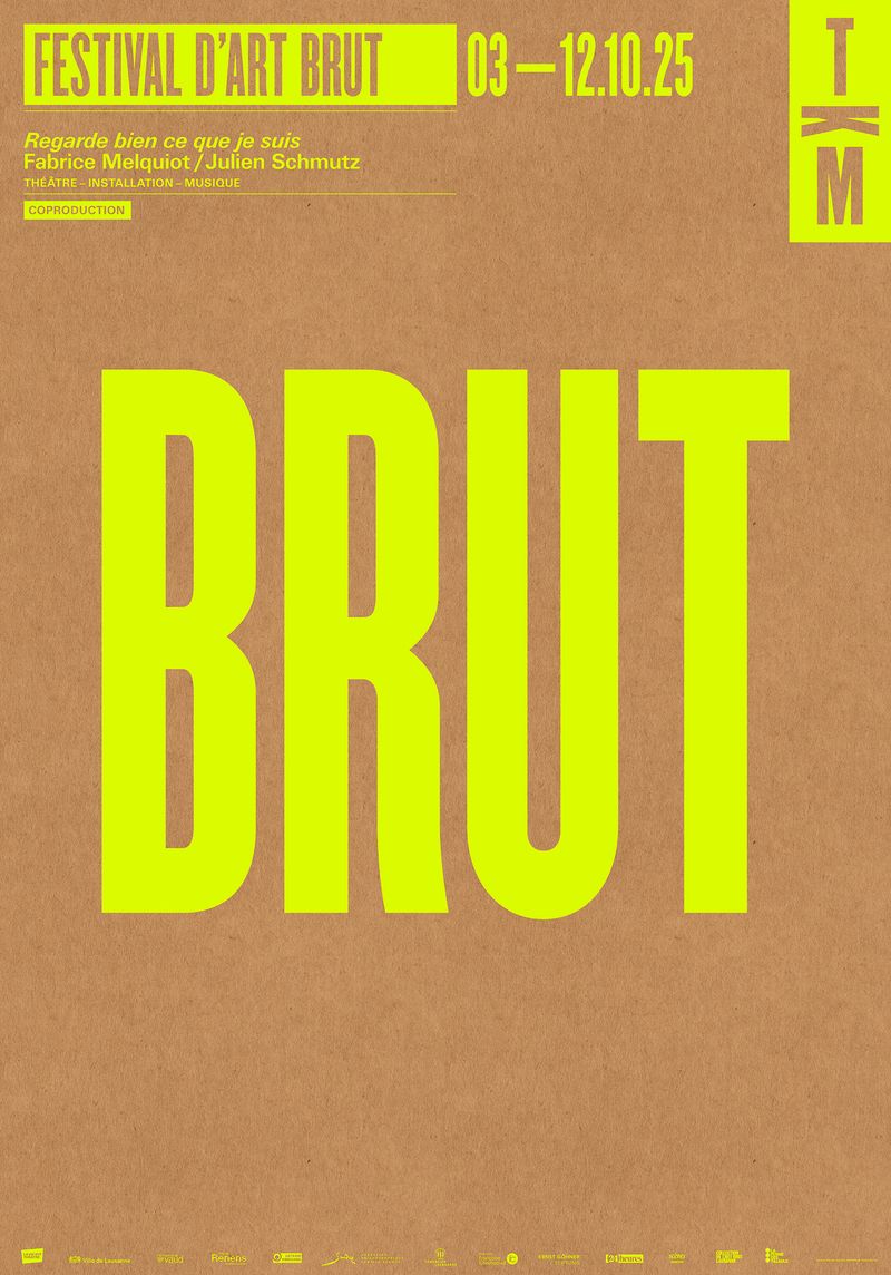
All six are posters, found in the 100 Beste Plakate archive, but the thinking carries straight over to a brand. A business that can be summed up in one shape or one word has a head start.
Where I’d use it: event posters, launches and packaging.
Watch: it looks easy and isn’t. With only one idea on the page, the idea has to be a good one. The small type still has to work too, so check that the date, the address and the web link can be read on a phone.
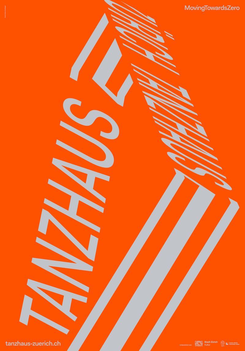
Acid colour: can a small brand pull it off?
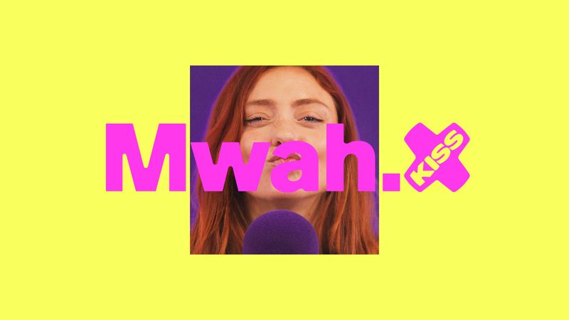
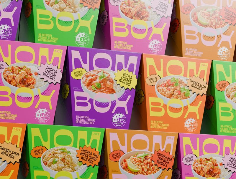
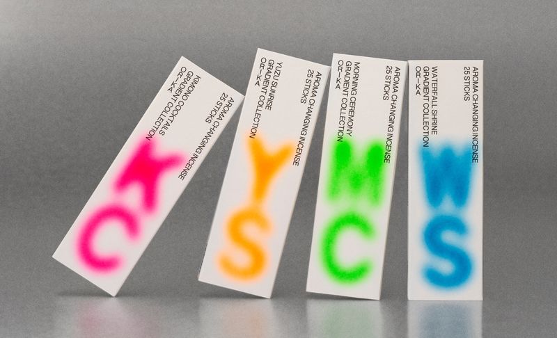
Hot pink, lime, electric orange and violet, put next to each other with no neutral to calm them down. NOT Wieden+Kennedy’s rebrand for KISS radio sets hot pink type on acid yellow beside a purple photo panel. Studio Payne’s NOMBOX ready meal packaging stacks purple, lime, pink and orange boxes edge to edge, and The Dieline described the result as clashing colours.
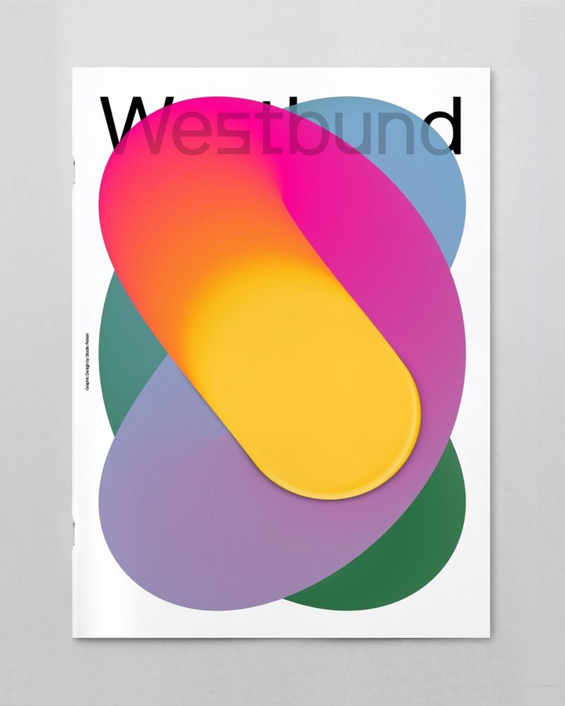
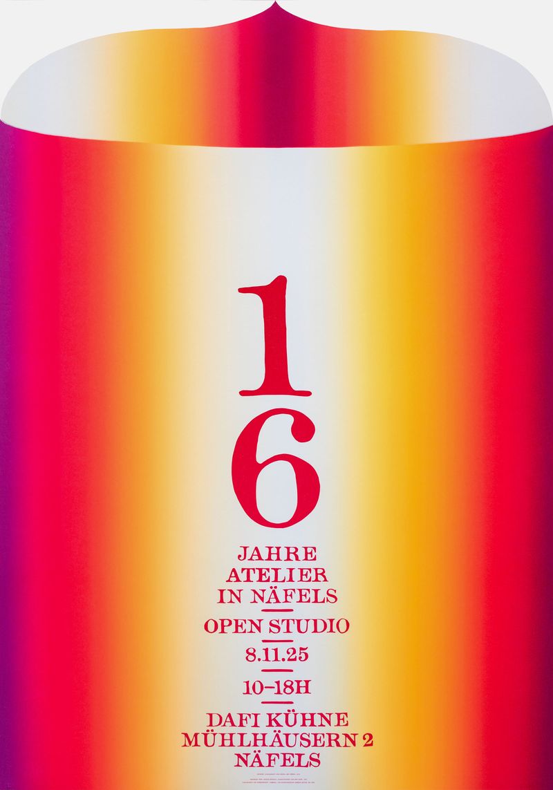
The handmade version goes further. Dafi Kühne cut the blends on his Open Studio poster in linoleum and printed them by letterpress, so even the gradient was made by hand.
Where I’d use it: launch campaigns, social media and retail.
Watch: bright text on a bright background is often hard to read. Keep acid colour for big type and backgrounds, and check any small text against an accessibility contrast checker before it goes live.
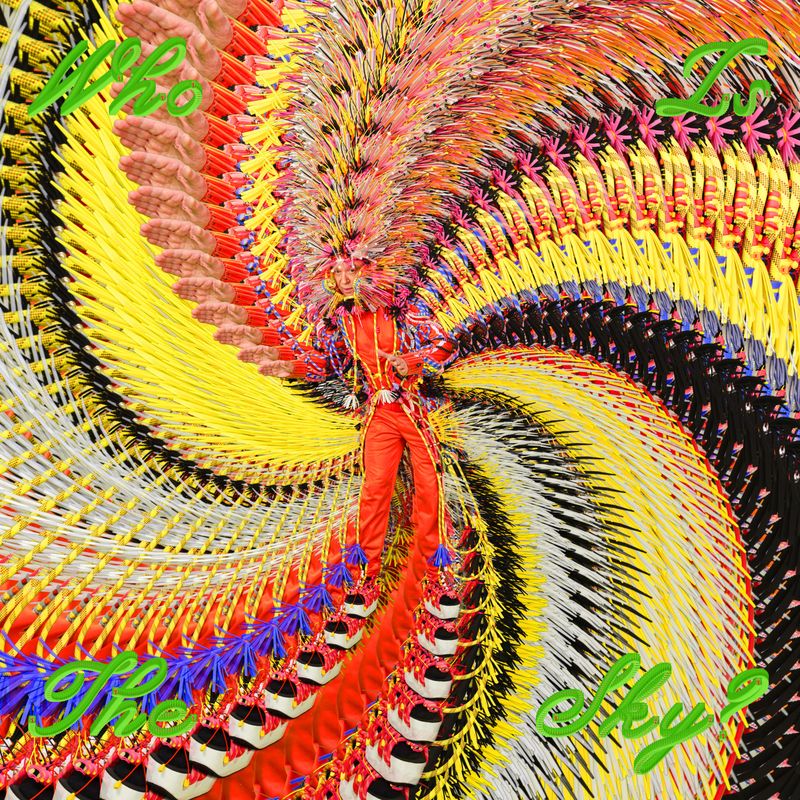
The trends with legs all look like a person made them.
Chrome and deco: what makes it look expensive?
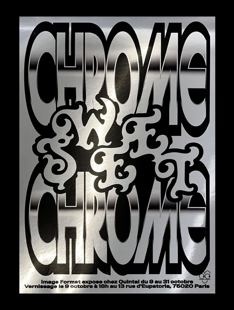
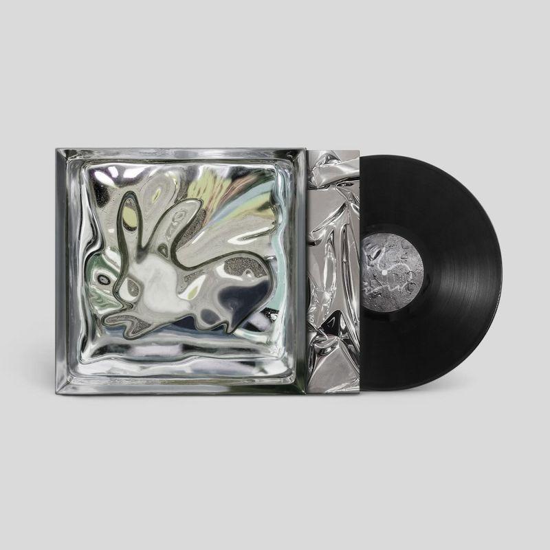
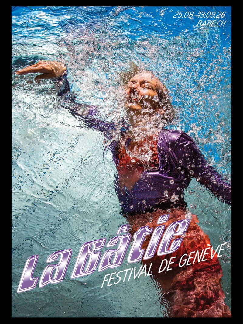
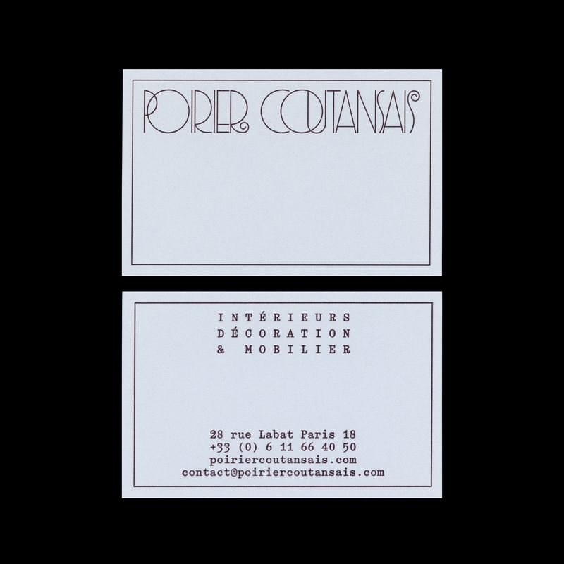
Liquid metal lettering on one side, and the framing lines and stepped shapes of 1920s Art Deco on the other. Image Format’s poster for the Chrome Sweet Chrome exhibition in Paris has liquid chrome lettering laser-printed on metallic paper. eschenlauer sinic built the Poirier Coutansais wordmark like a Parisian Art Deco facade, framed with fine lines, and it holds up on a business card.
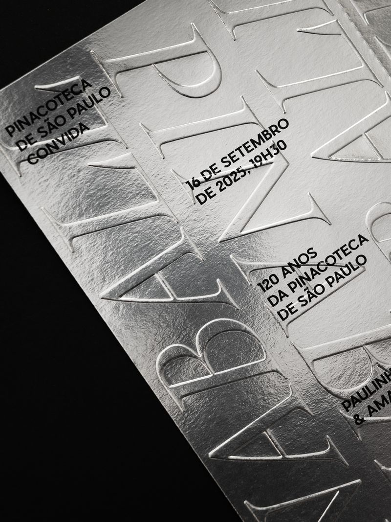
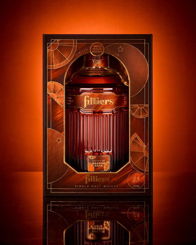
The quieter pieces are the useful ones for a small brand. Alles Blau’s invitation for the Pinacoteca de São Paulo’s 120th anniversary ball is mirror-silver card with an embossed serif, and Quatre Mains’ whisky packaging for Filliers pairs an arched window with copper linework and gold foil.
Where I’d use it: hospitality, beauty and music.
Watch: chrome is a finish, so the logo underneath has to work flat in one colour first. Deco turns into fancy dress when every detail is from the period. Take one element, such as the framing lines, and keep the rest of the brand current.
Hand-drawn marks: why are brands drawing again?
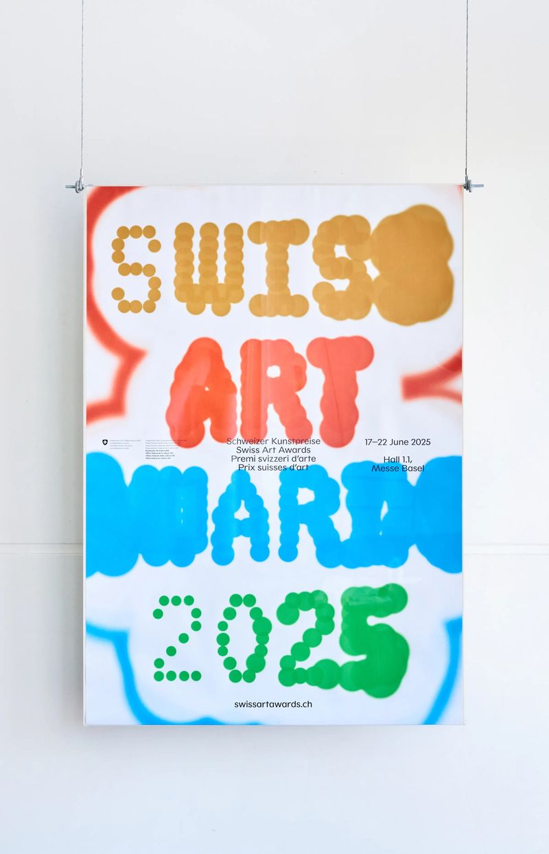
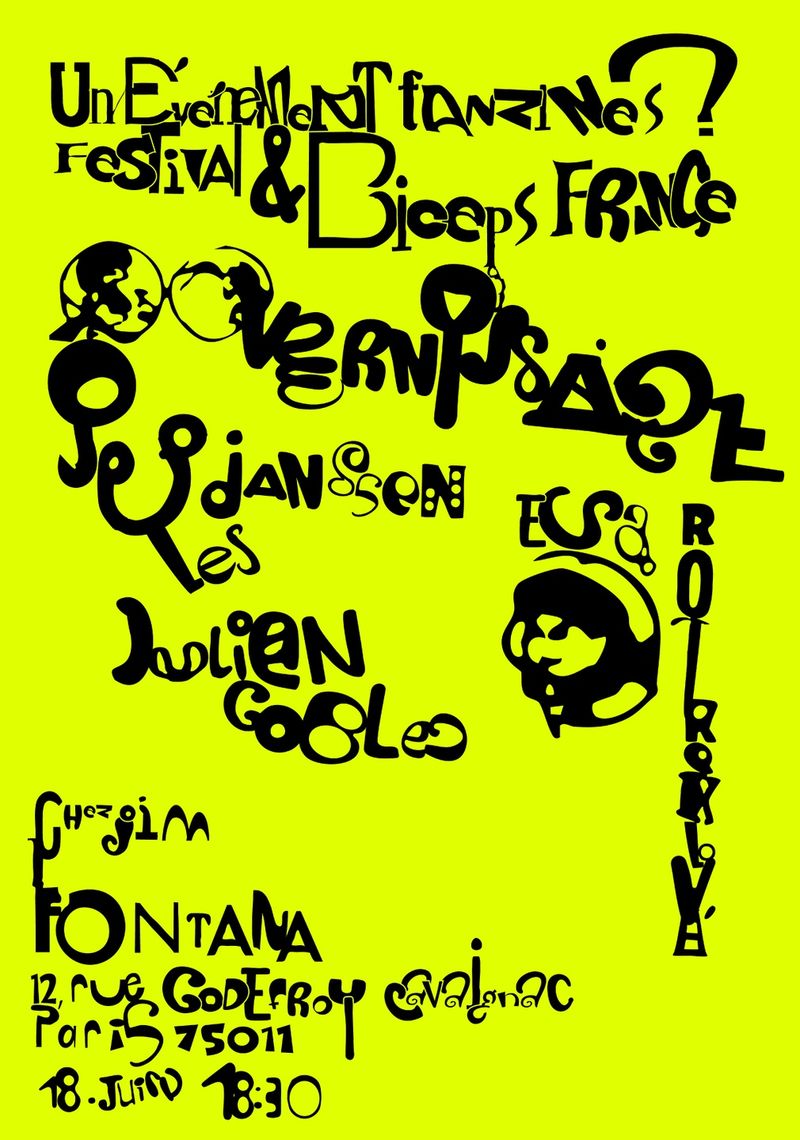
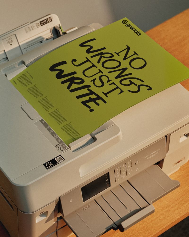
Letters and symbols drawn by hand, in marker or coloured pencil, with the wobble kept in. Clemens Piontek and Clio Hadjigeorgiou built the whole Swiss Art Awards 2025 identity from blotchy, leaking marker letters in four colours. Ragged Edge’s rebrand for Granola, an AI notepad app, uses a co-founder’s handwriting and a hand-drawn spiral, pitched as the opposite of slick AI branding.
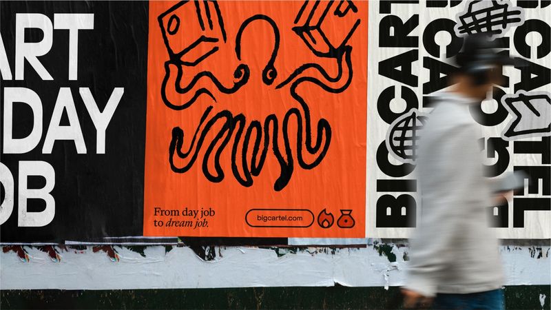
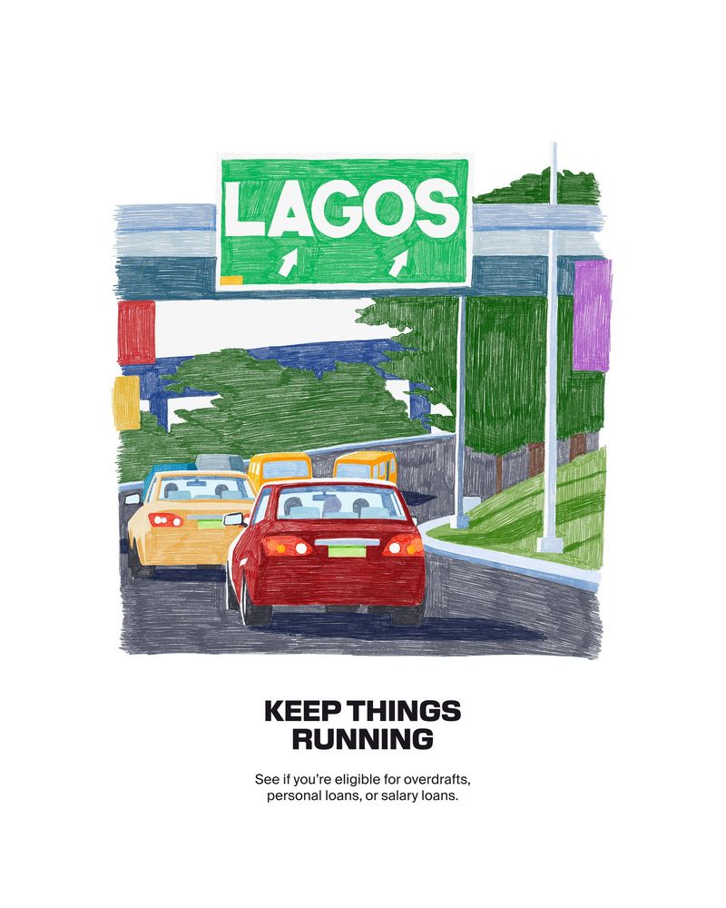
Barkas went further with Kuda, a bank, adding campaign art in visible coloured-pencil strokes to soften a bold type system. How&How’s Big Cartel rebrand uses rough brush-pen drawings to move the platform away from a polished tech look.
Where I’d use it: food and drink, and founder-led brands.
Watch: it has to be drawn. A handwriting font repeats the same letter shapes every time, which gives it away. Draw the mark bigger than you need it, then scan it and trace it so it scales cleanly.
Which design trend should a small business use?
Decide first where the trend is going to sit. Your logo ends up on signage, invoices, uniforms and every social profile, and changing it later costs time and money. The layer around it, such as packaging, posters, social posts and launch campaigns, can be refreshed each season.
Bold minimalism and hand-drawn marks are the two I’d trust in a logo, because a strong shape or a well-drawn mark doesn’t date the way a colour or a finish does. Deco framing can work in a logo if it stays simple. Collage, acid colour and chrome belong in the layer around it, where you can enjoy them for a year and move on.
Then hold the trend up against what you sell. Chrome suits a cocktail bar and looks odd on a plumber’s van. Kuda shows that the rule bends, though: a bank using coloured pencil works because the type around it stays firm.
What does each trend need in print and on screen?
Some of these looks are easy on a website and hard on paper, and some are the other way round. It’s worth knowing before you fall for one.
Acid colour is easy on a screen. Ordinary four-colour printing can’t reach those neon shades, so printed packaging or posters usually need fluorescent spot inks, which your printer will quote for separately. Ask for a printed proof before the full run goes ahead.
Chrome is happier on paper. In print it comes from foil, metallic ink or metallic paper. On a website it can only be a picture or an animation, so your site still needs a flat brand colour for buttons and links.
Collage needs permission. If you cut up photographs or printed pages that someone else made, you need the right to use them, so the safest route is your own photography or pieces made for you. Hand-drawn marks need tidying before they go anywhere: a scan straight from the sketchbook won’t stay sharp on a large sign.
If one of these looks has caught your eye and you want it on your brand without redoing everything in a year, I can help. I design brand identities for small businesses, with a logo built to last and a looser layer for campaigns and packaging that can follow the trends.
Who made the work in this article?
Every image belongs to the studio or designer named under it. I found them through It’s Nice That, Creative Review, Creative Boom, The Dieline, Fonts In Use, the 100 Beste Plakate archive and the studios’ own websites, and each caption links to the source. If you made one of these and would like the credit changed or the image taken down, email hello@sophie-evans.com.
Questions people also ask
What are the graphic design trends for 2026?
Collage cut by hand from paper and photographs, posters built on one big shape or word, bright colours that clash on purpose, chrome lettering and Art Deco framing, and marks drawn with a pen or pencil. What they share is that you can see the hand of whoever made them.
What is acid colour in design?
Very bright, saturated colours, close to fluorescent, set right next to each other: hot pink on acid yellow, or lime against purple. It is easy to show on a screen. On paper it usually needs special fluorescent inks to keep its punch.
Can I use chrome in my logo?
Use the shape, keep the chrome for later. A logo has to work flat in one colour on an invoice or an embroidered shirt, so design that version first. Chrome then goes on the packaging foil, the shop sign or a campaign image.
Is a hand-drawn logo a good idea for a small business?
It suits founder-led businesses and food and drink well, because it looks like a person is behind the brand. Have it drawn larger than you need, then scanned and traced so it stays crisp from a website tab up to a shopfront.
How do I try a trend without rebranding?
Put it in the part of the brand that changes anyway: a launch campaign, a packaging run, a set of social templates or an event poster. Keep the logo, colours and fonts that people know you by, and let the trend sit around them for a season.

Sophie is an independent designer based in the UK and the founder of S Evans Design, working across brand, web and product for founders and brand teams. Her career work includes projects for Arsenal, DreamWorks, BBC, Sky, Channel 4, Barclays and the NHS, and she is a Squarespace Circle Gold partner. More about Sophie.