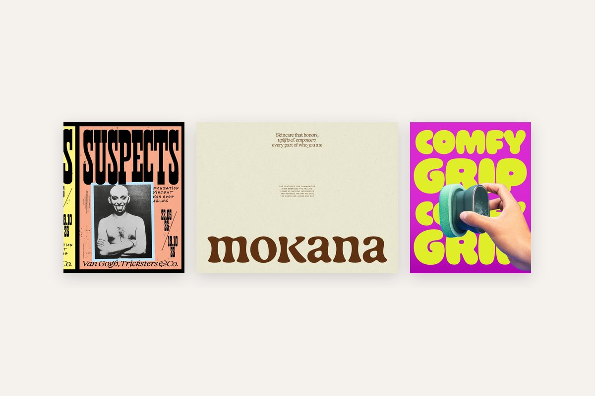
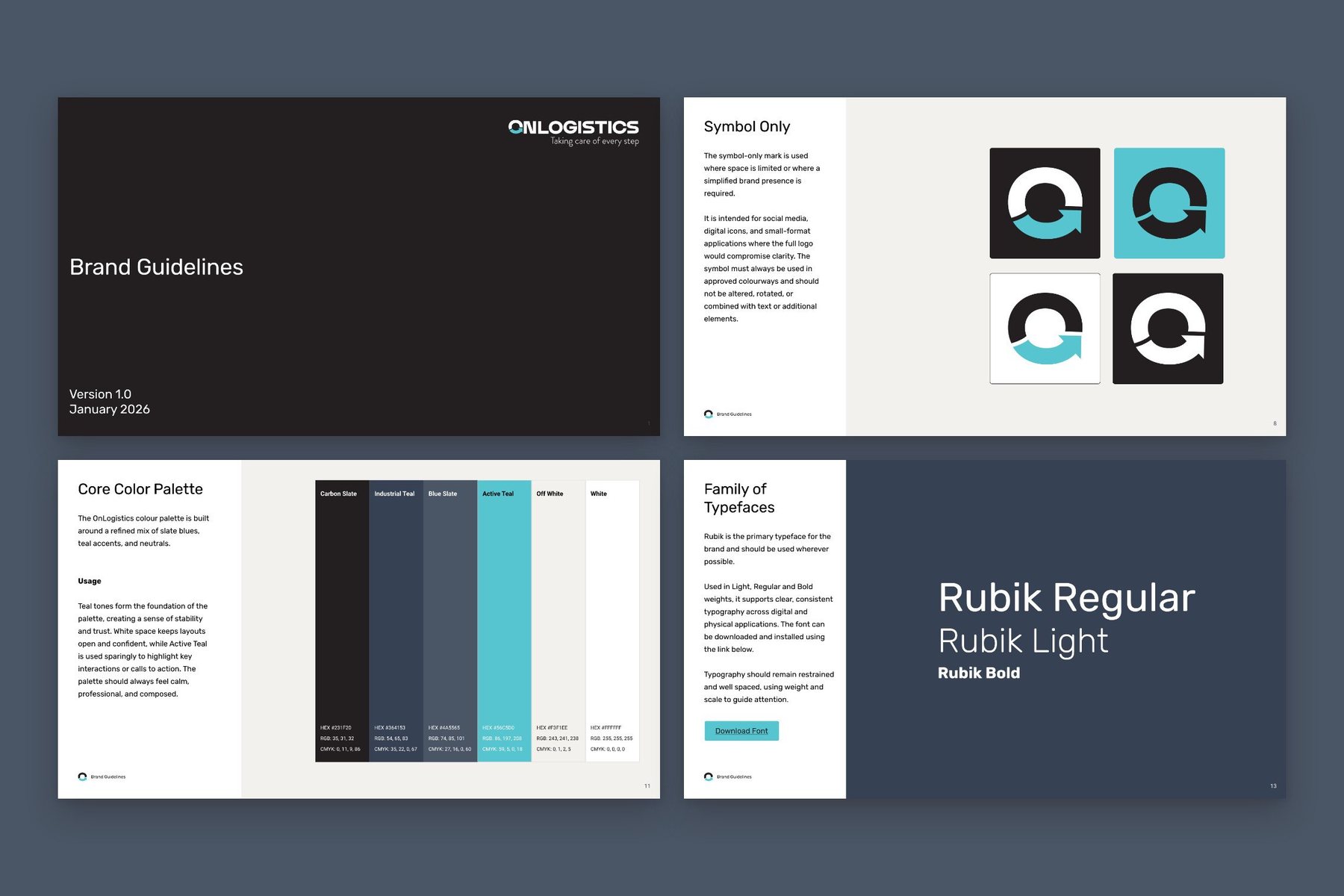
Most design styles have a name, and knowing it makes a brief much easier. This guide covers 34 of them in six groups: clean and ordered, decorative, made by hand, raw, from a screen, and moods. Each one has a line on what it looks like and who it suits, and a link to its section of my Visual Styles board on Pinterest. Each style has two or three examples of real work, credited to whoever made it.
Why does it help to know the name of a style?
When someone tells me they want their brand to look clean and modern, I ask what they’ve seen that they liked. Clean and modern covers a Swiss poster, a Scandinavian furniture shop and a skincare brand in beige, and those are three different briefs.
A name fixes that. If you can say Art Deco, or risograph, or quiet luxury, we’re looking at the same thing from the first call. It also makes searching easier, because Pinterest and Google both understand the names.
So I made a board. Visual Styles has 34 sections, one per style, with a dozen or so examples in each. This is the guide to it, and each style name links to its section. Under each style are two or three examples of real work, each credited to the person or studio who made it, with a link to where it’s published.
Which styles are clean and ordered?
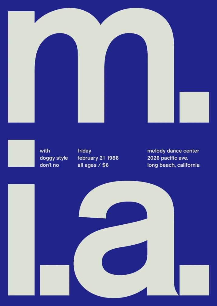
Swiss style. It came out of 1950s Switzerland. Everything sits on a grid, the type is a plain sans serif, and there’s a lot of white space. It suits professional services, architects and anyone who wants to look exact.
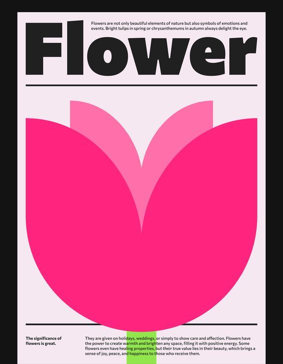
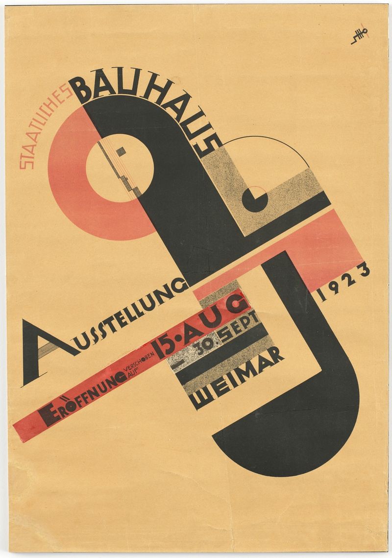
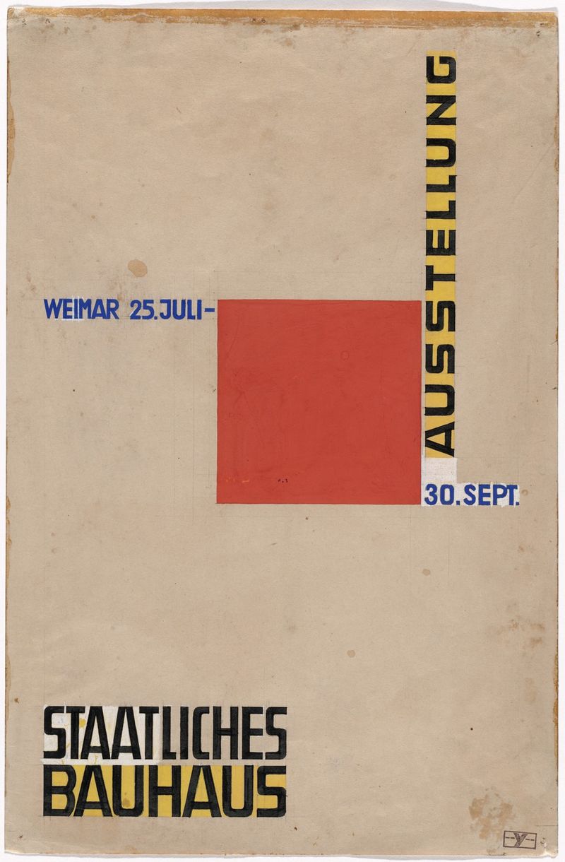
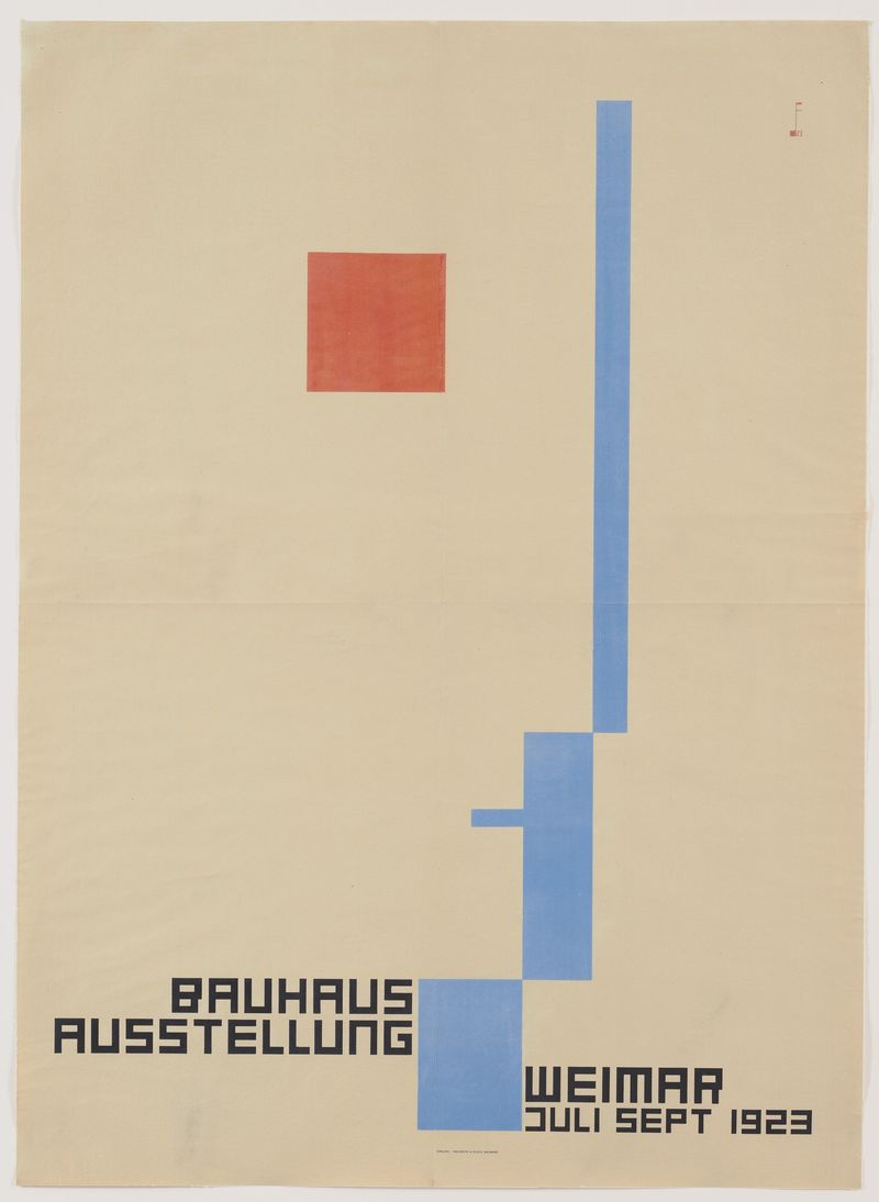
Bauhaus. Named after the German art school of the 1920s. Circles, squares and triangles, red, yellow and blue, and geometric lettering. It suits design-led products, furniture and education.
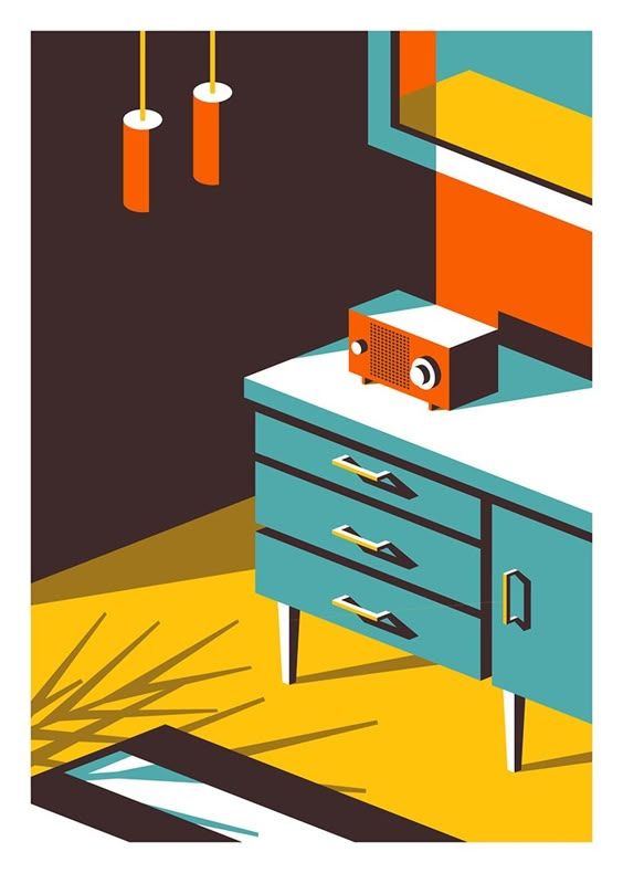
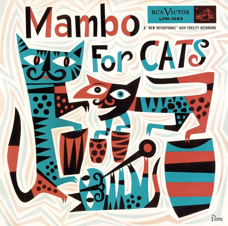
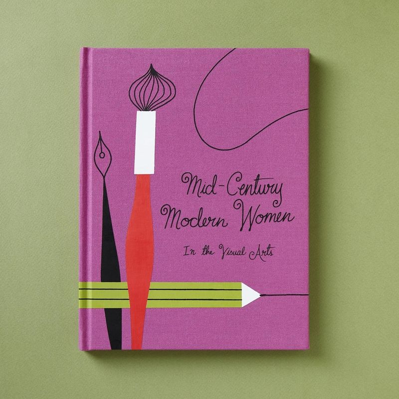
Mid-century modern. The 1950s and 60s: mustard, teal and burnt orange, simple shapes, starbursts and friendly illustration. It suits interiors, cafés and homeware.
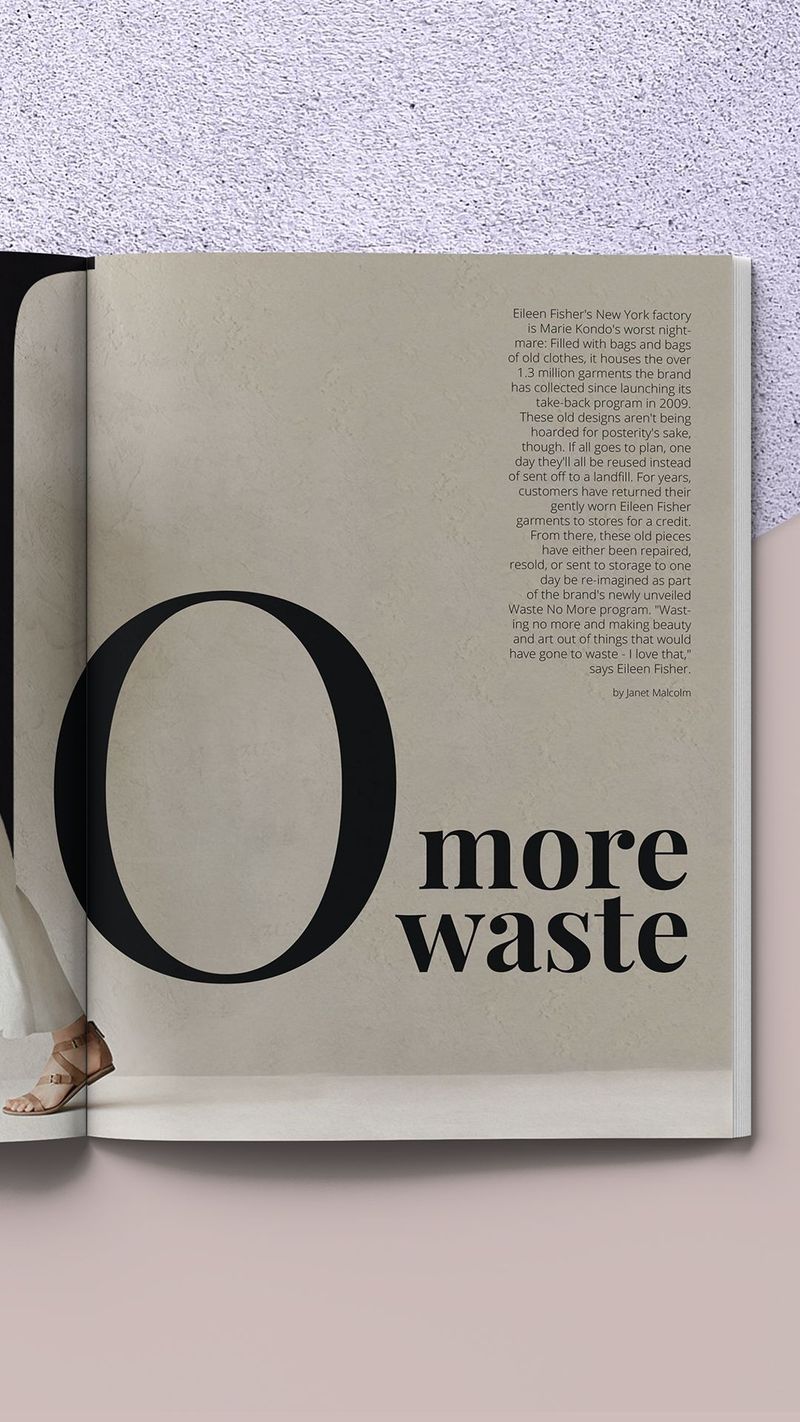
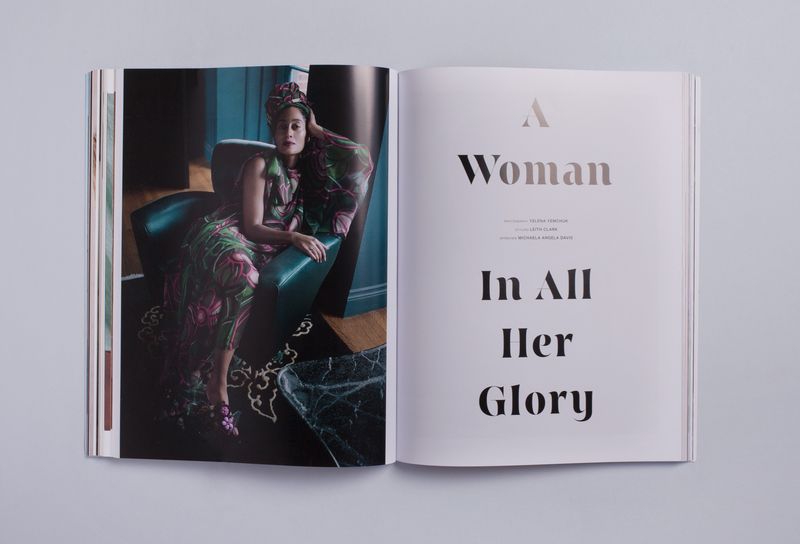
Editorial minimal. Laid out like a fashion magazine, with a large serif headline, wide margins and one photograph given plenty of room. It suits beauty, fashion and consultants.
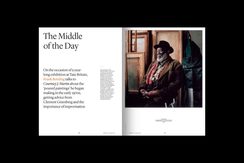
Scandi minimal. Pale wood, soft neutrals, natural light and nothing that doesn’t need to be there. It suits homeware, wellness and childrenswear.
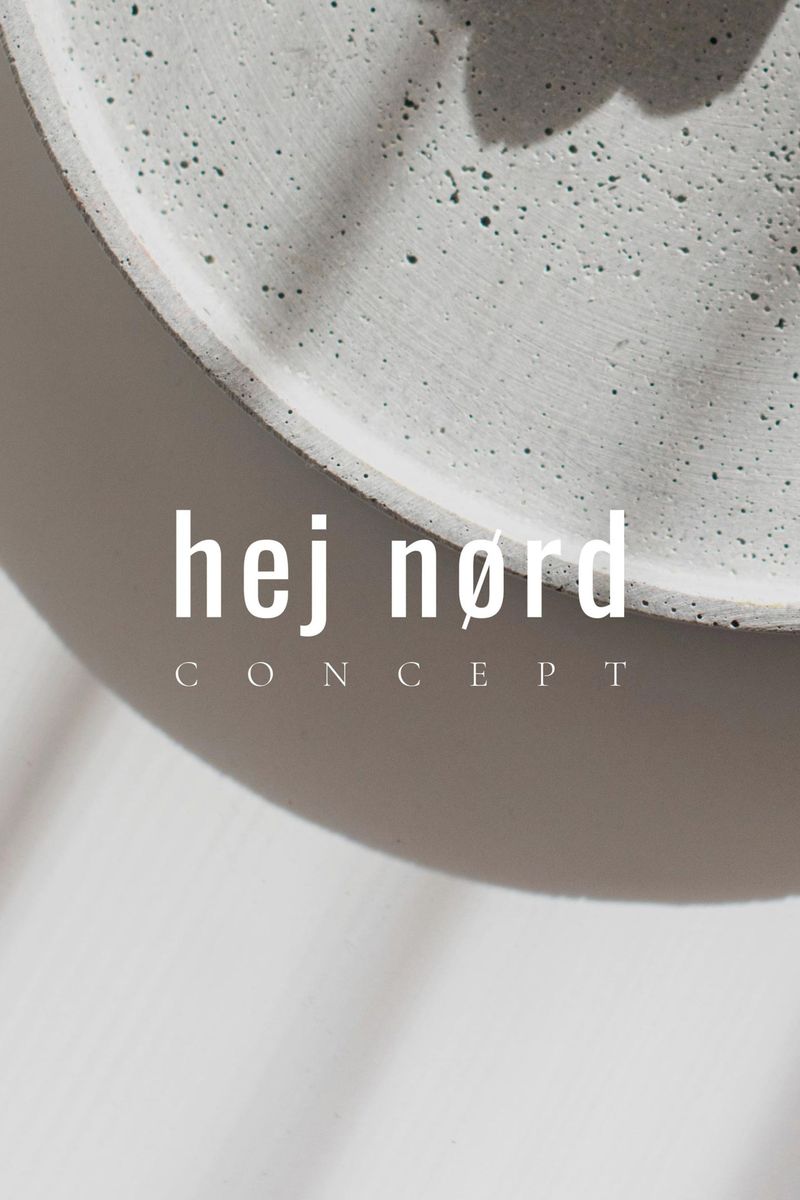
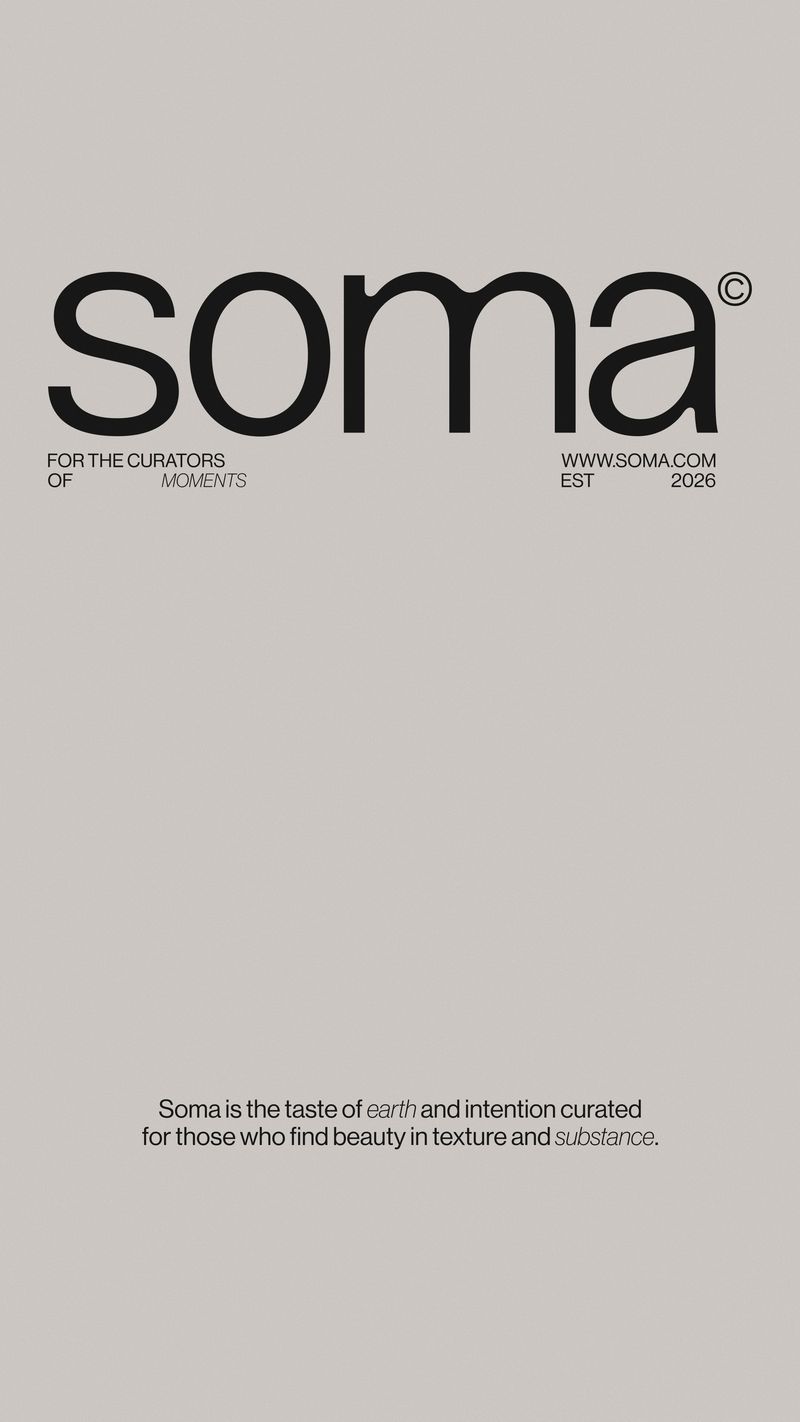
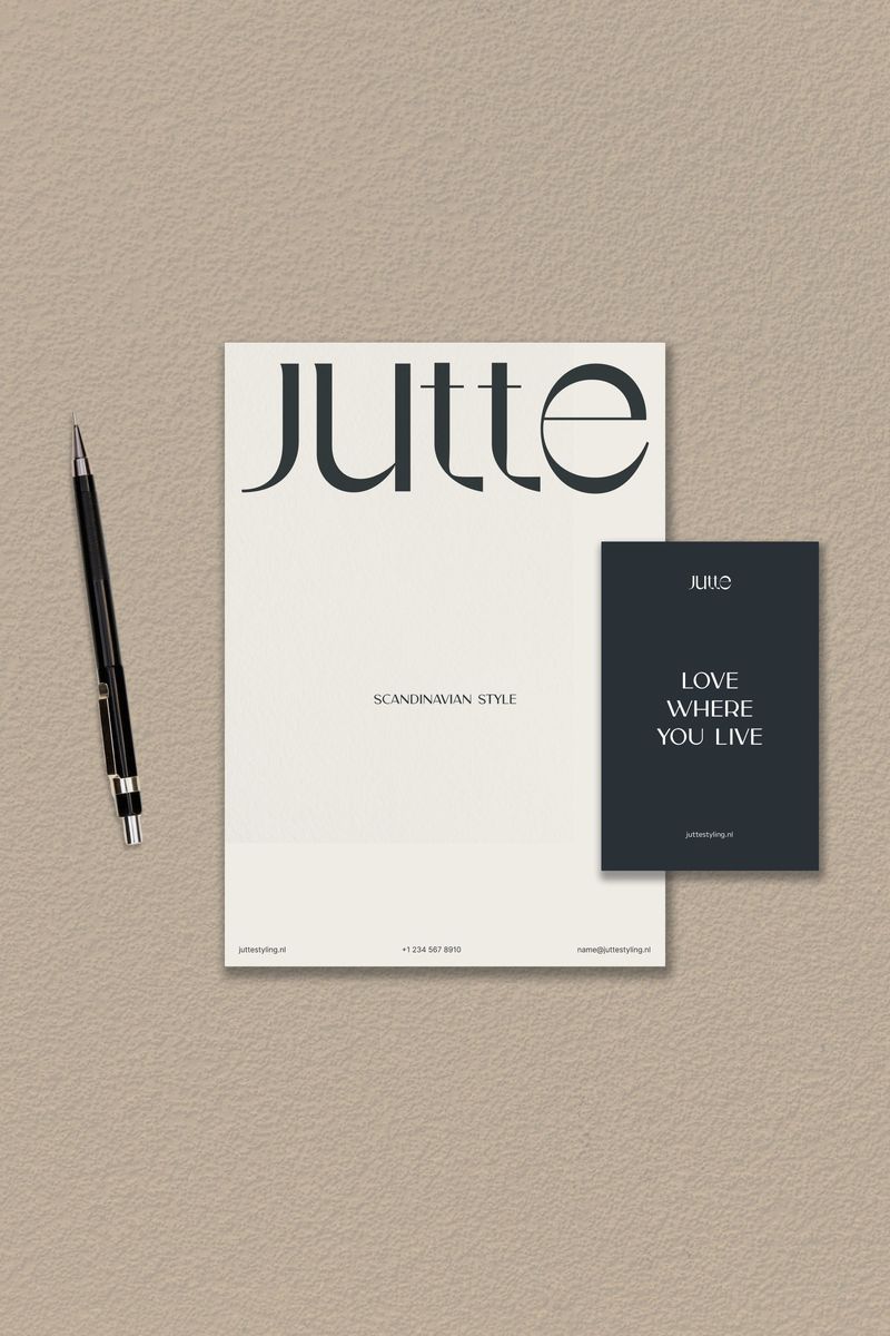
Quiet luxury. Muted colour, good materials, a small logo and a lot of space. It looks expensive without saying so. It suits jewellery, interiors and high-end services.
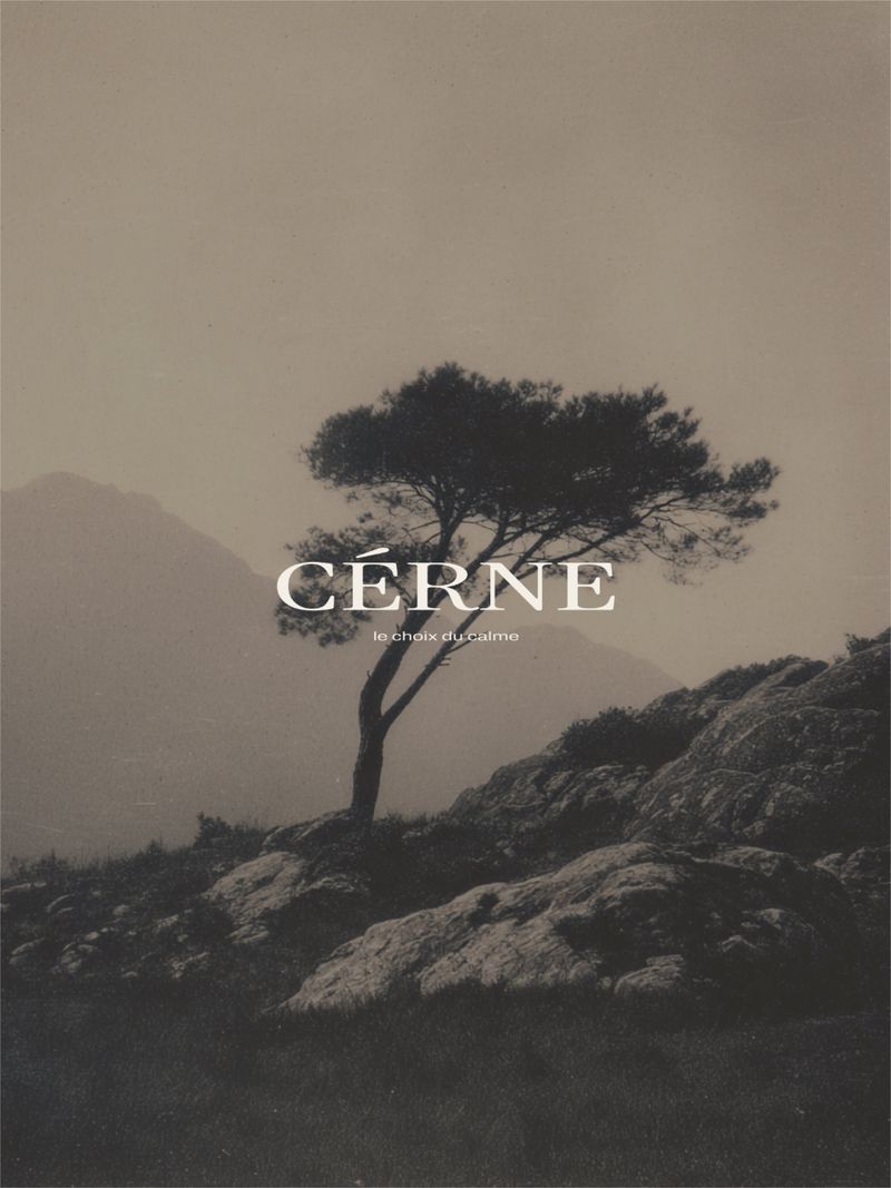
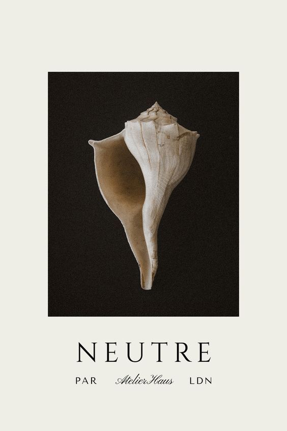
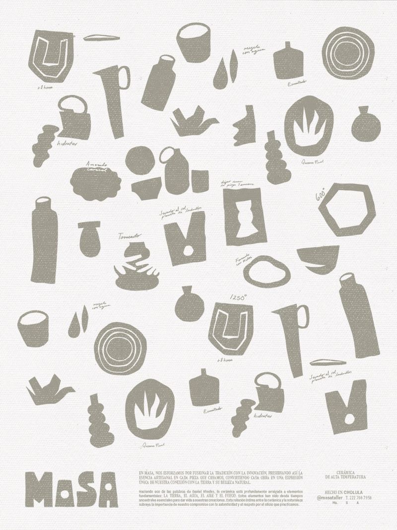
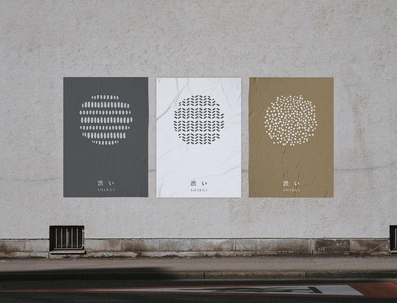
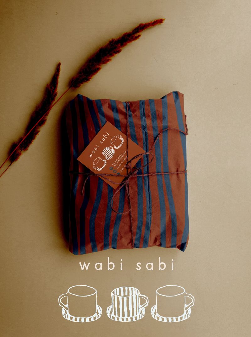
Wabi-sabi. A Japanese idea that finds beauty in things that are imperfect and worn. Rough clay, uneven edges and earthy colour. It suits ceramics, skincare and anything made slowly.
Which styles are decorative?
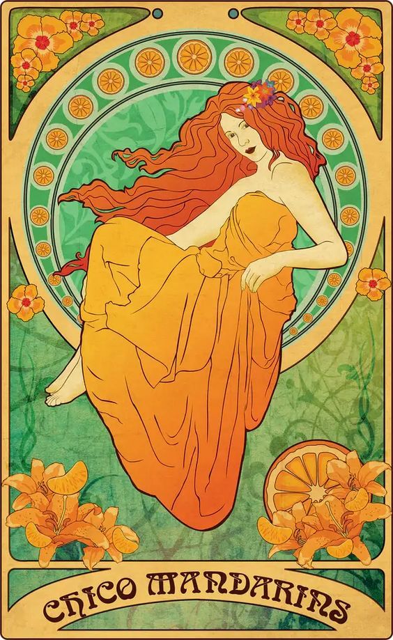
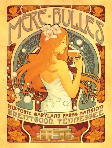
Art Nouveau. Popular from around 1890 to 1910, it’s all long flowing curves, flowers, vines and ornate borders. It suits florists, tea and botanical beauty.
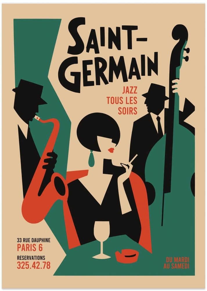
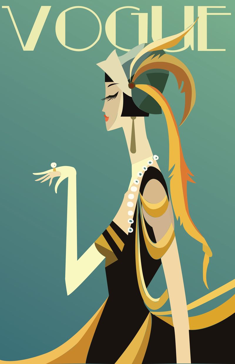
Art Deco. The look of the 1920s and 30s, with symmetry, sunbursts, stepped shapes, black and gold, and tall geometric lettering. It suits hotels, bars and jewellery.
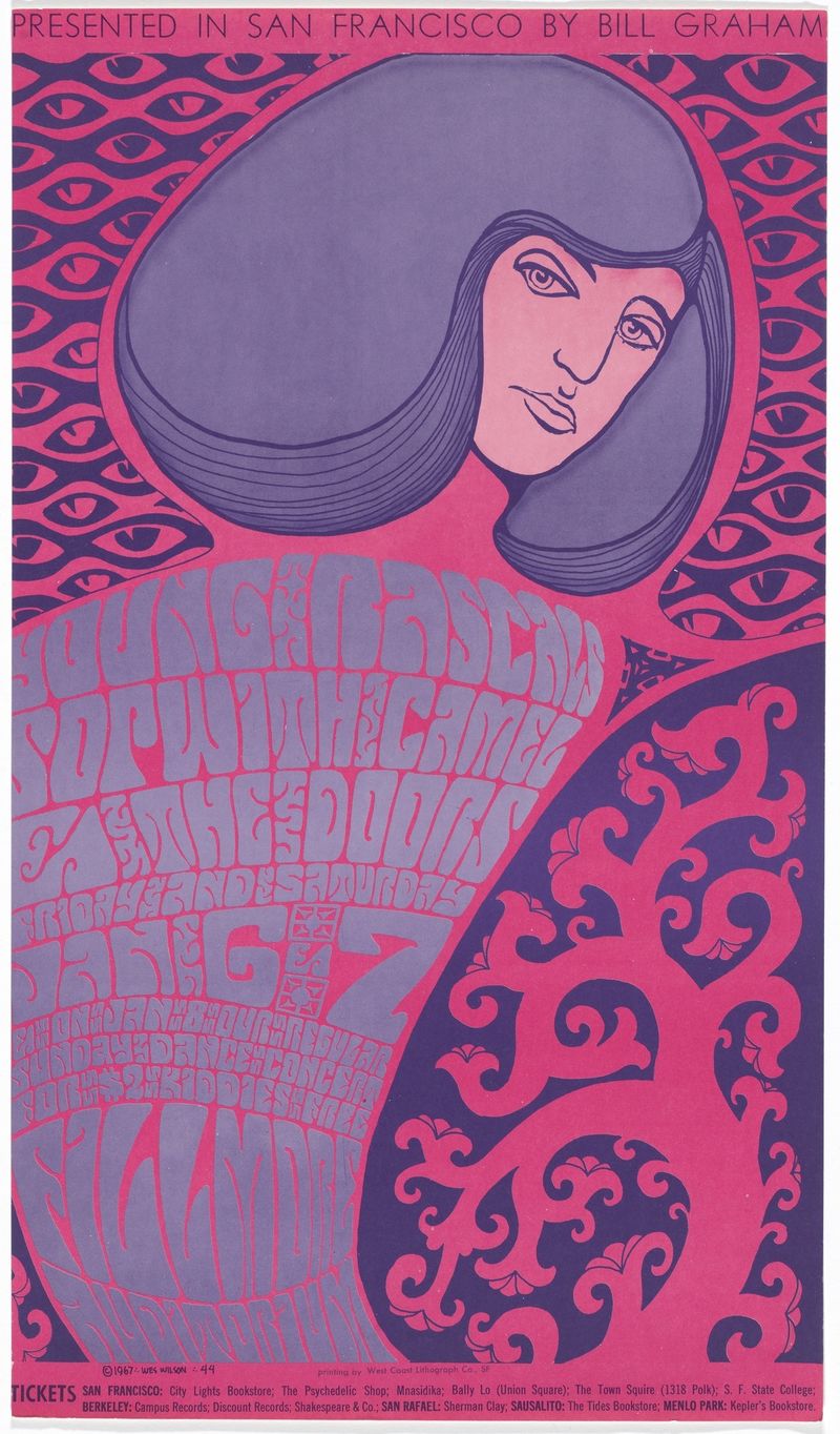
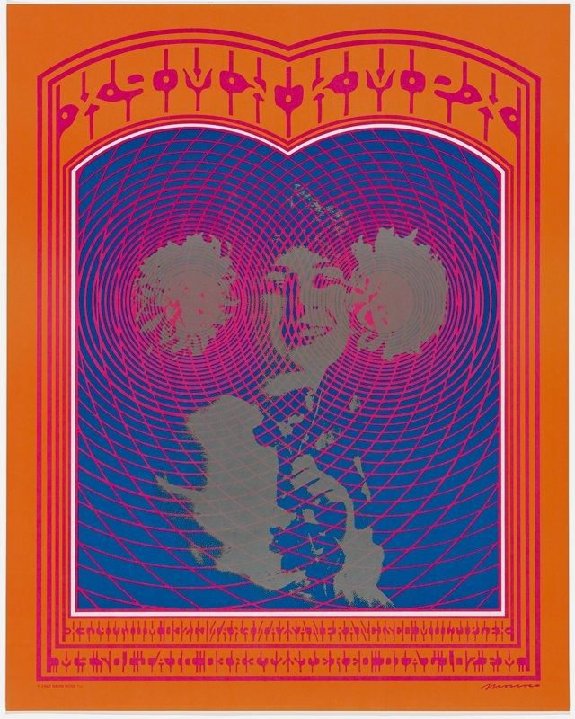
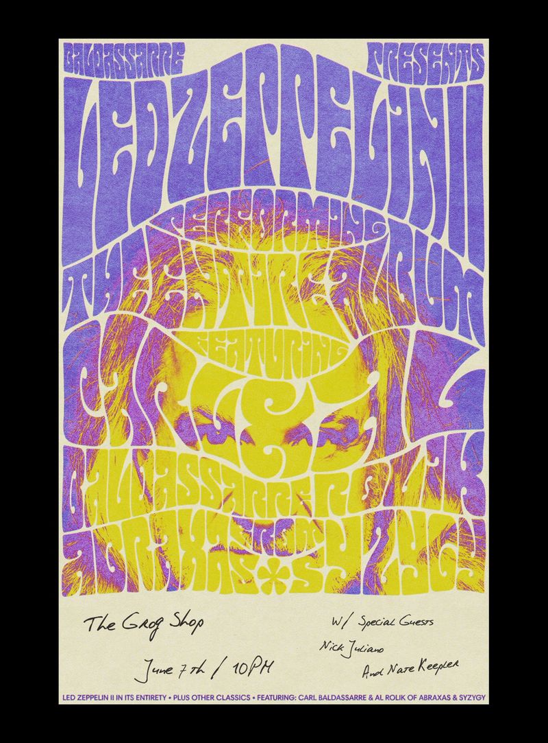
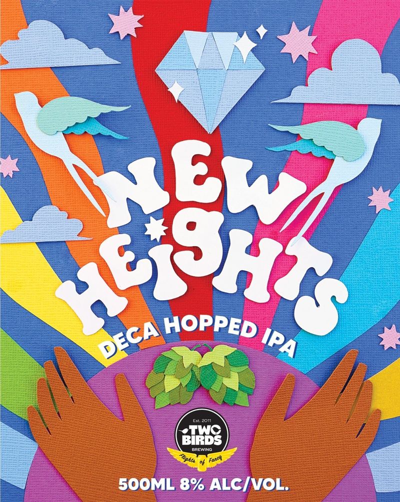
70s psychedelic. Swirling lettering that looks like it’s melting, wavy lines and warm colours that clash on purpose. It suits music, festivals, drinks and vintage clothing.
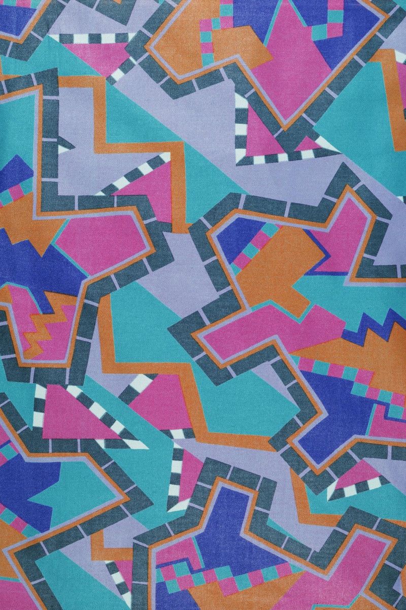
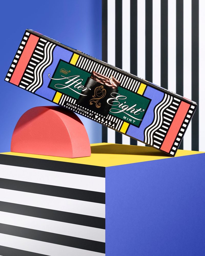
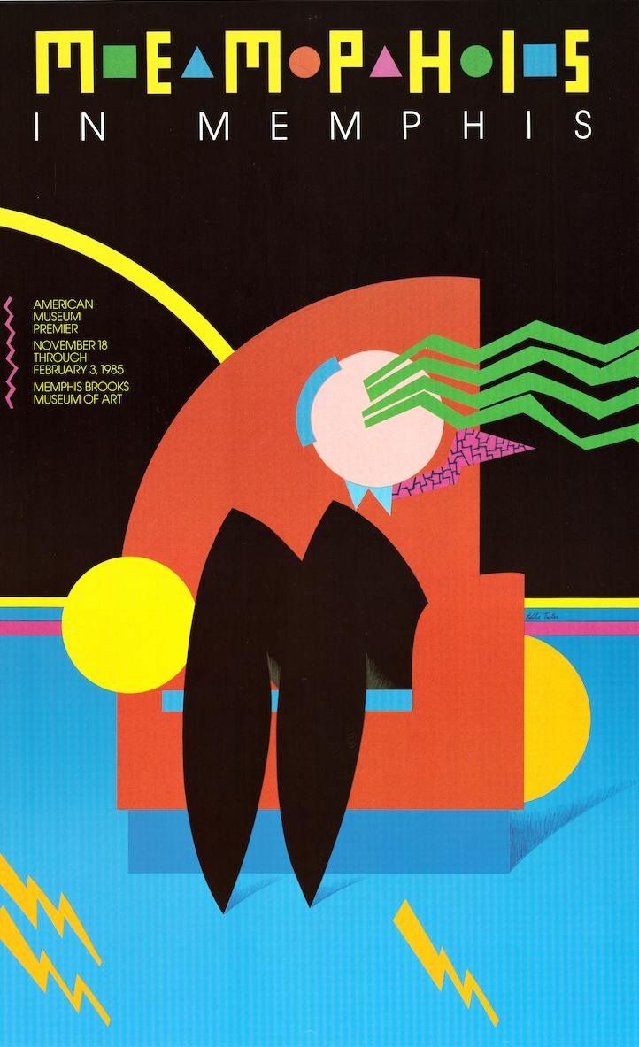
Memphis. Named after a group of designers in Milan in the early 1980s. Squiggles, confetti patterns, stripes and bright blocks of colour. It suits stationery, children’s brands and anything playful.
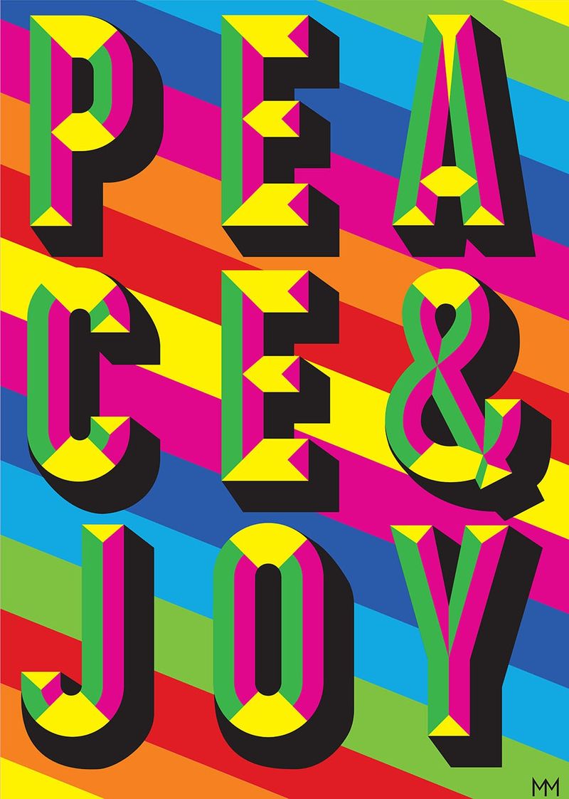
Dopamine and maximalist. More of everything: saturated colour, pattern on pattern, and no empty space. It suits gifting, fashion and hospitality with a big personality.
Which styles look made by hand?
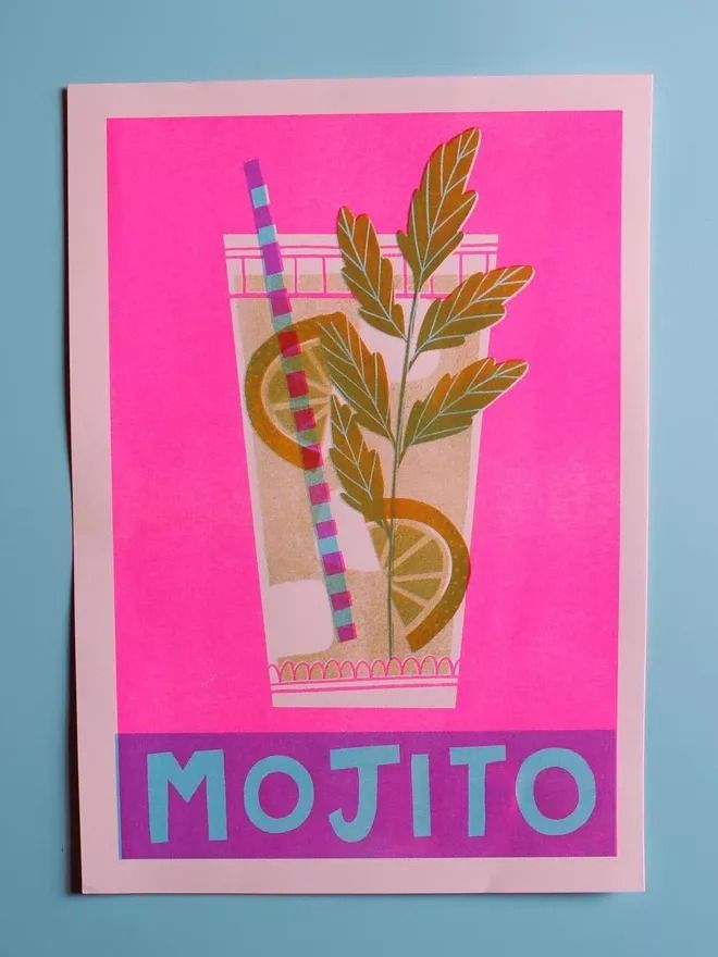
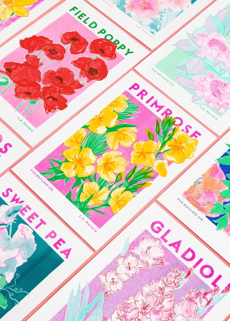
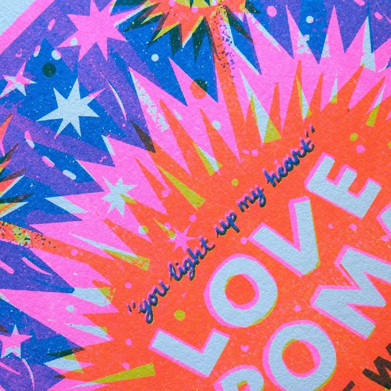
Risograph. A riso is a printer that lays down one bright ink at a time, so the colours overlap, sit slightly out of line and have a grainy texture. It suits independent publishers, cafés and events.
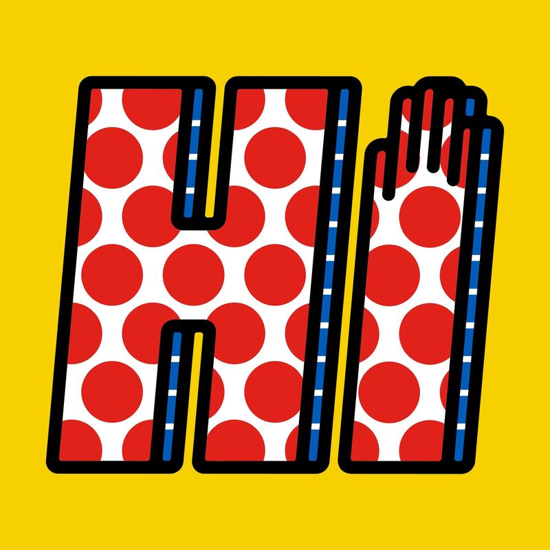
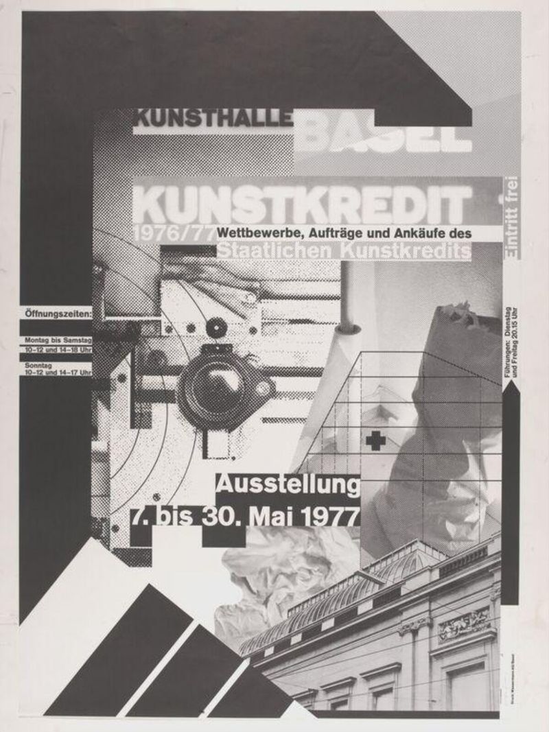
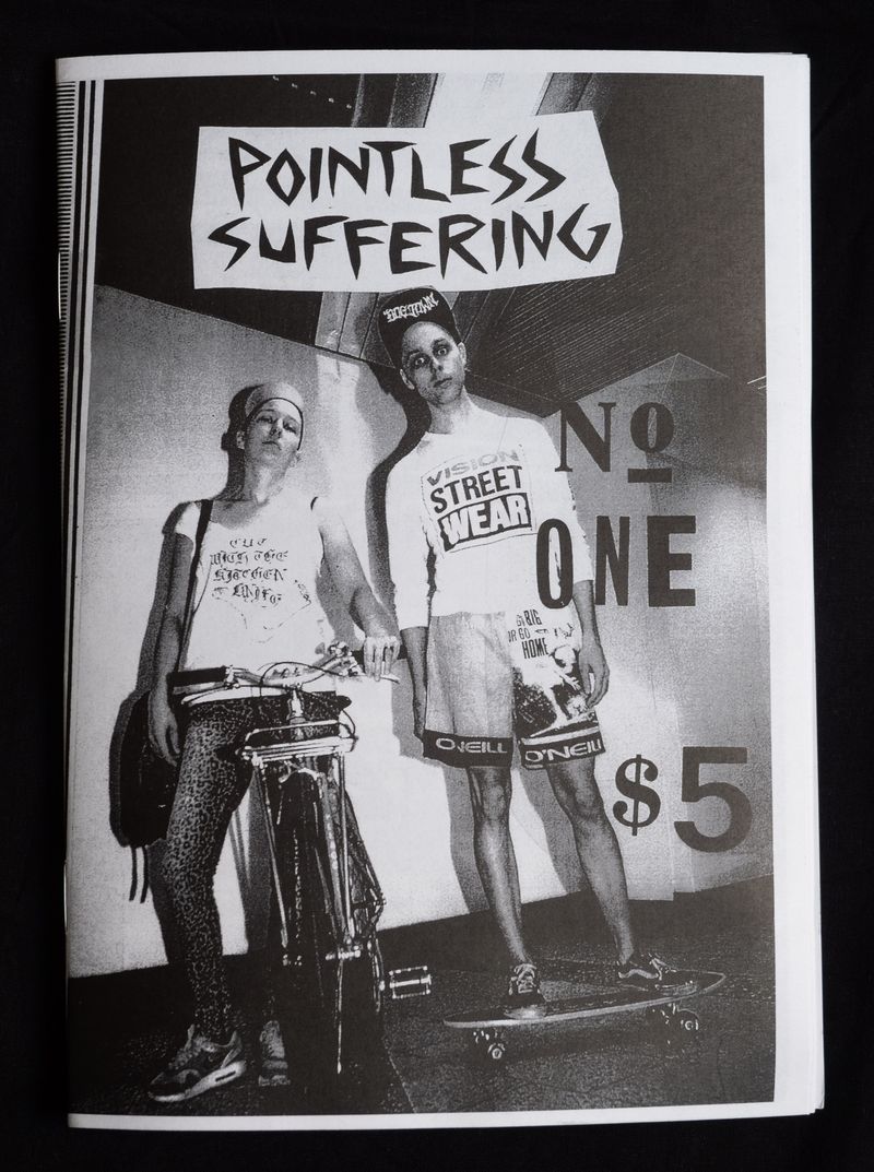
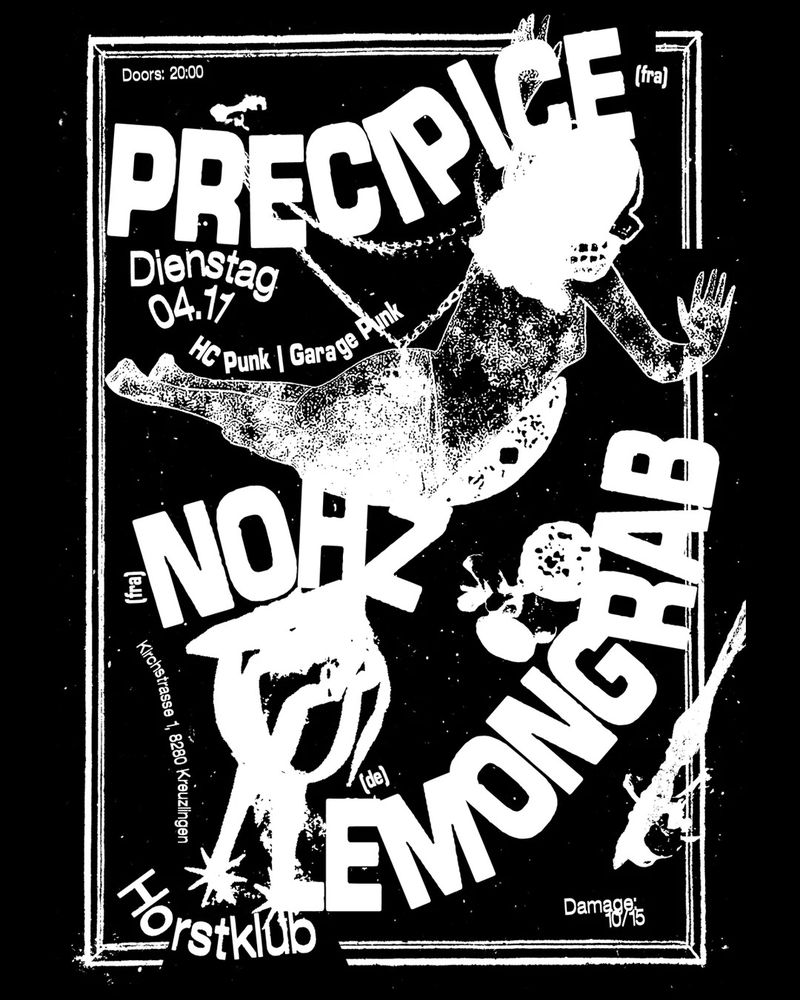
Halftone and photocopy. The dots of old newspaper print and the harsh black of a photocopier. It suits music, streetwear and posters.
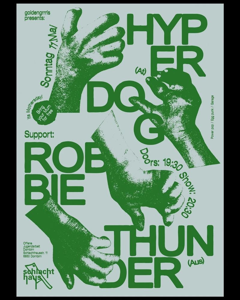
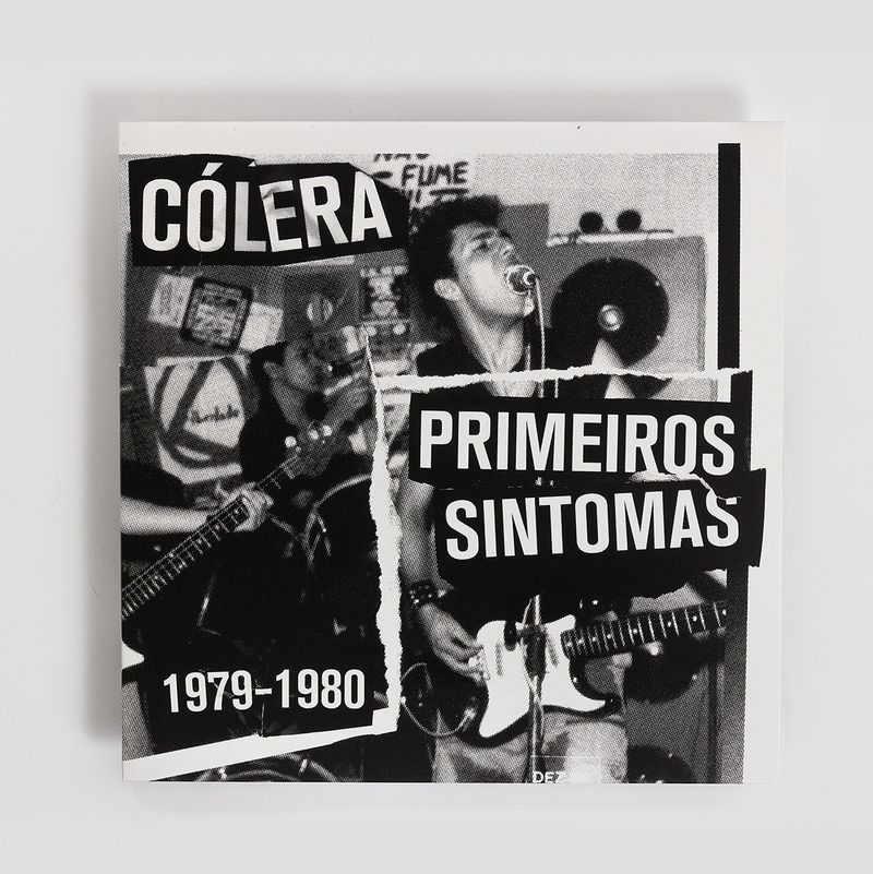
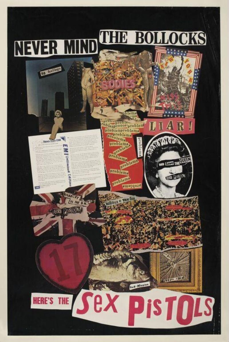
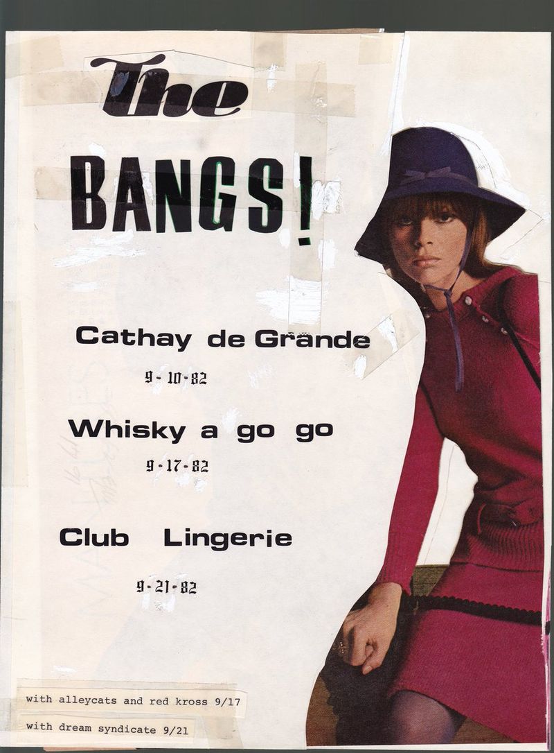
Zine, or cut and paste. Scissors, glue, torn paper and letters cut from magazines, borrowed from punk fanzines. It suits record shops, campaigns and brands for younger customers.
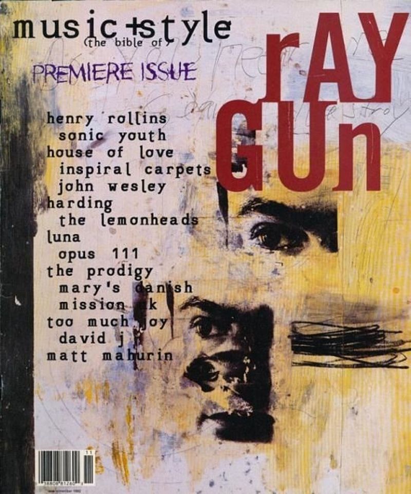
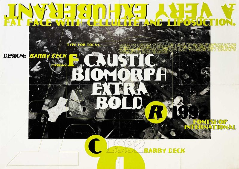
90s grunge. Scratched and broken type, dirty textures and layouts that look pulled apart. It suits music, skate and streetwear.
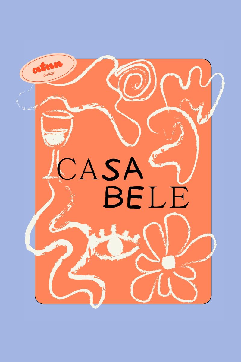
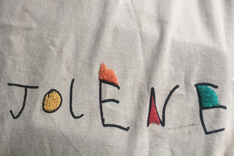
Naive hand-drawn. Wobbly lines, felt-tip colour and drawings that look like a child could have made them, done on purpose. It suits food, children’s brands and friendly local businesses.
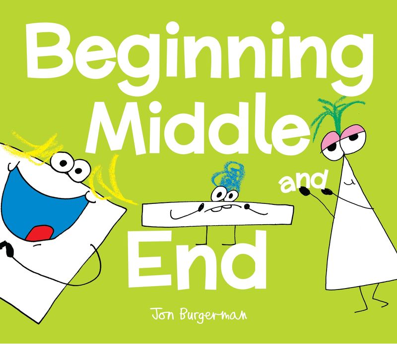
Grainy gradient. Soft blends of colour with a layer of film grain over the top. It suits wellness, music and technology that wants to feel warm.
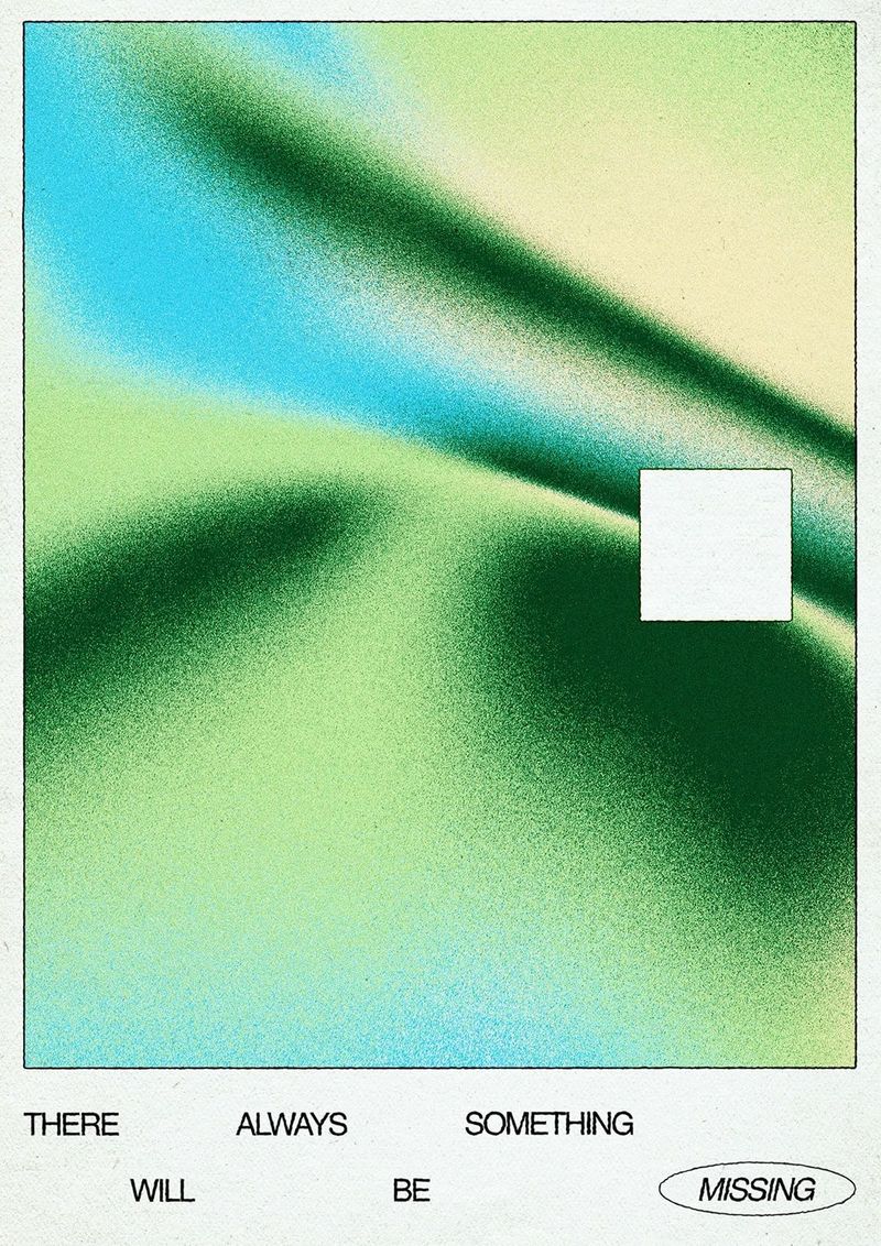
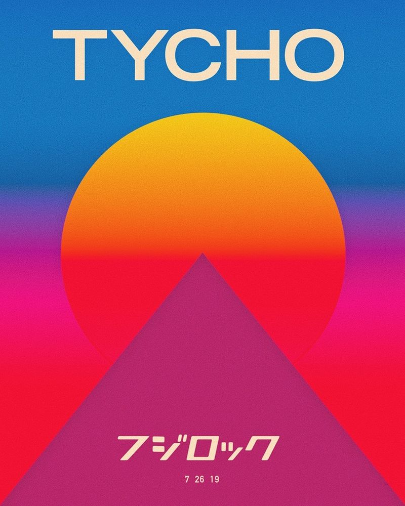
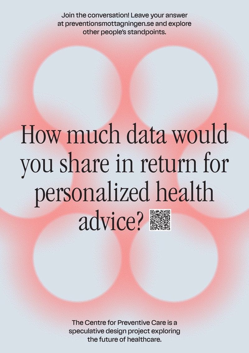
If you can name the style, we’re looking at the same thing.
Which styles are raw on purpose?
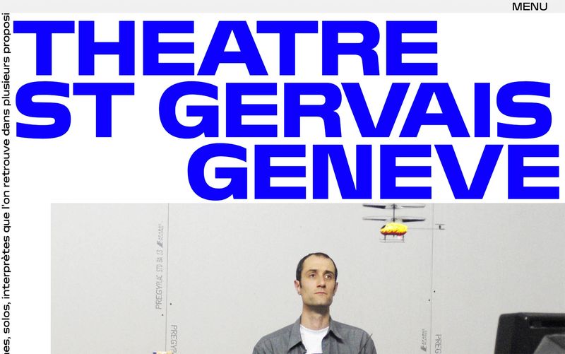
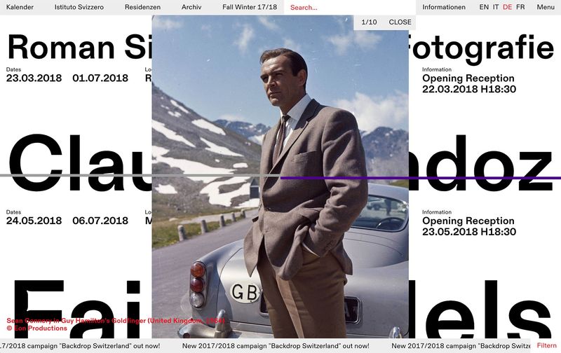
Brutalism. Named after bare concrete buildings. On a page or a website it means plain fonts, harsh layouts and no decoration. It suits galleries, fashion and portfolios.
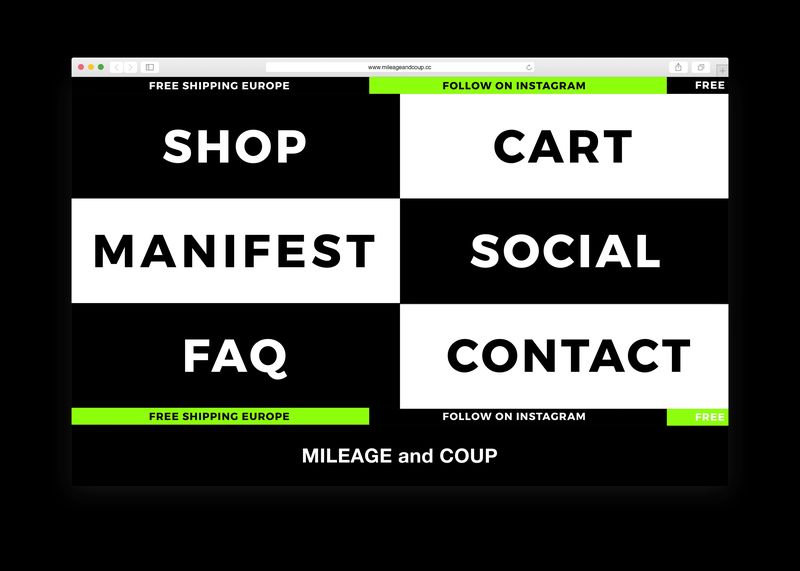
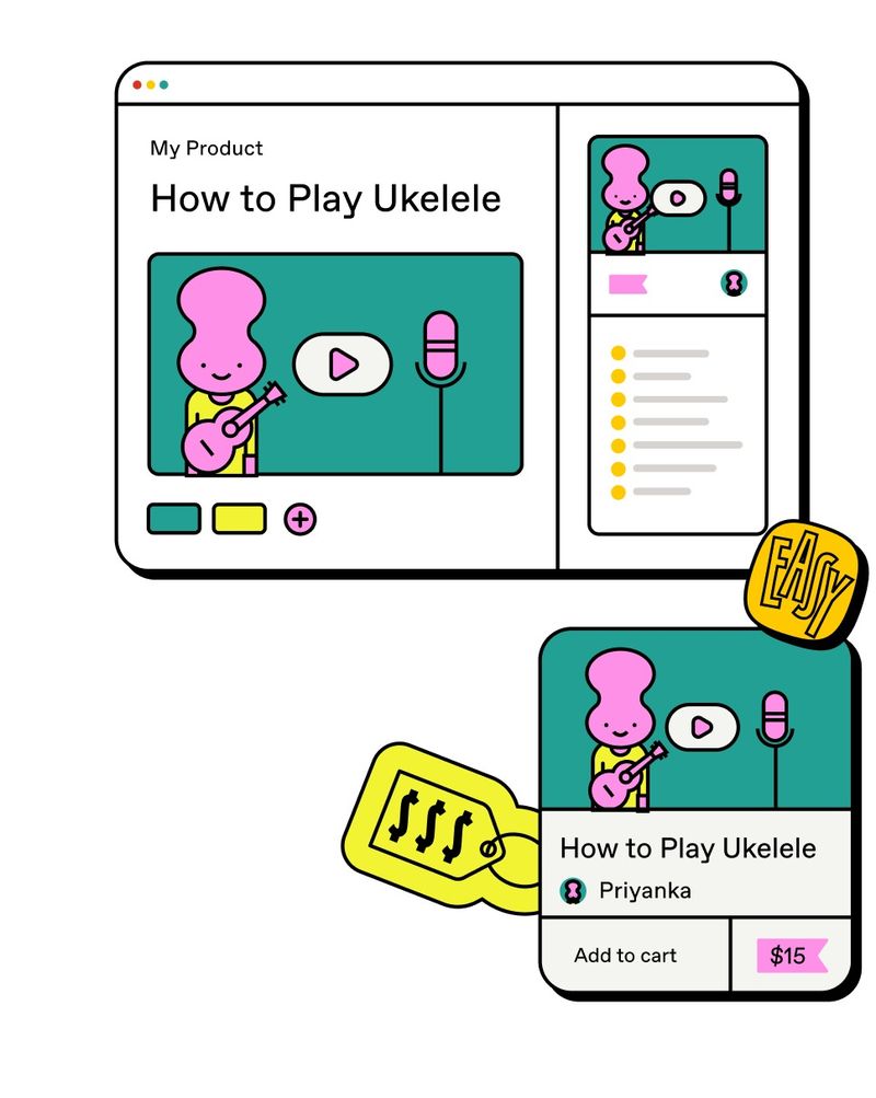
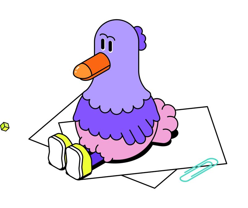
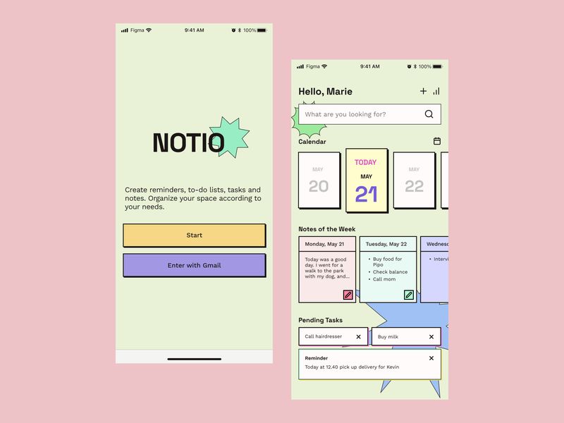
Neo-brutalism. The friendly version: thick black outlines, flat bright colour, hard drop shadows and chunky buttons. It suits apps, start-ups and creators.
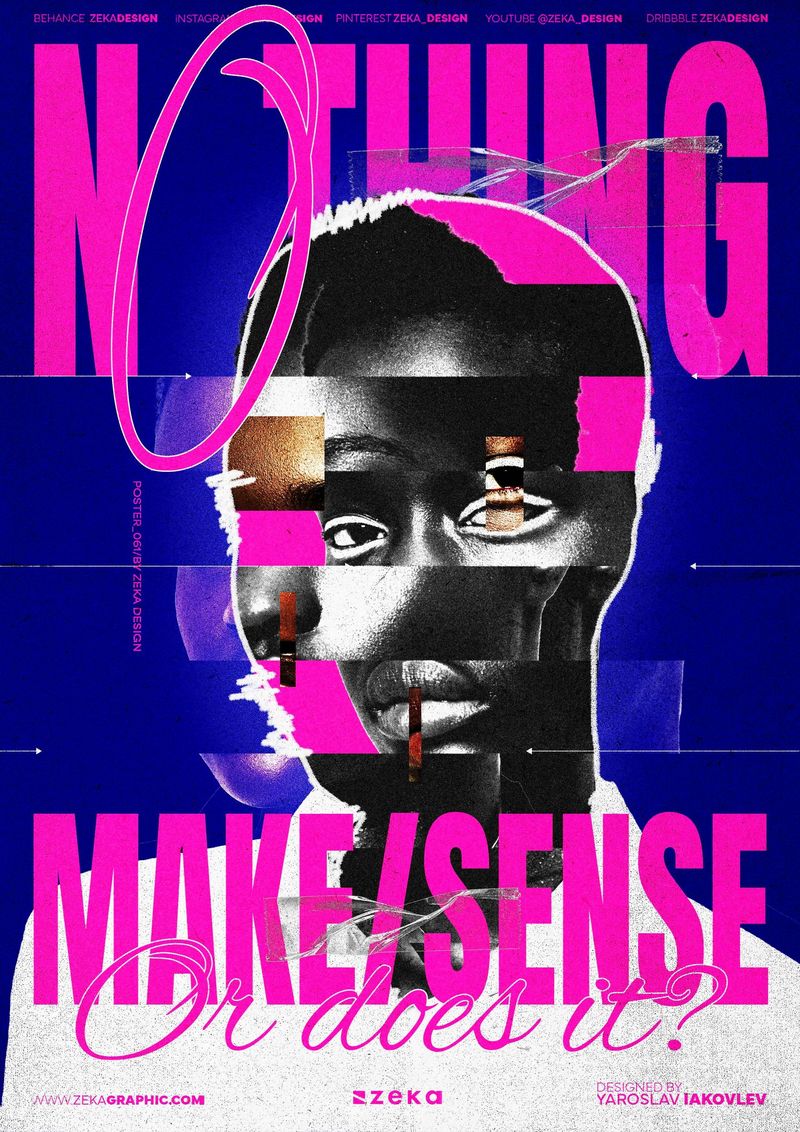
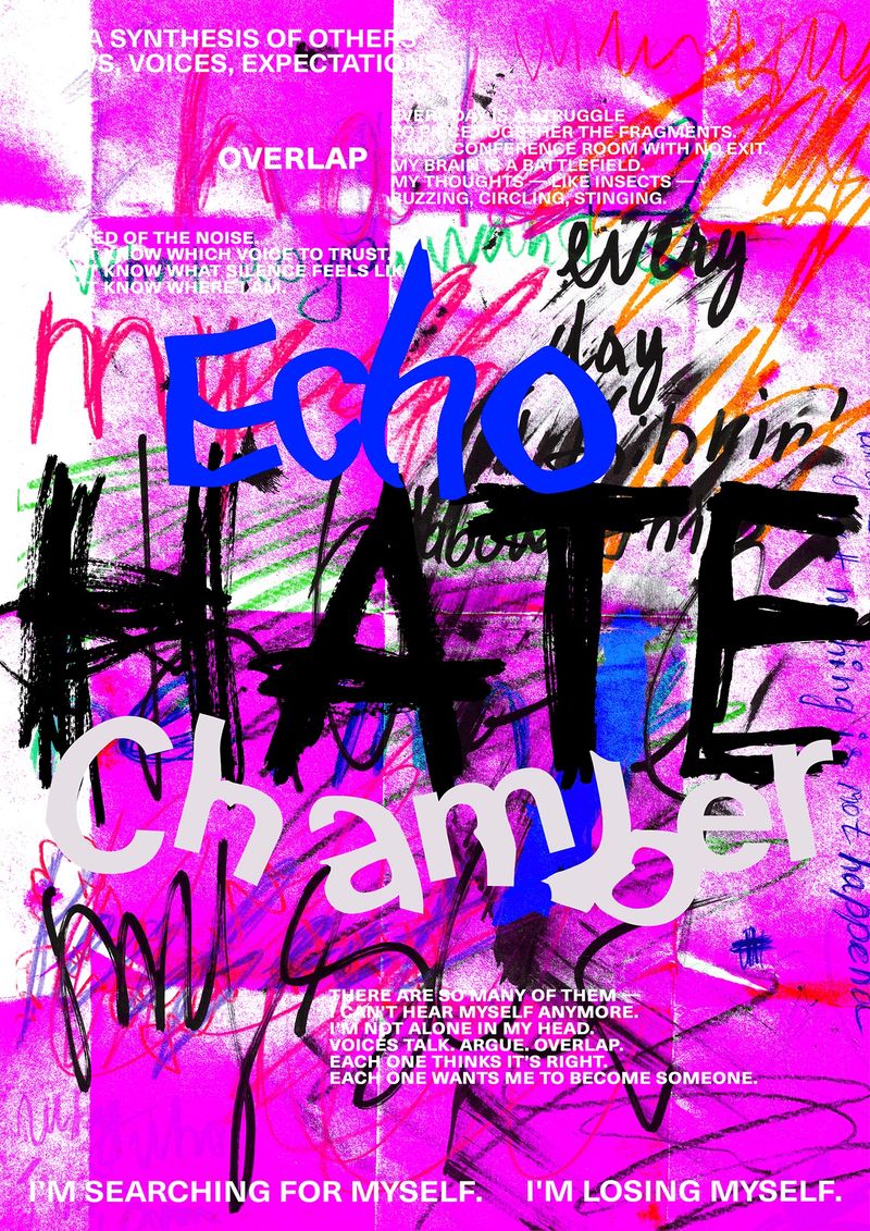
Anti-design. It breaks the rules deliberately, with clashing colour, stretched type and things overlapping where they shouldn’t. It suits fashion, music and brands whose customers are tired of polish.
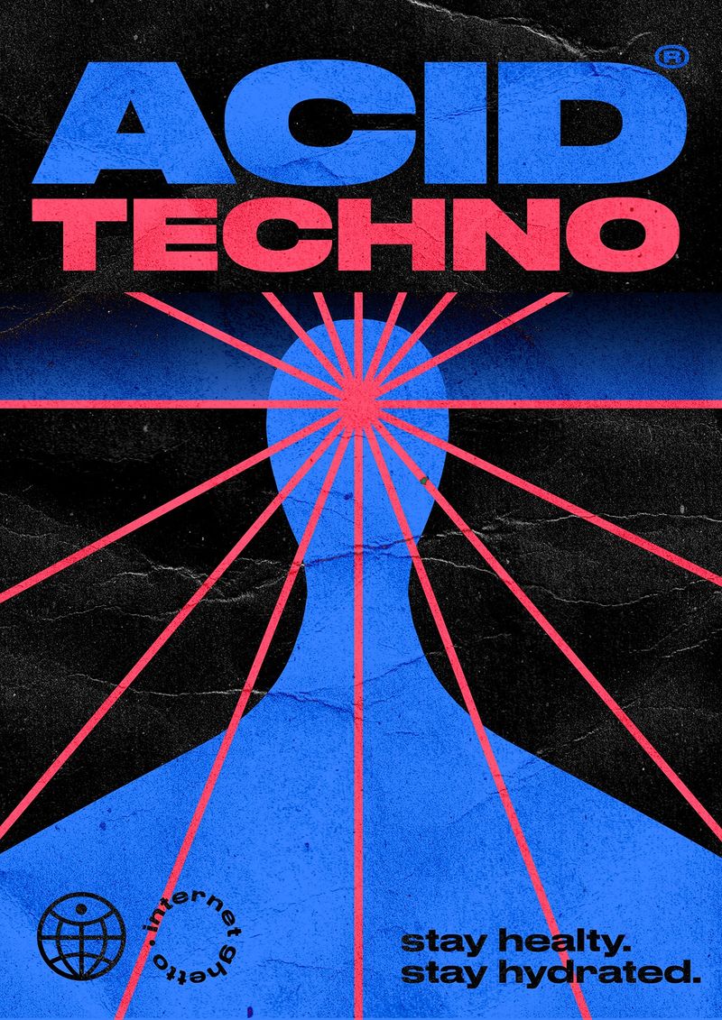
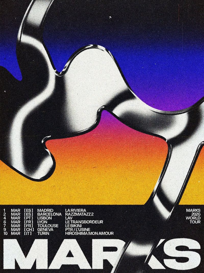
Acid graphics. The rave flyer look: chrome, liquid lettering, spiky shapes and acid green on black. It suits club nights, music and streetwear.
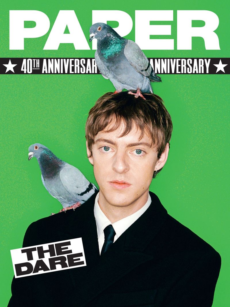
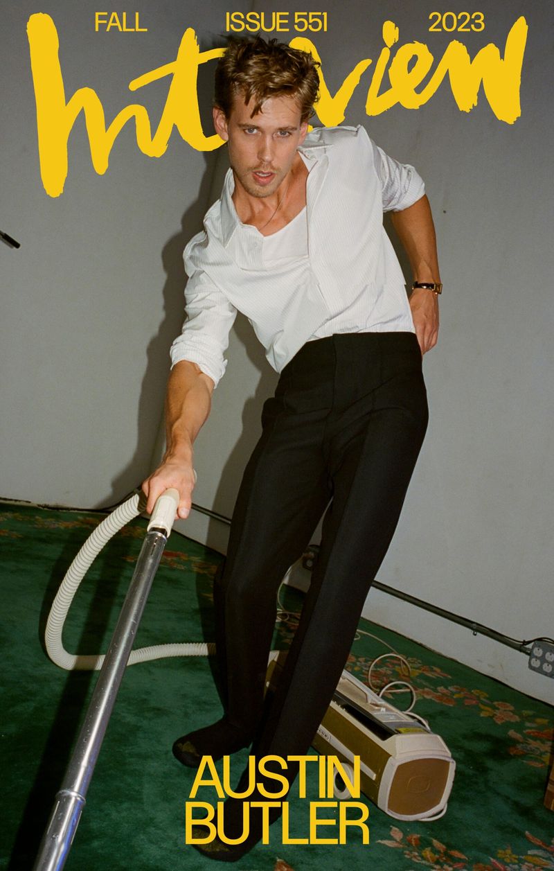
Indie sleaze. The late 2000s party photograph: direct flash, smudged eyeliner and a messy room. It’s a photography style more than a graphic one, and it suits fashion, nightlife and music.
Which styles come from a screen?
Y2K. The turn of the millennium: shiny, bubbly and translucent, in silver, baby blue and pink. It suits fashion, beauty and anything aimed at people in their twenties.
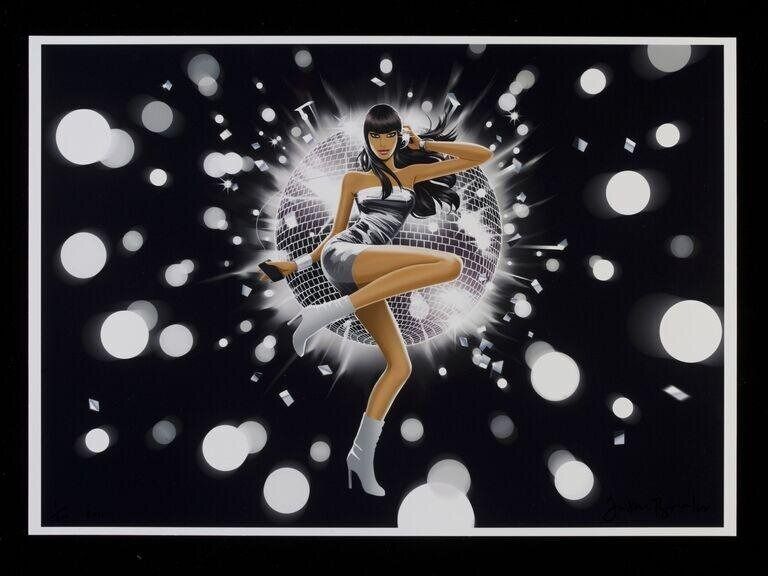
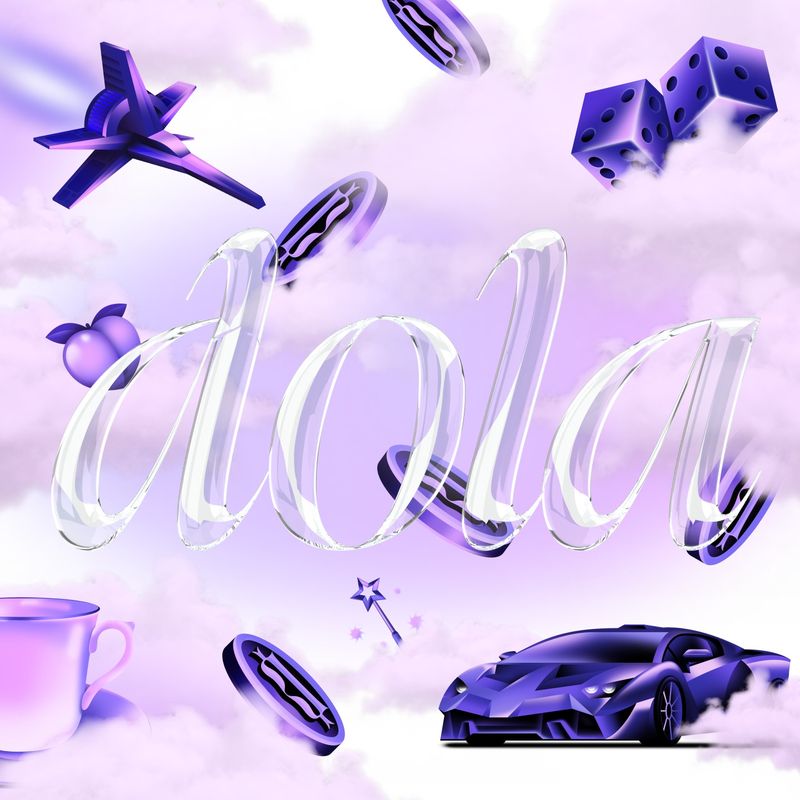
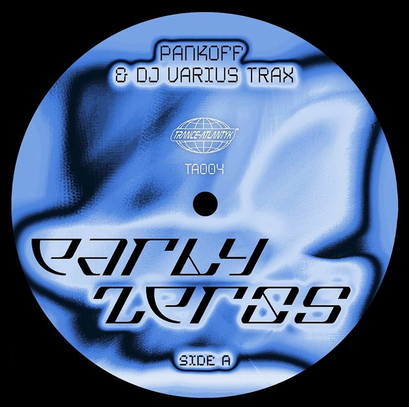
Frutiger Aero. The glossy technology look of about 2004 to 2013, with glass buttons, water droplets, blue skies and green grass. It suits drinks, playful campaigns and anything nostalgic about old gadgets.
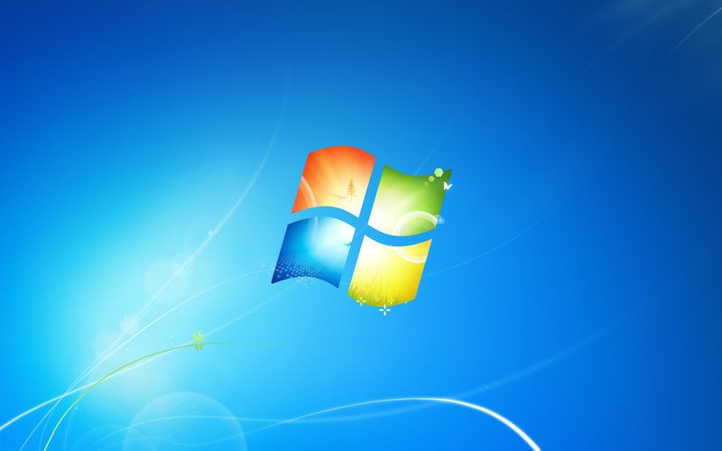


Vaporwave. Pink and teal, classical statues, palm trees and old computer graphics, from an internet music scene of the early 2010s. It suits music, merchandise and gaming.
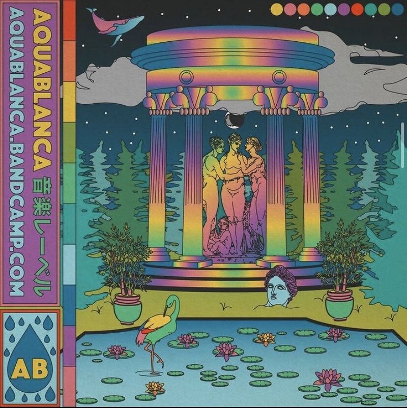
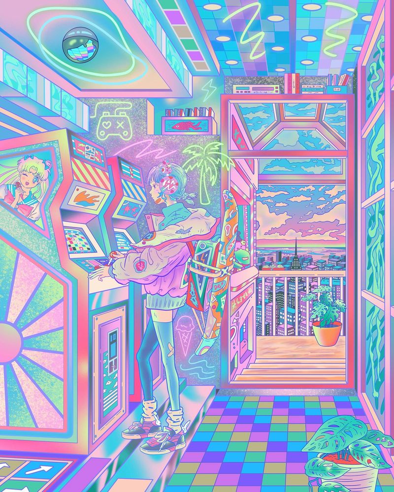
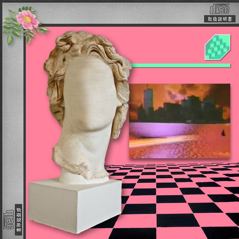
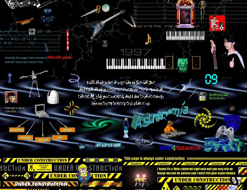
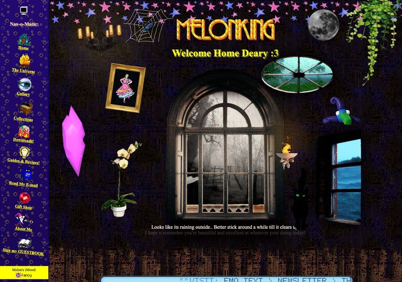
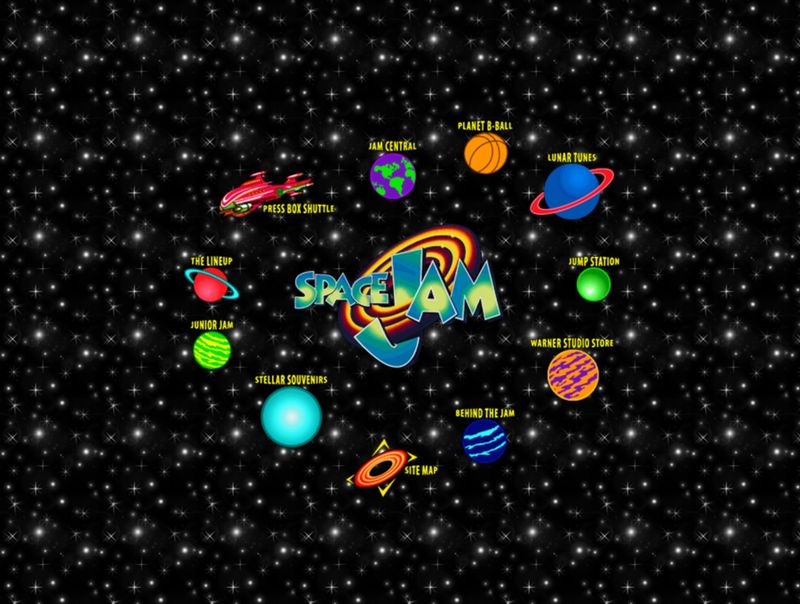
Webcore, or retro web. The home-made internet of the 1990s, with tiled backgrounds, visitor counters and bright blue links. It suits creators, personal sites and one-off campaigns.
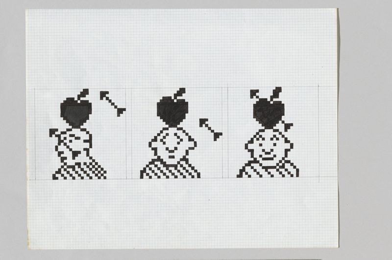
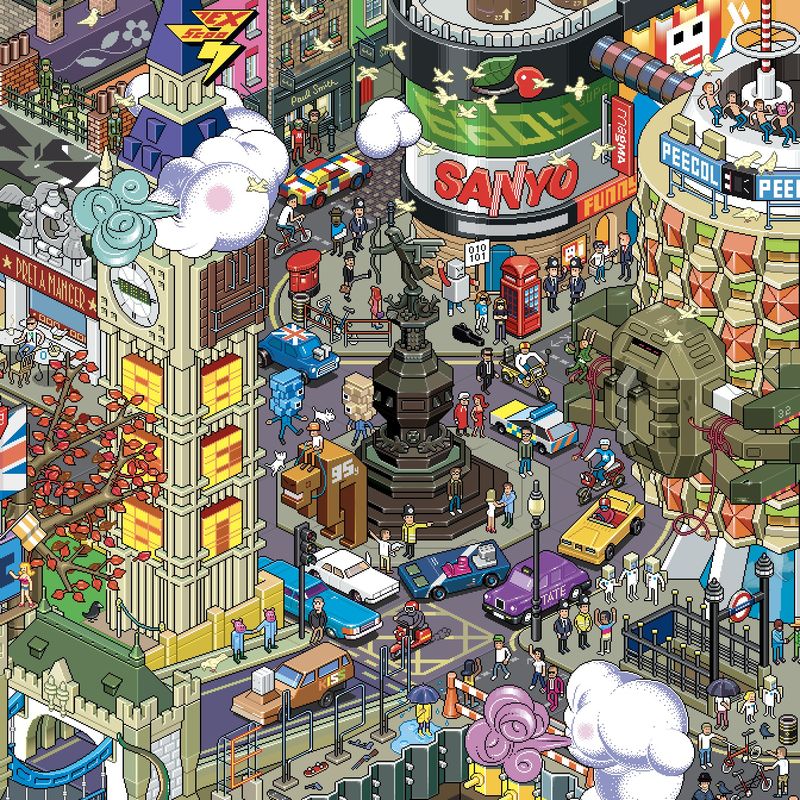
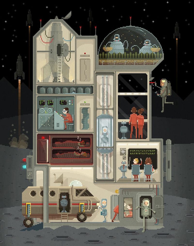
Pixel art. Pictures built from visible squares, like an early video game. It suits gaming, toys and technology.
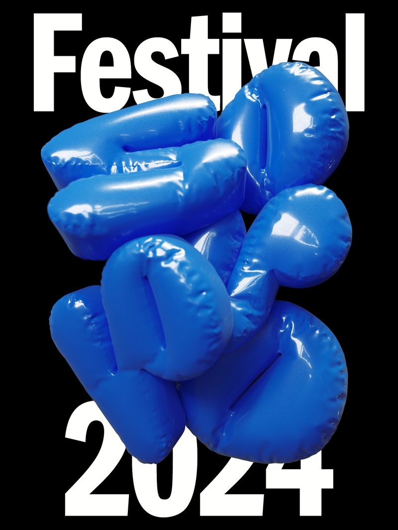
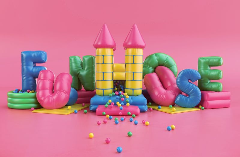
Inflated 3D. Letters and shapes that look like balloons or pool floats, soft and shiny. It suits launches, beauty and social media.
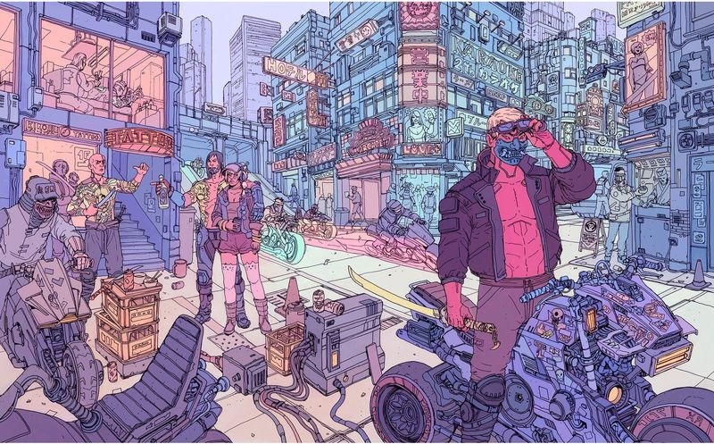
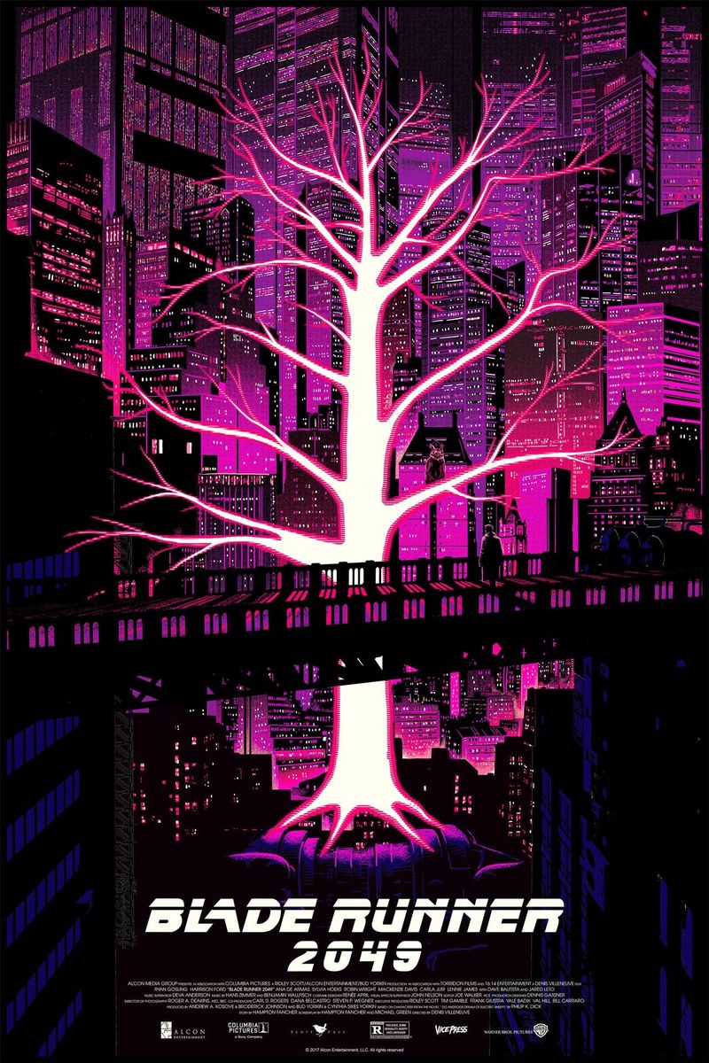
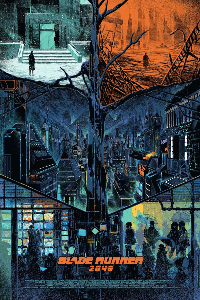
Cyberpunk. Neon signs in a dark, wet city, in magenta and electric blue, with glitches. It suits gaming, technology events and energy drinks.
Which styles are more of a mood?
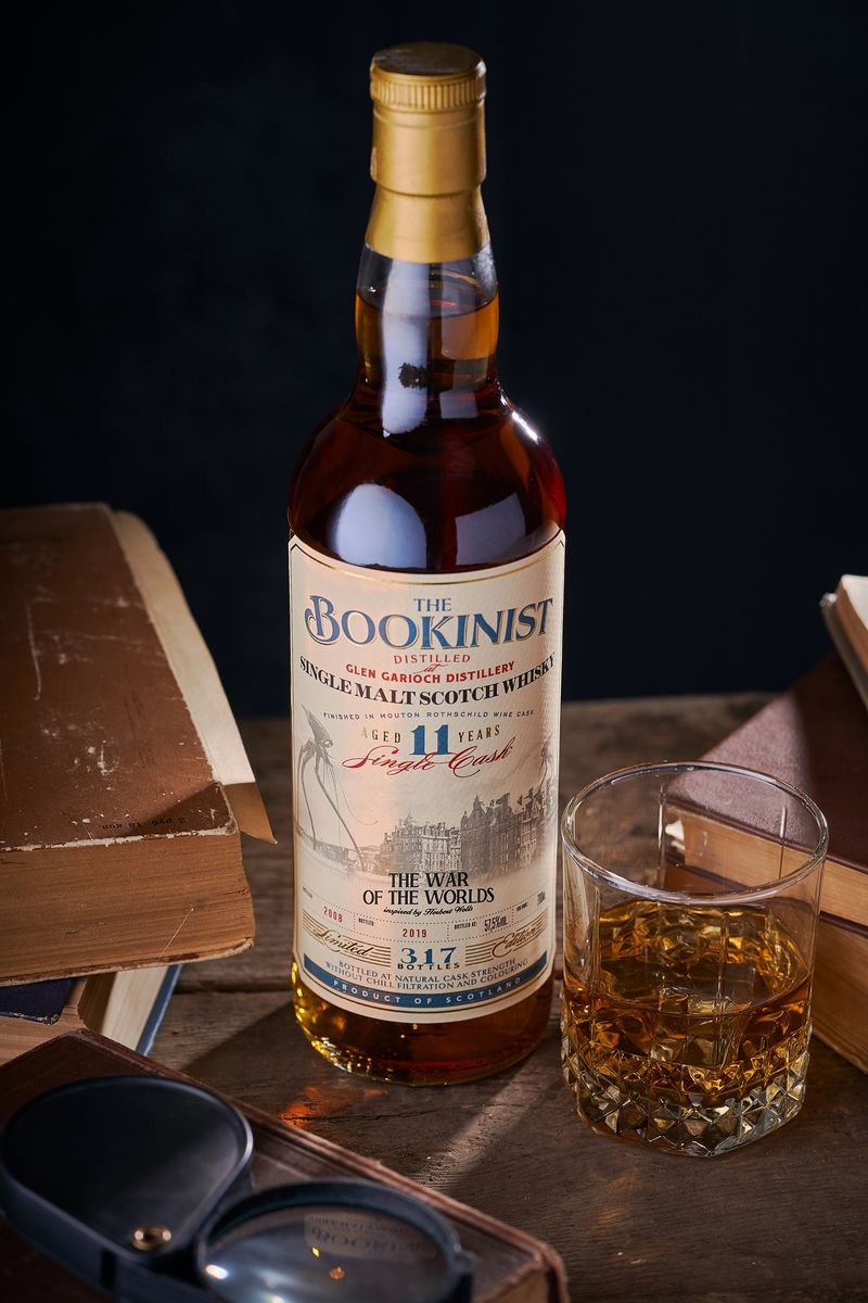
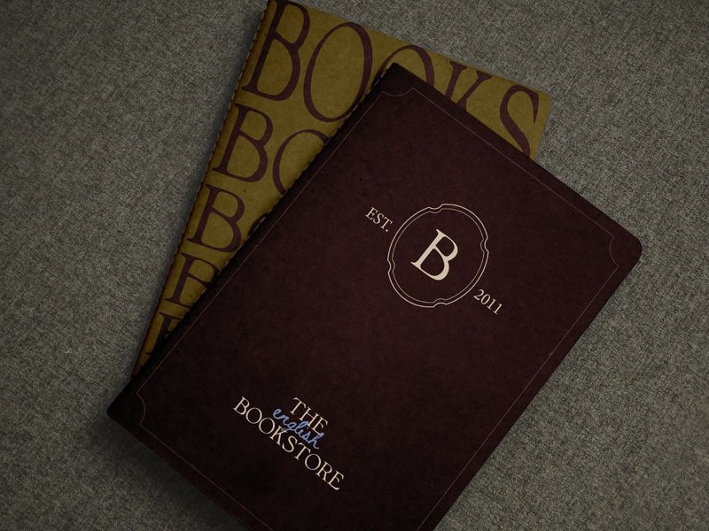
Dark academia. Old libraries, tweed, candlelight, deep brown and green, and serif type. It suits bookshops, stationery, whisky and tutors.
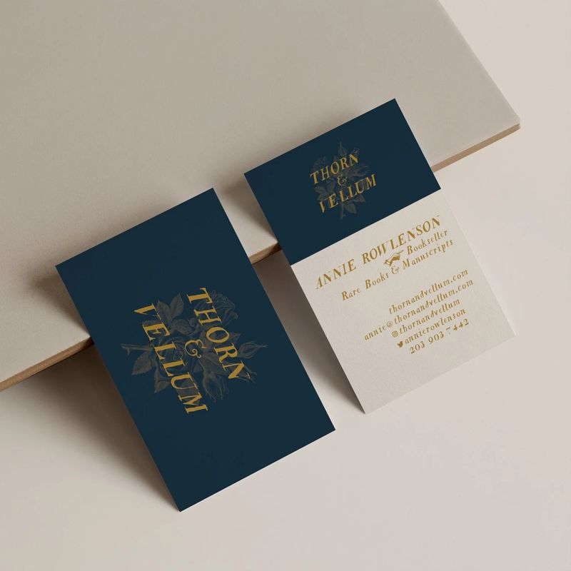
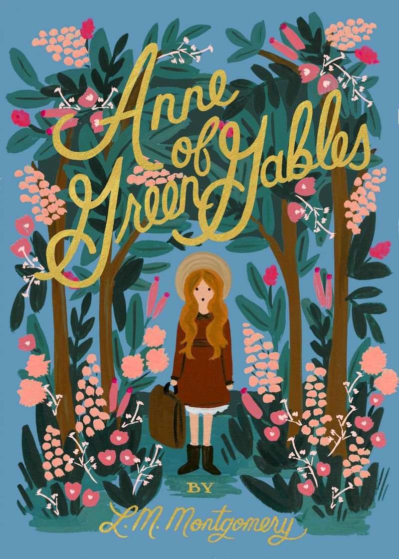
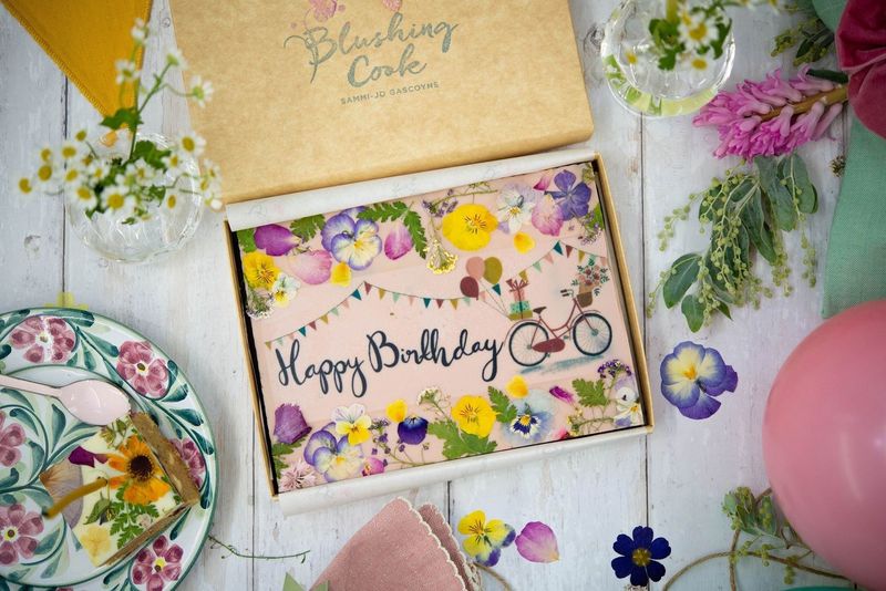
Cottagecore. A dream of the countryside: wildflowers, gingham, linen, baking and soft sunlight. It suits bakeries, florists, homeware and crafts.
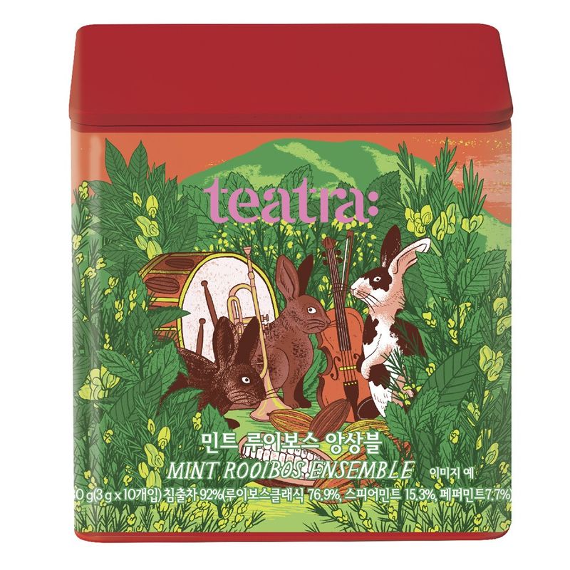
Dreamcore and liminal. Empty corridors, deserted swimming pools and places that feel half remembered. It’s unsettling, so it suits music, art and fashion shoots far more than a shop.
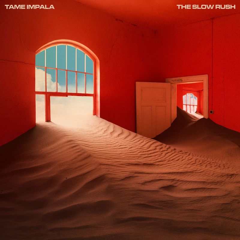
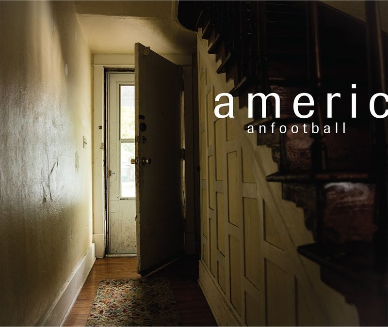
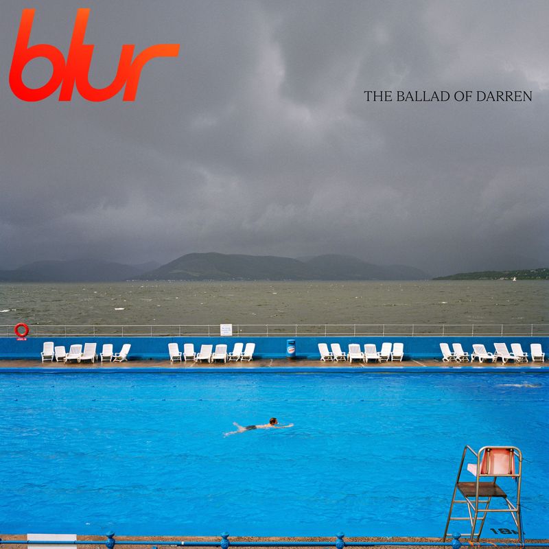
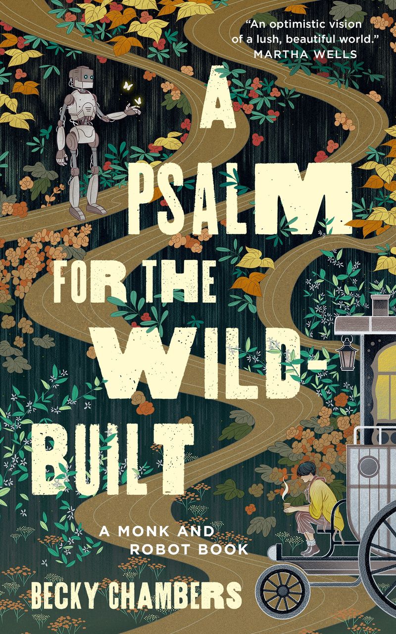
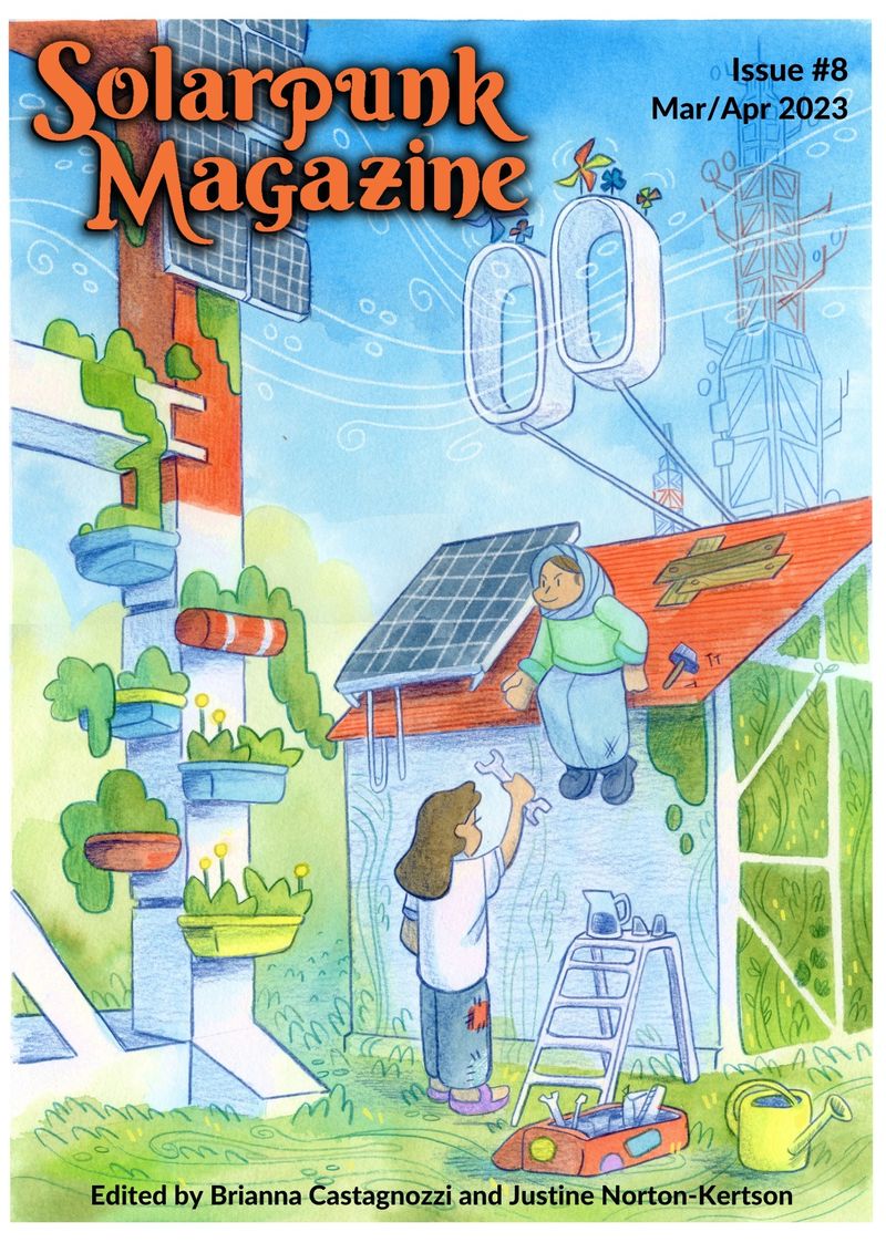
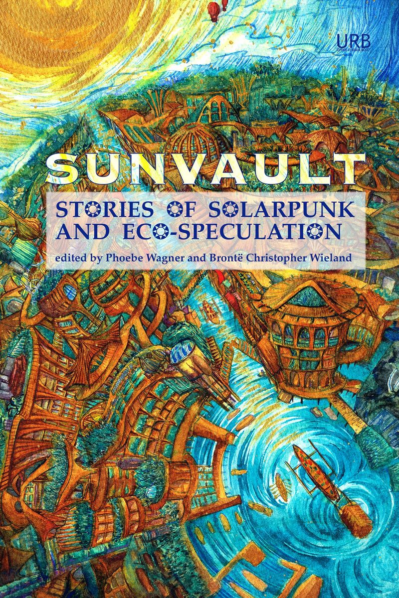
Solarpunk. A hopeful green future, with plants growing over buildings, solar panels and warm light. It suits sustainability, energy and gardening brands.
How do you use a style name in a brief?
Bring one or two names and a few examples of each. Two is plenty. Three or more and the brief is back to being vague.
Say what you don’t want as well. “Editorial minimal, and please no beige” tells a designer a great deal.
Treat the style as a starting point. A good identity borrows from a style and then becomes its own thing, with your colours, your words and your photographs. Keep the logo simple enough to outlast the style, and let colour, illustration and photography carry the look.
If you know the look you want and would like help turning it into a brand, I can help. I design brand identities for small businesses, starting with a moodboard so we agree on the direction before anything is drawn.
Who made the work in this article?
Every image belongs to the designer, illustrator or studio named under it, and each caption links to the page where the work is published. I’ve only shown work where I could trace who made it. You’ll find more in each style’s section of the Visual Styles board. If you made one of these and would like the credit changed or the image taken down, email hello@sophie-evans.com.
Questions people also ask
How do I find the name of a design style?
Start with what you can see: the colours, the kind of lettering, whether it looks printed, drawn or made on a computer, and which decade it reminds you of. Then match it against a list like this one. Searching Pinterest for the name will show you quickly whether you’ve got the right one.
What is the difference between brutalism and neo-brutalism?
Brutalism is raw and undecorated: plain fonts, harsh layouts and very little colour. Neo-brutalism keeps the bluntness and makes it friendly, with thick black outlines, flat bright colour and hard drop shadows. Most of the brutalist apps and websites you see now are neo-brutalist.
What is Frutiger Aero?
It is the glossy look of technology from about 2004 to 2013: shiny buttons, glass effects, water droplets, blue skies and green grass. Think of the Windows Vista desktop. The name was given to it years later, after the Frutiger typeface and the Aero look of Windows.
Should my brand follow one of these styles?
It can borrow from one, and usually from no more than two. Use a style for the layer around your logo, such as colour, photography and illustration, and keep the logo itself simple enough to outlast it.
Are these styles the same as design trends?
Not quite. A style is a recognisable look with a name, and many of these are decades old. A trend is a style that happens to be popular now. Swiss style has been in use since the 1950s, and Y2K comes round again every few years.

Sophie is an independent designer based in the UK and the founder of S Evans Design, working across brand, web and product for founders and brand teams. Her career work includes projects for Arsenal, DreamWorks, BBC, Sky, Channel 4, Barclays and the NHS, and she is a Squarespace Circle Gold partner. More about Sophie.