The best event branding at Amsterdam Dance Event 2026 fell into three groups: posters drawn by hand, chrome and 3D objects, and flyers that were printed, scanned or built from stickers. Each of the seven events here picked one idea and used it everywhere. That is the part a small business can borrow for a launch, a pop-up or a seasonal campaign.
What does ADE event branding look like in 2026?
Amsterdam Dance Event ran from 21 to 25 October this year. The festival’s own yellow and black flags were up on every street, and each event inside it had its own poster competing for the same weekend.
Before I went, I saved the events whose artwork made me stop scrolling. Seven made the cut, and they fall into three groups: drawn by hand, chrome and 3D, and printed, scanned and stuck. Every image is credited to the artist who made it, with a link to the original post. On the Thursday night I went to RAW Factory, and the rest of the weekend we just wandered around the city.
Drawn by hand: why does a cartoon work for a club night?
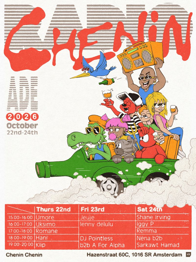
Two of the seven are illustrations, and they’re the two I’d recognise from across a room. Pointless James drew the poster for Radio Chenin, three days of music at Chenin Chenin: a crowd of cartoon characters riding a green wine bottle like a car, with red brush lettering above and the whole timetable set out in a red grid below.
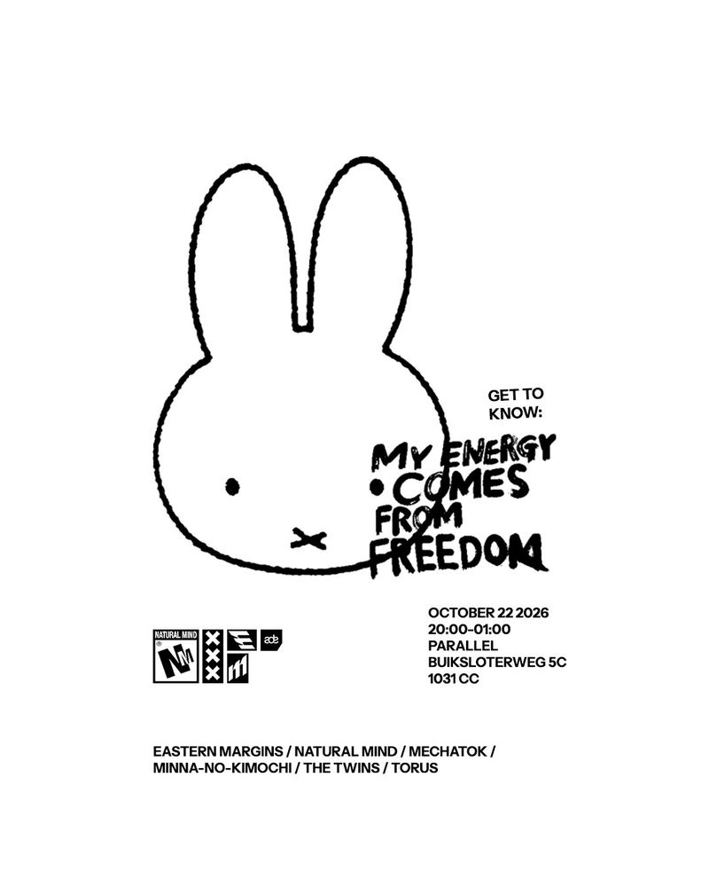
Mechatok’s artwork for Eastern Margins x Natural Mind at Parallel goes the other way. It’s one black line drawing of a rabbit on a white page, with a few handwritten words and the details in small type underneath.
Where I’d use it: food and drink, small venues, markets and anything with a regular crowd. A drawing gives people a character to remember.
Watch: a drawing takes the attention, so the date and place need their own clear block. Radio Chenin’s timetable is easy to read because it sits in a plain grid, apart from the picture.
Chrome and 3D: why does everything look like an object?
Three events turned their artwork into something you could hold. For Ely Oaks & Friends at Chicago Social Club, Katharina Eibeck made a chrome keyring with the name and the date stamped into the tags, on a background that fades from silver to yellow. S.bySolo’s visual for Pegassi All Day Long is a chrome skateboard on black, with yellow wheels and the name in yellow capitals on the poster.
Shelter’s programme for the week is 3D too, though it isn’t chrome. Tim Straver built a rock covered in bright green moss and set the week’s line-ups around it.
Where I’d use it: launches and limited editions, where one object can stand for the whole campaign and be animated for video.
Watch: chrome is everywhere at the moment, and two of these three put it with yellow. The object you choose is what makes it yours. A keyring says something a floating blob doesn’t.
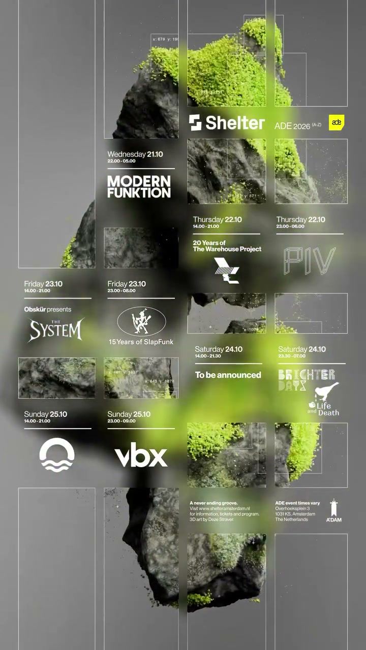
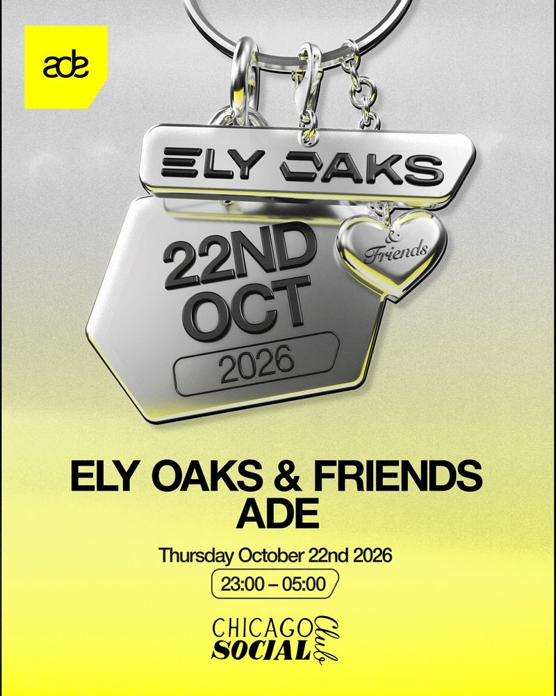
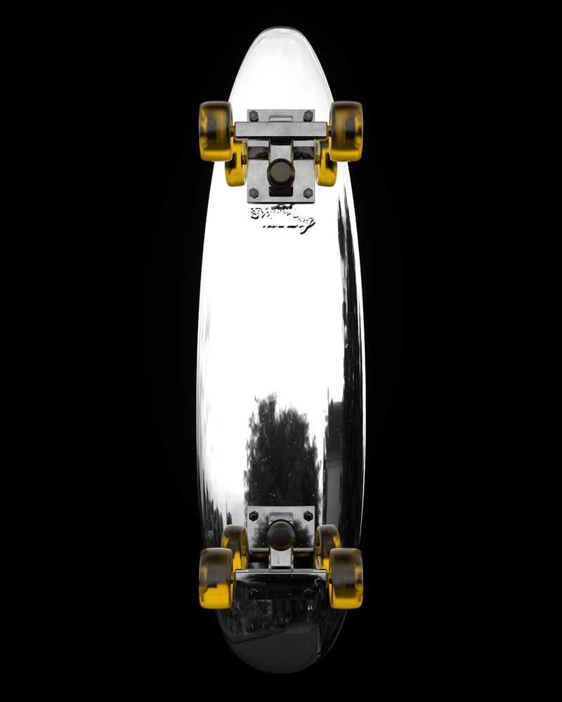
Each event picked one idea and used it everywhere.
Printed, scanned and stuck: why does rough texture feel right?
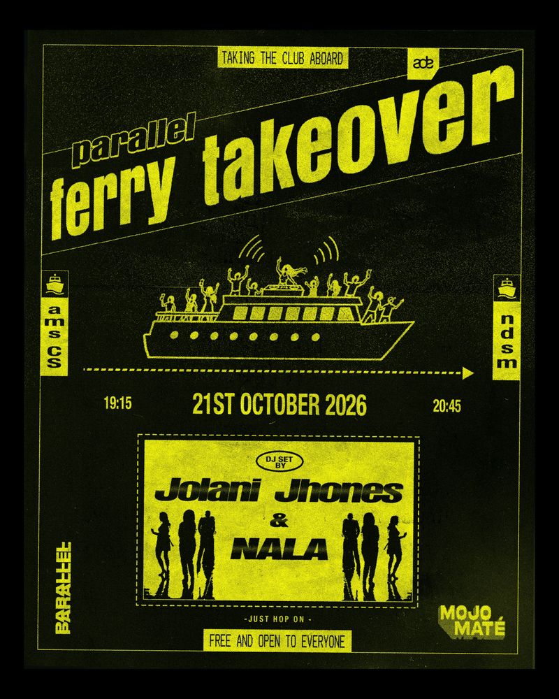
Studio Jonsson’s flyer for the Parallel ferry takeover, a free party on the boat from Amsterdam Centraal to NDSM, was printed and then scanned back in. It’s yellow on black, with a line drawing of the ferry and the grain of a photocopier over everything.
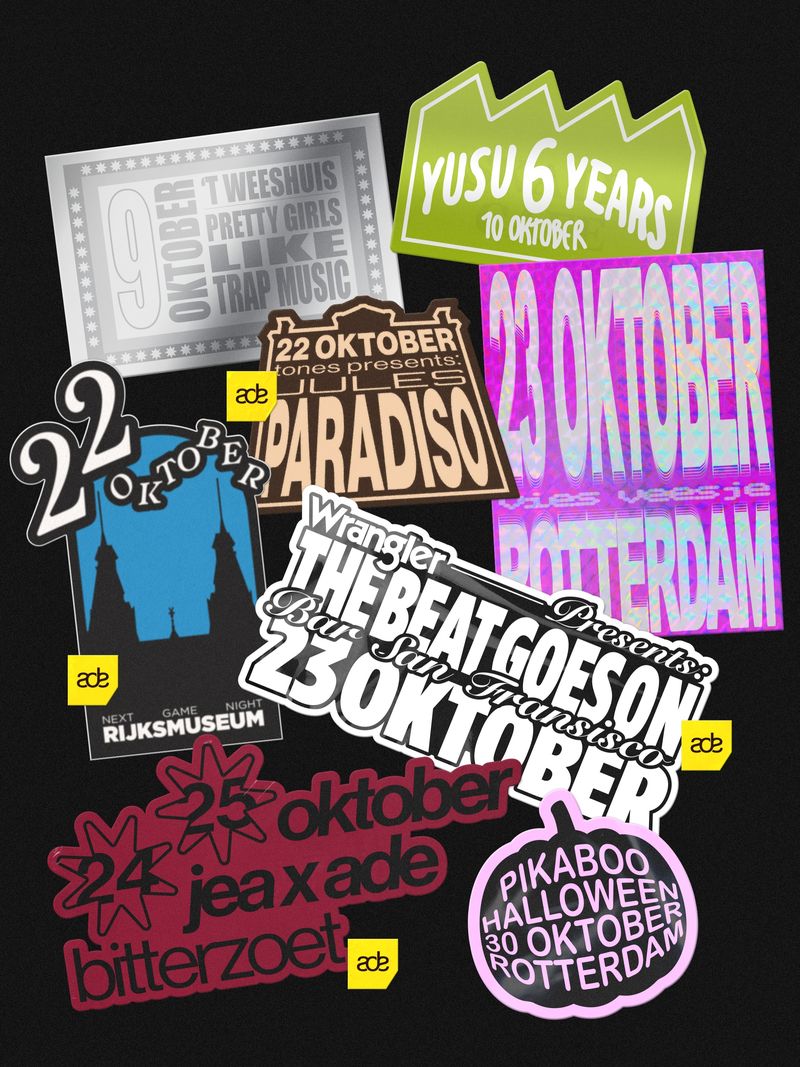
Lucas Hooijer’s poster for AK Soundsystem is a pile of stickers. Each date and venue is its own sticker in its own style, overlapping the next, which is a neat way to show several nights in one image.
Where I’d use it: independent shops, record and book sellers, street food, and any brand that wants to look made by people.
Watch: texture eats small type. On the ferry flyer the date, the times and the route are the biggest, cleanest things on the page.
What did I photograph between events?
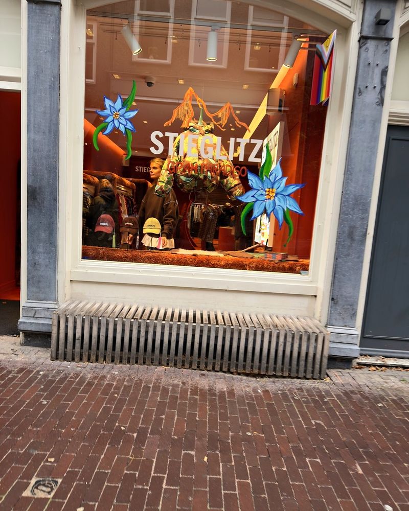
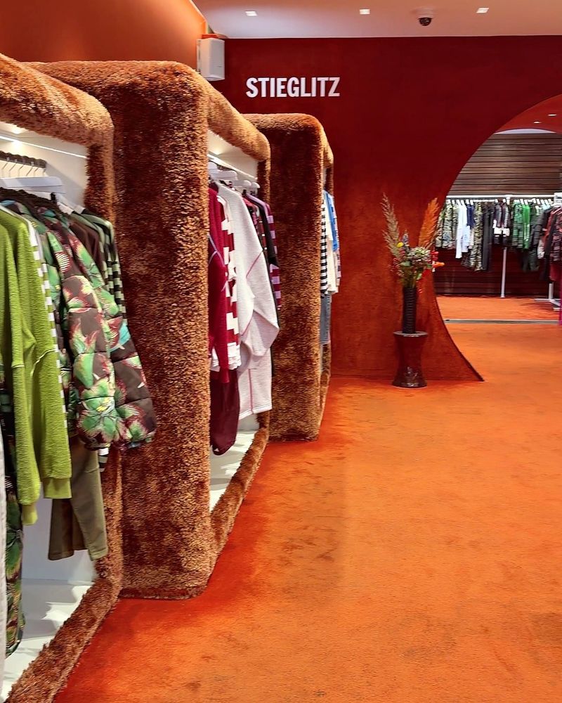
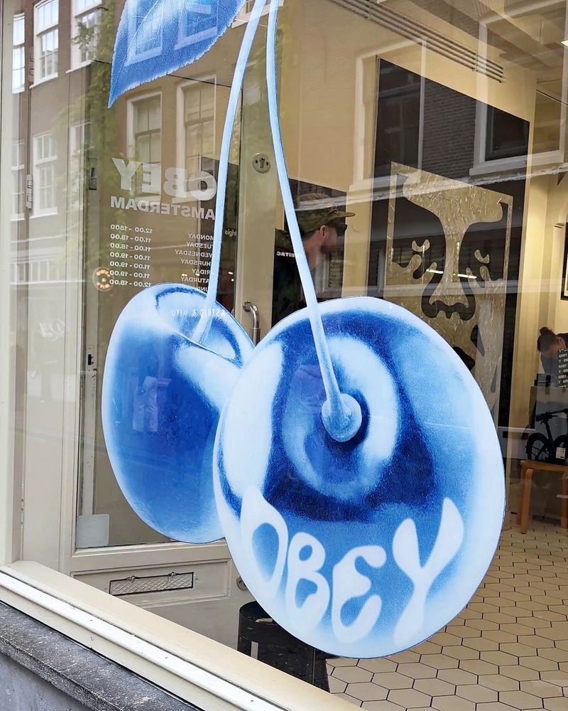
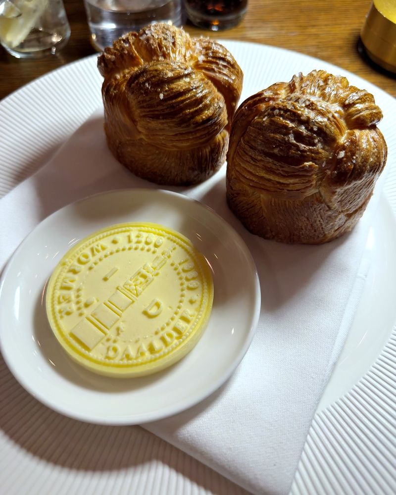
Mostly shop windows. Stieglitz has big blue flowers across the glass and an orange room inside, with the clothes rails wrapped in fur. OBEY had two huge cherries hanging in the window with the name across them. At Daalder, the butter arrived stamped with the restaurant’s name.
They’re all the same idea as the posters: one decision, carried through to the smallest thing a customer touches.
What can a small business borrow from ADE?
Pick one idea for a campaign and use it everywhere. Each of these events has a single drawing, object or texture, and you’d know it again on a poster, a story or a wristband.
Keep the details plain. Name, date, time, place and how to get in. However wild the artwork is, all seven posters set the facts in clean type you can read on a phone.
Let a campaign look different from your everyday brand. Your logo and colours stay as they are. A launch, a pop-up or a Christmas range can have its own illustration or its own object for a few weeks, and then it goes away again.
Credit the artist. Most of these promoters name the designer in the caption, which is how I found them.
If you have a launch or an event coming up and want it to look like it belongs to your brand, I can help. I design brand identities for small businesses, and the campaign pieces that sit around them.
Who made the work in this article?
Every poster belongs to the artist named under it and the event that commissioned it. Credits come from the promoters’ own captions, the artists’ posts or the poster itself, and each caption links to the original post. The four Amsterdam photos are mine. If you made one of these and would like the credit changed or the image taken down, email hello@sophie-evans.com.
Questions people also ask
What is ADE?
Amsterdam Dance Event is an electronic music conference and festival held across Amsterdam every October. In 2026 it ran from 21 to 25 October, with events in clubs, bars, galleries and one ferry.
Who designs the posters for ADE events?
Each promoter commissions its own artwork, usually from an illustrator, a 3D artist or a small studio. The seven here are by Pointless James, Mechatok, Tim Straver, Katharina Eibeck, S.bySolo, Studio Jonsson and Lucas Hooijer, and each caption links to the original post.
Why does so much event artwork use chrome?
Chrome 3D objects look like something you could pick up, they catch the eye on a phone, and they are easy to animate for a video post. Three of these seven events used one: a keyring, a skateboard and a mossy rock.
Can a small business use event-style branding?
Yes, for anything with a date on it: a launch, a pop-up, a sale or a seasonal product. Keep your logo and colours as they are and let the campaign have its own drawing, object or texture for a few weeks.
What should a poster for an event always include?
The name, the date, the time, the place and how to get in, in that order of size. All seven of these posters set those details in clean type, however busy the artwork is.
Sophie is an independent designer based in the UK and the founder of S Evans Design, working across brand, web and product for founders and brand teams. Her career work includes projects for Arsenal, DreamWorks, BBC, Sky, Channel 4, Barclays and the NHS, and she is a Squarespace Circle Gold partner. More about Sophie.